

 v0.0.4
speech_balloon
यह एक सरल बोलने का बबल उत्पन्न करने वाला फ्लटर विजेट है। इस विजेट का उपयोग सरल बोलने के बबल और सीमा वाले बबल को प्रदर्शित करने के लिए किया जा सकता है।
43लाइक 6.1 हज़ार30-दिन डाउनलोड155Pub अंक
AndroidiOSWebmacOSWindowsLinux
s-tyd/speech_balloon open-source repository details.

यह अंग्रेज़ी मूल स्नैपशॉट है। नवीनतम सामग्री GitHub पर देखें।
A flutter widget that emulates a speech balloon.
This widget is a copy of https://pub.dev/packages/speech_balloon
I created this because the previous creator doesn't seem to have updated it.
Changes from speech_balloon include the ability to display a border.
Dart Pub: https://pub.dartlang.org/packages/speech_balloon#-installing-tab-
Depend on it
Add this to your package's pubspec.yaml file:
speech_balloon: ^0.0.4
Install it
You can install packages from the command line:
$ flutter packages get
Alternatively, your editor might support flutter packages get. Check the docs for your editor to learn more.
Now in your Dart code, you can use:
import 'package:speech_balloon/speech_balloon.dart';
Creates a widget that emulates a speech balloon. Could be used for a tooltip, or as a pop-up notification, etc.
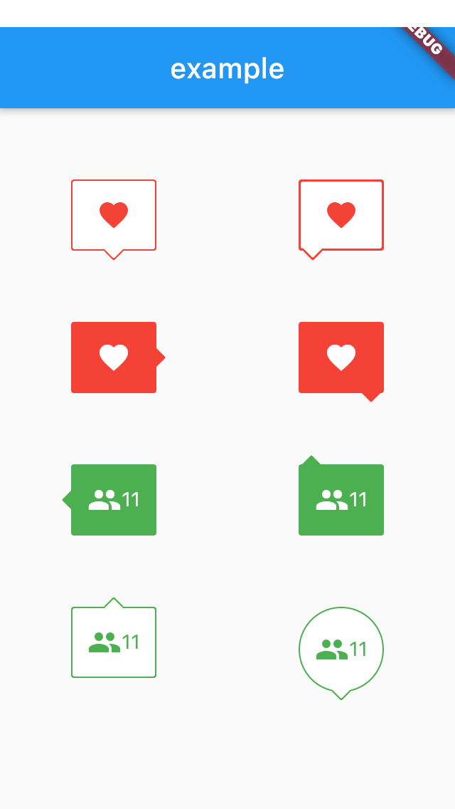
import 'package:flutter/material.dart';
import 'package:speech_balloon/speech_balloon.dart';

void main() => runApp(MyApp());

class MyApp extends StatefulWidget {
  @override
  _MyAppState createState() => _MyAppState();
}

class _MyAppState extends State<MyApp> {
  @override
  Widget build(BuildContext context) {
    return MaterialApp(
      home: Scaffold(
        appBar: AppBar(
          title: const Text('example'),
        ),
        body: Center(
          child: Row(
            mainAxisAlignment: MainAxisAlignment.spaceAround,
            children: [
              Column(
                children: [
                  SizedBox(height: 50),
                  SpeechBalloon(
                    nipLocation: NipLocation.bottom,
                    borderColor: Colors.red,
                    color: Colors.white,
                    child: Icon(
                      Icons.favorite,
                      color: Colors.red,
                    ),
                  ),
                  SizedBox(height: 50),
                  SpeechBalloon(
                    nipLocation: NipLocation.right,
                    color: Colors.red,
                    child: Icon(
                      Icons.favorite,
                      color: Colors.white,
                    ),
                  ),
                  SizedBox(height: 50),
                  SpeechBalloon(
                    nipLocation: NipLocation.left,
                    color: Colors.green,
                    child: Row(
                      mainAxisAlignment: MainAxisAlignment.center,
                      children: [
                        Icon(
                          Icons.people,
                          color: Colors.white,
                        ),
                        Text(
                          '11',
                          style: TextStyle(color: Colors.white),
                        ),
                      ],
                    ),
                  ),
                  SizedBox(height: 50),
                  SpeechBalloon(
                    nipLocation: NipLocation.top,
                    borderColor: Colors.green,
                    child: Row(
                      mainAxisAlignment: MainAxisAlignment.center,
                      children: [
                        Icon(
                          Icons.people,
                          color: Colors.green,
                        ),
                        Text(
                          '11',
                          style: TextStyle(color: Colors.green),
                        ),
                      ],
                    ),
                  ),
                ],
              ),
              Column(
                children: [
                  SizedBox(height: 50),
                  SpeechBalloon(
                    nipLocation: NipLocation.bottomLeft,
                    borderColor: Colors.red,
                    color: Colors.white,
                    borderWidth: 3,
                    child: Icon(
                      Icons.favorite,
                      color: Colors.red,
                    ),
                  ),
                  SizedBox(height: 50),
                  SpeechBalloon(
                    nipLocation: NipLocation.bottomRight,
                    color: Colors.red,
                    child: Icon(
                      Icons.favorite,
                      color: Colors.white,
                    ),
                  ),
                  SizedBox(height: 50),
                  SpeechBalloon(
                    nipLocation: NipLocation.topLeft,
                    color: Colors.green,
                    child: Row(
                      mainAxisAlignment: MainAxisAlignment.center,
                      children: [
                        Icon(
                          Icons.people,
                          color: Colors.white,
                        ),
                        Text(
                          '11',
                          style: TextStyle(color: Colors.white),
                        ),
                      ],
                    ),
                  ),
                  SizedBox(height: 50),
                  SpeechBalloon(
                    nipLocation: NipLocation.bottom,
                    borderColor: Colors.green,
                    height: 60,
                    width: 60,
                    borderRadius: 40,
                    offset: Offset(0, -1),
                    child: Row(
                      mainAxisAlignment: MainAxisAlignment.center,
                      children: [
                        Icon(
                          Icons.people,
                          color: Colors.green,
                        ),
                        Text(
                          '11',
                          style: TextStyle(color: Colors.green),
                        ),
                      ],
                    ),
                  ),
                ],
              ),
            ],
          ),
        ),
      ),
    );
  }
}
निर्भरता सूची 2 आइटम
{"sdk":"flutter"}{"sdk":"flutter"}उपयोग के अनुसार छाँटें, गतिविधि की तुलना करें और अपनाने से पहले मूल प्रोजेक्ट की आवश्यकताएँ जाँचें।
“A repository is the most basic element of GitHub.”
GitHub Docs — About repositories ↗