
 v0.4.0
input_history_text_field
एक input_history_text_field विशेषता स्वचालित रूप से सहेजी जाती है और आपके टाइप करने पर सुझाव देती है।
80लाइक 1.5 हज़ार30-दिन डाउनलोड150Pub अंक
AndroidiOSWebmacOSWindowsLinux
एक विजेट स्वचालित रूप से सहेजा जाता है और फ्लटर के लिए टाइप करते समय सुझाव देता है।

{"sdk":"flutter"}^2.0.8{"sdk":"flutter"}यह अंग्रेज़ी मूल स्नैपशॉट है। नवीनतम सामग्री GitHub पर देखें।
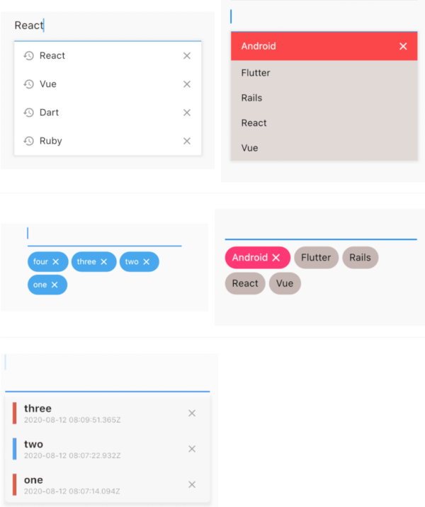
A input_history_text_field widget is automatically saved and suggest as you type.
| example1 | example2 |
|---|---|
| image | image |
| example1 | example2 |
|---|---|
| image | image |
| image |
The only key in the your widget of application set to historyKey, supports like a text_field.
InputHistoryTextField(
    historyKey: "01",
),
a saved automatically as you type.( save up to limit, default to 5 )
input_history_text_field-1
a input history is suggested.
input_history_text_field-2
input history can be deleted.
input_history_text_field-3
All you need is a historyKey.
InputHistoryTextField(
    historyKey: "01",
),
Change style to badge is listStyle = ListStyle.Badge
InputHistoryTextField(
    historyKey: "01",
    listStyle: ListStyle.Badge,
),
| image |
If there is an item you want to display from the beginning or an item you want the user to selected.
InputHistoryTextField(
    historyKey: "01",
    lockItems: ['Flutter', 'Rails', 'React', 'Vue'],
),
| List |
|---|
| image |
Can hide or change the icon.
InputHistoryTextField(
    historyKey: "01",
    showHistoryIcon: true,
    showDeleteIcon: true,
    historyIcon: Icons.add,
    deleteIcon: Icons.delete,
),
| image |
enableOpacityGradient is input history list is gradually transmitted.
InputHistoryTextField(
    historyKey: "01",
    enableOpacityGradient: true,
),
| image |
listRowDecoration is input history lines as a decoration.
InputHistoryTextField(
    historyKey: "01",
    listRowDecoration: BoxDecoration(
        border: Border(
        left: BorderSide(color: Colors.blue, width: 8),
        ),
    ),
),
| image |
listDecoration is input history list as a decoration.
InputHistoryTextField(
    historyKey: "01",
    listDecoration: BoxDecoration(
        color: Colors.cyan,
        borderRadius: BorderRadius.only(
            bottomLeft: Radius.circular(20),
            bottomRight: Radius.circular(20)),
        boxShadow: [
        BoxShadow(
            color: Colors.grey.withOpacity(0.2),
            spreadRadius: 8,
            blurRadius: 8,
            offset: Offset(0, 3)),
        ],
    ),
),
| image |
If you want to customize everything, to use historyListItemLayoutBuilder.
InputHistoryTextField(
    historyKey: "01",
    historyListItemLayoutBuilder: (controller, value, index) {
        return InkWell(
        onTap: () => controller.select(value.text),
        child: Row(
            children: [
            Expanded(
                flex: 1,
                child: Container(
                    margin: const EdgeInsets.only(left: 10.0),
                    padding: const EdgeInsets.only(left: 10.0),
                    decoration: BoxDecoration(
                    border: Border(
                        left: BorderSide(
                        width: 5.0,
                        color: index % 2 == 0
                            ? Colors.red
                            : Colors.blue,
                        ),
                    ),
                    ),
                    child: Column(
                    crossAxisAlignment: CrossAxisAlignment.start,
                    children: [
                        Text(
                        value.textToSingleLine,
                        overflow: TextOverflow.ellipsis,
                        style:
                            TextStyle(fontWeight: FontWeight.bold),
                        ),
                        Text(
                        DateTime.fromMillisecondsSinceEpoch(
                                value.createdTime)
                            .toUtc()
                            .toString(),
                        overflow: TextOverflow.ellipsis,
                        style: TextStyle(
                            fontSize: 10,
                            color: Theme.of(context).disabledColor),
                        ),
                    ],
                    )),
            ),
            IconButton(
                icon: Icon(
                Icons.close,
                size: 16,
                color: Theme.of(context).disabledColor,
                ),
                onPressed: () {
                controller.remove(value);
                },
            ),
            ],
        ),
    );}
)
| image |
| name | ex | note | |
|---|---|---|---|
| historyKey | key-01 |
String | a only key in the your application,saved with this key. |
| limit | 5 |
int | max limit of input history |
| hasFocusExpand | true |
bool | show input history of edit text focused |
| showHistoryIcon | true |
bool | icon of input history at left positioned |
| showDeleteIcon | true |
bool | icon of delete at right positioned |
| enableHistory | true |
bool | enabled/disabled of input history |
| enableSave | true |
bool | enabled/disabled saved history |
| enableOpacityGradient | true |
bool | make the input history list gradually transparent |
| enableFilterHistory | true |
bool | suggest filters when input text |
| showHistoryList | true |
bool | show/hide of input history list |
| historyIcon | Icons.add |
IconData | IconData for history icon. |
| historyIconTheme | IconTheme |
IconTheme | IconTheme for history icon. |
| deleteIcon | Icons.delete |
IconData | IconData for delete icon. |
| deleteIconTheme | IconTheme |
IconTheme | IconTheme for delete icon. |
| listOffset | Offset(0, 5) |
Offset | set a position for list. |
| listTextStyle | TextStyle(fontSize: 30) |
TextStyle | sets a text style for list. |
| listRowDecoration | BoxDecoration |
Decoration | a row of input history for decoration |
| listDecoration | BoxDecoration |
Decoration | a list of input history for decoration |
| listStyle | ListStyle.List |
ListStyle | change style List or Badge |
| textColor | Colors.black |
Color | a text color |
| backGroundColor | Colors.grey |
Color | a background color |
| historyIconColor | Colors.white |
Color | a history icon color |
| deleteIconColor | Colors.white |
Color | a delete icon color |
| lockItems | ['Flutter', 'Rails', 'React', 'Vue'] |
List | |
| fixed shown, cannot be delete items | |||
| lockTextColor | Colors.black |
Color | a lock items text color |
| lockBackgroundColor | Colors.grey |
Color | a lock items background color |
| historyListItemLayoutBuilder | Widget |
Widget | a customize full layout. |
| InputHistoryController | InputHistoryController |
InputHistoryController | Select or delete the input history list |