
Flutter에 대한 응답
앱이 작동 중인 장치의 디스플레이 크기에 맞게 모든 위젯을 다시 생성함으로써, 어떤 기기에서도 원하는 대로 반응형 UI 디자인을 구축하는 데 도움을 주는 Flutter UI 패키지입니다.

- 스타
- 3
- 포크
- 0
- 최근 푸시(UTC)
- 2021. 4. 5.
- 프로젝트 상태
- 활성
원본 README
아래는 영문 원문 스냅샷입니다. 최신 내용은 GitHub에서 확인하세요.
Response
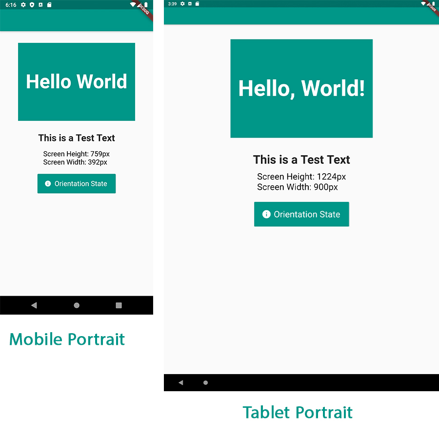
Flutter UI package which will help you to build your responsive UI design as you wanted to be on any device as it recreates every widget to fit the device display size on which the app is working.
Features
- Easy to use, with so few but yet powerful methods.
- Fast, very reliable and readable.
- Saves you a lot of time trying to fit widget size to different displays.
- Works on any Android/ IOS device (including iPad).
- Works in Portrait mode or Landscape mode on the same device.
How to use
First wrap your MaterialApp widget with Response.
     Response(
      originalScreenHeight: 759,
      originalScreenWidth: 392,
      child: MaterialApp(
        home: HomePage(),
      ),
    )
Note: Responsive needs to be at the top of your Widget Tree to be able to work and rebulid the widgets to a new size as the device display changes.
Note: if you want to use any functions features related to
MediaQueryyou must change the order to make theResponsewidget a child to theMaterialAppwidget.
Second
declare an instance response of ResponseUI() class at the top of your file.
final response = ResponseUI.instance;
And that is all to be able to initialize the package, Very easy!
to use the package on your widget you have 4 easy to use methods:
| Name | Description |
|---|---|
response.setWidth(width) |
Sets the widget width in pixels value to be relatively constant across all different display sizes. |
response.setHeight(height) |
Sets the widget height in pixels value to be relatively constant across all different display sizes. |
response.setFontSize(fontSize) |
Sets the text size in pixels to be relativly constant on all diplays sizes. |
response.isDevicePortrait |
Helpful if you want to know whether the device orientation is in Portrait or in Landscape. |
response.inMobilePortrait |
Helps you if you want to know whether the device you are working on a Mobile Portrait (returns true) or a Tablet Portrait mode (returns false). |
response.screenWidth |
returns the current device screen width as of type double. |
response.screenPixelRatio |
returns the current device screen ratio. (using MediaQuery) |
response.textScaleFactor |
returns the font scalling factore as of type double. (using MediaQuery) |
response.bottomPadding |
returns the current device screen padding offset from the bottom. (using MediaQuery) |
response.topPadding |
returns the current device screen padding offset from the top. (using MediaQuery) |
Note:
isDevicePortraitandinMobilePortraitreturns abool(true or false) with which you can know the current orientation state of your device.
Height and Width
to set a width and height to for example a Container.
//We want the Container Widget to be 200px in width and 200px in height
    Container(
        width: response.setWidth(300), //setting the Container width to be 300px
        height: response.setHeight(200), //setting the Container height to be 300px
        color: Colors.teal,
       )
Note: the scaling process will work also in the same device in both in Portrait mode or in Landscape mode.
Text Size
to set the text size.
    Text(
        'This is a Test Text',
        style: TextStyle(
           fontSize: response.setFontSize(24), //defined a fixed font size in pixels
           fontWeight: FontWeight.bold,
    ),
)
Getting Screen Width & Height
    TextSpan(
      text: '\nScreen Height: ${response.screenHeight}px\n', //we are getting back our current device screen
      //height in pixels.
      style: TextStyle(
        color: Colors.black,
        fontSize: response.setFontSize(18),
      ),
    ),
    TextSpan(
      text: 'Screen Width: ${response.screenWidth}px', //we are getting back our current device screen
      //width in pixels.
      style: TextStyle(
        color: Colors.black,
        fontSize: response.setFontSize(18),
      ),
    ),
Contributions
If you feel like you can contribute to make the package much better and more useful for other
developers, don't hesitate to fork the repo and make pull request to your changes.
Source code on Github: here
Inspired
This package was inspired by Prateek Sharma's great custom responsive UI project.

Ahmed Abouelkheir ↗
사용 중인 의존성
의존성 목록 2 개
- flutter
{"sdk":"flutter"} - flutter_test개발 의존성
{"sdk":"flutter"}
프로젝트에 맞는 저장소를 선택하려면?
사용 목적에 따라 검색하고 개발 활동을 비교한 뒤 원본 저장소에서 요구 사항을 확인하세요.
- 이름, 작성자 또는 설명으로 검색하고 기술 주제로 범위를 좁힙니다.
- 스타, 포크, 최근 푸시를 함께 비교하세요. 스타는 관심의 지표이며 품질을 보장하지 않습니다.
- 사용하기 전에 GitHub에서 README, 라이선스, Issues를 확인하세요.
출처 및 관리
“A repository is the most basic element of GitHub.”
GitHub Docs — About repositories ↗