
flutter-반응 효과
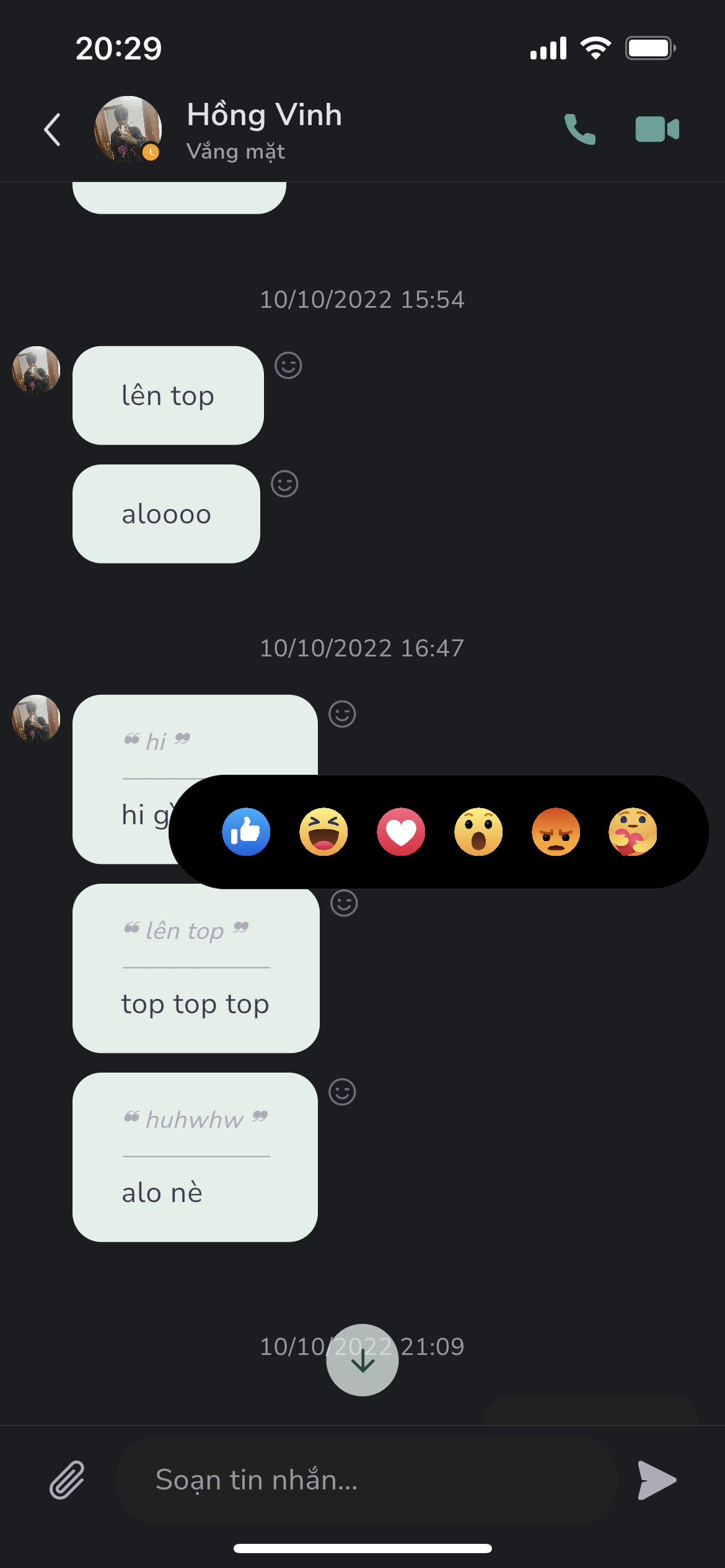
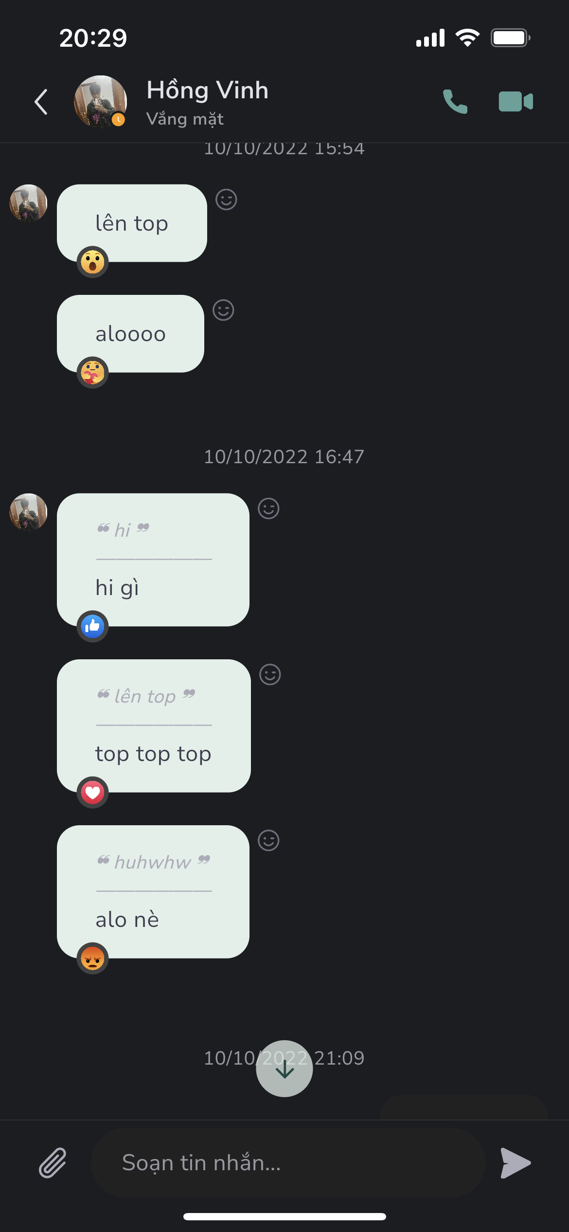
:lion: 패키지 도움말은 Facebook처럼 팝업 반응을 표시하고 위젯 래퍼(이 메시지에 반응한 사람을 표시)입니다.
- 스타
- 20
- 포크
- 6
- 최근 푸시(UTC)
- 2023. 9. 21.
- 프로젝트 상태
- 활성
원본 README
아래는 영문 원문 스냅샷입니다. 최신 내용은 GitHub에서 확인하세요.
:four_leaf_clover: Package help show popup reaction like Facebook and wrapper for widget (Show anyone who reaction this message).
:four_leaf_clover::four_leaf_clover: Preview


Features
- Support show popup emotions picker
- Support reaction wrapper for message card use case
Usage
- Show reaction popup
        GestureDetector(
          onTapDown: (details) {
            ReactionAskany.showReactionBox(
              context,
              offset: details.globalPosition,
              boxParamenters: boxParamenters,
              emotionPicked: _emotion,
              handlePressed: (Emotions emotion) {
                setState(() {
                  _emotion = emotion;
                });
              },
            );
          },
          child: widget.buttonReaction,
        ),
- Use reaction wrapper - useful for reaction message
            ReactionWrapper(
              boxParamenters: ReactionBoxParamenters(
                brightness: Brightness.light,
                iconSize: 26,
                iconSpacing: 10,
                paddingHorizontal: 30,
                radiusBox: 40,
                quantityPerPage: 6,
              ),
              buttonReaction: const Padding(
                padding: EdgeInsets.only(top: 2.0),
                child: Icon(
                  Icons.face_outlined,
                  size: 20.0,
                  color: Colors.grey,
                ),
              ),
              child: Container(
                padding: const EdgeInsets.symmetric(
                  vertical: 12.0,
                  horizontal: 20.0,
                ),
                decoration: BoxDecoration(
                  color: Colors.greenAccent.shade100,
                  borderRadius: BorderRadius.circular(30),
                ),
                child: const Text(
                  'Message from lambiengcode <3',
                ),
              ),
            ),
ReactionBoxParamenters
| parameter | description | default |
|---|---|---|
| iconSize | Size of emotion in reaction box | 20 |
| iconSpacing | Padding horizontal value for each emotion | 8 |
| paddingHorizontal | Padding horizontal value for reaction box | 16 |
| radiusBox | Radius circular of reaction box | 10 |
| quantityPerPage | Number of emotions per page view | 5 |
| brightness | Set brightness for show background color compatitive | Brightness.light |
Download Askany


License - lambiengcode
MIT License

Copyright (c) 2022 Askany

Permission is hereby granted, free of charge, to any person obtaining a copy
of this software and associated documentation files (the "Software"), to deal
in the Software without restriction, including without limitation the rights
to use, copy, modify, merge, publish, distribute, sublicense, and/or sell
copies of the Software, and to permit persons to whom the Software is
furnished to do so, subject to the following conditions:

The above copyright notice and this permission notice shall be included in all
copies or substantial portions of the Software.

THE SOFTWARE IS PROVIDED "AS IS", WITHOUT WARRANTY OF ANY KIND, EXPRESS OR
IMPLIED, INCLUDING BUT NOT LIMITED TO THE WARRANTIES OF MERCHANTABILITY,
FITNESS FOR A PARTICULAR PURPOSE AND NONINFRINGEMENT. IN NO EVENT SHALL THE
AUTHORS OR COPYRIGHT HOLDERS BE LIABLE FOR ANY CLAIM, DAMAGES OR OTHER
LIABILITY, WHETHER IN AN ACTION OF CONTRACT, TORT OR OTHERWISE, ARISING FROM,
OUT OF OR IN CONNECTION WITH THE SOFTWARE OR THE USE OR OTHER DEALINGS IN THE
SOFTWARE.

GitHub 작성자
Askany ↗
언어DartC++CMakeHTMLCSwiftKotlinObjective-C
분류
사용 중인 의존성
의존성 목록 3 개
- flutter
{"sdk":"flutter"} - flutter_test개발 의존성
{"sdk":"flutter"} - flutter_lints개발 의존성
^2.0.0
프로젝트에 맞는 저장소를 선택하려면?
사용 목적에 따라 검색하고 개발 활동을 비교한 뒤 원본 저장소에서 요구 사항을 확인하세요.
- 이름, 작성자 또는 설명으로 검색하고 기술 주제로 범위를 좁힙니다.
- 스타, 포크, 최근 푸시를 함께 비교하세요. 스타는 관심의 지표이며 품질을 보장하지 않습니다.
- 사용하기 전에 GitHub에서 README, 라이선스, Issues를 확인하세요.
출처 및 관리
“A repository is the most basic element of GitHub.”
GitHub Docs — About repositories ↗