
확장 가능한 카드
Flutter용 슬라이딩 카드 위젯

- 스타
- 110
- 포크
- 15
- 최근 푸시(UTC)
- 2019. 11. 27.
- 프로젝트 상태
- 활성
원본 README
아래는 영문 원문 스냅샷입니다. 최신 내용은 GitHub에서 확인하세요.
Expandable Card
This is a Flutter Widget that makes it easy to build a page with a bottom Card that can be expanded on user drag.
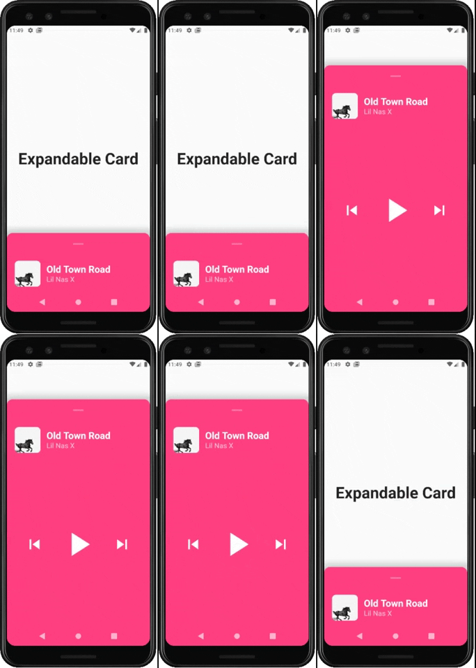
How to use it
Use ExpandableCardPage for the body of your Scaffold. This widget will take two attributes:
Widget page: which is the default page in the backgroundExpandableCard expandableCard: which is the bottom card itself. You can call theExpandableCardconstructor to build one.
ExpandableCard constructor has a few attributes:
EdgeInsetsGeometry padding: padding inside the card. Default value isEdgeInsets.all(15)double minHeight: default height of the card when it's not expanded. Default value is200double maxHeight: height of the card when it's fully expanded. Default value is500bool hasShadow: determines whether the card has box shadow or not. Default istrueColor backgroundColor: background color of the card. Default isColors.blueGreybool hasRoundedCorners: determines whether the card has rounded corners or not. Default isfalsebool hasHandle: will add a little handle icon. Default istrueList<Widget> Children: Widgets that make the actual content of the card
Future Implementations:
AnimatedExpandableCard: will allow animation between closed state and expanded state.- Add suport for scrolling card when its fully expanded

GitHub 작성자
Lucas Bernardi ↗
언어DartObjective-CJava
사용 중인 의존성
의존성 목록 3 개
- flutter
{"sdk":"flutter"} - cupertino_icons
^0.1.2 - flutter_test개발 의존성
{"sdk":"flutter"}
프로젝트에 맞는 저장소를 선택하려면?
사용 목적에 따라 검색하고 개발 활동을 비교한 뒤 원본 저장소에서 요구 사항을 확인하세요.
- 이름, 작성자 또는 설명으로 검색하고 기술 주제로 범위를 좁힙니다.
- 스타, 포크, 최근 푸시를 함께 비교하세요. 스타는 관심의 지표이며 품질을 보장하지 않습니다.
- 사용하기 전에 GitHub에서 README, 라이선스, Issues를 확인하세요.
출처 및 관리
“A repository is the most basic element of GitHub.”
GitHub Docs — About repositories ↗