

 v1.0.0
load
전역 로딩 위젯, 순수한 플러터 라이브러리, 네이티브 코드를 사용하지 않습니다. 사용 방법은 OKToast와 유사합니다.
22좋아요 1.9천30일 다운로드130Pub 점수
AndroidiOSWebmacOSWindowsLinux
CaiJingLong/flutter_load_widget open-source repository details.

아래는 영문 원문 스냅샷입니다. 최신 내용은 GitHub에서 확인하세요.


Global loading widget, which can be used through simple configuration.
Pure flutter library, not use native code.
It is similar to OKToast in use.
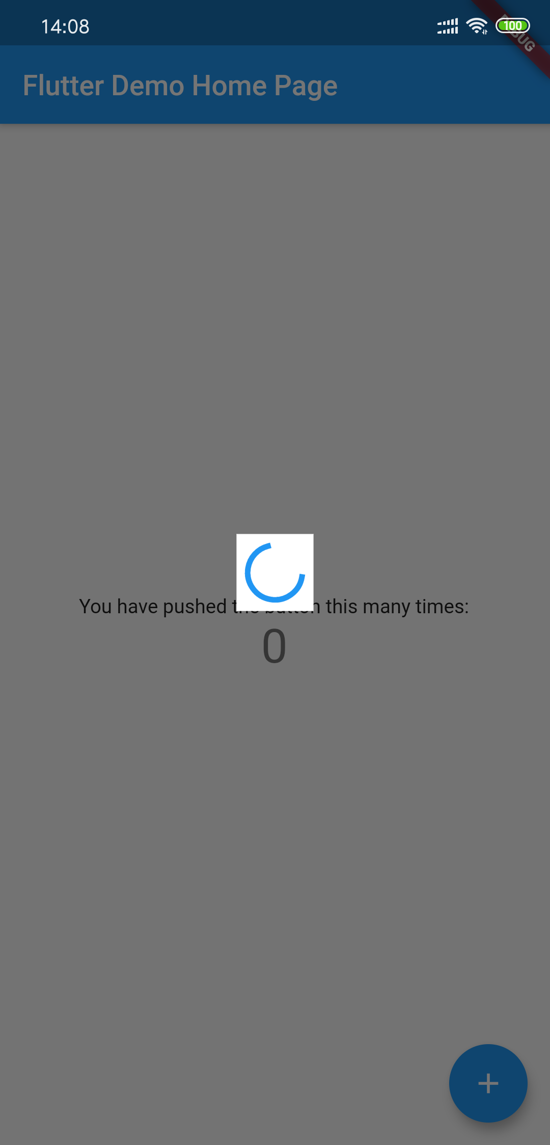
Add to yaml
version is
dependencies:
  load: $latest_version
import 'package:load/load.dart';
void main() {
  runApp(
    LoadingProvider(
      child: MyApp(),
    ),
  );
}

or

LoadingProvider(
  child: MaterialApp(),
);
Debug custom loading widget in Flutter inspector
You can try to use next method to include the widget:
MaterialApp(
  builder: (context, widget) {
    return LoadingProvider(
      child: widget,
    );
  },
);
see example/lib/main.dart
showLoadingDialog();
showCustomLoadingWidget(Container()); // custom dialog
hideLoadingDialog();
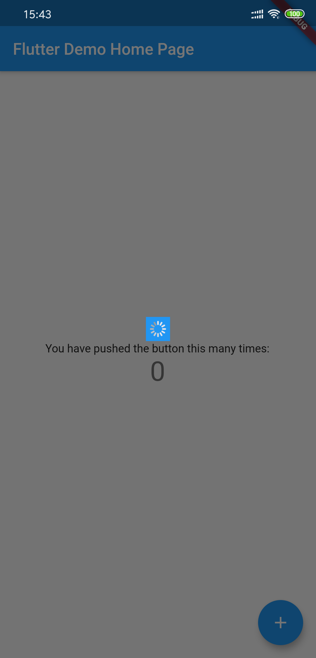
Using LoadingThemeData and loadingWidgetBuilder
LoadingProvider(
  themeData: LoadingThemeData(),
  loadingWidgetBuilder: (ctx, data) {
    return Center(
      child: SizedBox(
        width: 30,
        height: 30,
        child: Container(
          child: CupertinoActivityIndicator(),
          color: Colors.blue,
        ),
      ),
    );
  },
  child: MyApp(),
);
All params is optional
| Params | Type | Default Value | Desc |
|---|---|---|---|
| backgroundColor | Color | Colors.black54 | Background transparent mask |
| tapDismiss | bool | true | Will it close when touching the background? |
| loadingBackgroundColor | Color | Colors.white | Background color for the center Loading Widget |
| loadingPadding | EdgeInsets | EdgeInsets.all(8.0) | Padding for the center Loading Widget |
| loadingSize | Size | Size(55,55) | Size for the center Loading Widget |
| animDuration | Duration | Duration(milliseconds: 300) | Show/Hide Time Duration |
의존성 목록 2 개
{"sdk":"flutter"}{"sdk":"flutter"}사용 목적에 따라 검색하고 개발 활동을 비교한 뒤 원본 저장소에서 요구 사항을 확인하세요.
“A repository is the most basic element of GitHub.”
GitHub Docs — About repositories ↗