
 v0.0.4
custom_pointed_popup
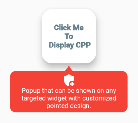
목표 위젯에 표시할 수 있는 팝업으로 사용자 지정된 화살표 디자인을 지원합니다.
23좋아요 15030일 다운로드130Pub 점수
AndroidiOSWebmacOSWindowsLinux
목표 위젯에 표시할 수 있는 팝업으로 사용자 지정된 화살표 디자인을 지원합니다.

{"sdk":"flutter"}{"sdk":"flutter"}아래는 영문 원문 스냅샷입니다. 최신 내용은 GitHub에서 확인하세요.
Popup that can be shown on any targeted widget with customized pointed design.
alt text alt text alt text alt text
  final GlobalKey widgetKey = GlobalKey();

  CustomPointedPopup getCustomPointedPopup(BuildContext context) {
    return CustomPointedPopup(
      backgroundColor: Colors.red,
      context: context,
      lineColor: Colors.tealAccent,
      widthFractionWithRespectToDeviceWidth: 3,
      displayBelowWidget: true,
      triangleDirection: TriangleDirection.FullLeft,
      popupElevation: 10,

      ///you can also add border radius
      ////popupBorderRadius:,
      item: CustomPointedPopupItem(
        title: 'Popup that can be shown on any targeted widget with customized pointed design.',
        textStyle: Theme.of(context).textTheme.caption!.copyWith(
              color: Theme.of(context).cardColor,
            ),
        iconWidget: Icon(
          Icons.add_moderator,
          color: Theme.of(context).cardColor,
        ),

        ///Or you can add custom item widget below instead above 3
        ///itemWidget: Container(),
      ),
      onClickWidget: (onClickMenu) {
        print('popup item clicked');
      },
      onDismiss: () {
        print('on dismissed called');
      },
    );
  }

  @override
  Widget build(BuildContext context) {
    return Scaffold(
      appBar: AppBar(
        title: Text(
          'Custom Pointed Popup [CPP]',
        ),
      ),
      body: Container(
        child: Center(
          child: Column(
            mainAxisAlignment: MainAxisAlignment.center,
            children: [
              Text(
                'CPP with straight pointer & item.',
                style: TextStyle(
                  color: Colors.red,
                  fontSize: 14.0,
                  fontStyle: FontStyle.italic,
                  fontWeight: FontWeight.bold,
                ),
              ),
              SizedBox(
                height: 40,
              ),
              GestureDetector(
                onTap: () {
                  getCustomPointedPopup(context)
                    ..show(
                      widgetKey: widgetKey,
                    );
                },
                child: Card(
                  key: widgetKey,
                  elevation: 10,
                  shape: RoundedRectangleBorder(
                    borderRadius: BorderRadius.circular(20),
                  ),
                  child: Container(
                    height: 100,
                    width: 100,
                    child: Center(
                      child: Text(
                        'Click Me \nTo\n Display CPP',
                        textAlign: TextAlign.center,
                        overflow: TextOverflow.clip,
                        style: TextStyle(
                          color: Colors.blueGrey,
                          fontWeight: FontWeight.w900,
                          fontSize: 14.0,
                        ),
                      ),
                    ),
                  ),
                ),
              ),
            ],
          ),
        ),
      ),
    );
  }
The important class to know. CustomPointedPopupItem - Model item to display inside the pointed popup:
| Attribute | Type | Default | Required | Description |
|---|---|---|---|---|
iconWidget |
Widget |
No |
This will create an icon inside the pointed popup. | |
title |
String |
No |
Title or text for the pointed popup. | |
textStyle |
TextStyle |
No |
Text style for the title. | |
textAlign |
TextAlign |
No |
Alignment for the title. | |
itemWidget |
Widget |
No |
Custom item widget or child for the pointed popup. No need to add iconWidget & title if you added this. |
The important function to know. show - Function to show the custom pointed popup:
| Attribute | Type | Default | Required | Description |
|---|---|---|---|---|
rect |
Rect |
No |
The rect bound that the popup should appear around it. | |
widgetKey |
GlobalKey |
No |
The key to widget. | |
item |
CustomPointedPopupItem [class] |
No |
If you want the dynamic item widget or child inside the popup per action, you can add the item here. |
The important enum to know. TriangleDirection - Enum to choose the direction of pointer or triangle shape:
| Value | Description |
|---|---|
Straight |
This will create an pointer with straight upward. |
Right |
This will create an pointer with slightly bended towards right. |
FullRight |
This will create an pointer with fully bended towards right. |
Left |
This will create an pointer with slightly bended towards left. |
FullLeft |
This will create an pointer with fully bended towards left. |
In order to create a custom pointed popup on the widget, there are several attributes that are supported by custom_pointed_popup:
| Attribute | Type | Default | Required | Description |
|---|---|---|---|---|
item |
CustomPointedPopupItem [class] |
Yes |
To create the item widget or child in pointed popup. | |
customHeight |
double |
Yes |
The custom height of the pointed popup. | |
displayBelowWidget |
bool |
false |
No |
If true always display the popup below the widget else automatically calculate the space and display the popup either up or below the widget. |
triangleDirection |
TriangleDirection [enum] |
TraingleDirection.Straight |
No |
Determines the direction of pointer or triangle shape. |
popupBorderRadius |
BorderRadius |
BorderRadius.circular(10.0) |
No |
Defines the border of the custom pointed popup. |
popupElevation |
double |
0 |
No |
The elevation of the pointed popup. |
stateChanged |
Function(bool isShow) |
No |
This event function will fire immediately the the popup state changes. | |
backgroundColor |
Color |
Colors.red |
No |
Background color for pointed popup. |
widthFractionWithRespectToDeviceWidth |
int |
3 |
No |
Width ratio with respect to the device width. |
onDismiss |
VoidCallBack |
No |
Callback function that fire when the custom pointed popup dismissed. | |
onClickWidget |
Function(CustomPointedPopupItem item) |
No |
Callback function that fire when the child of popup is clicked. | |
context |
BuildContext |
Yes |
Context where the popup to be shown. |
##If you have any queries, email me to dipak.shrestha@eemc.edu.np
Made with contributors-img.