
 v0.3.0
flutter_date_range_picker
입력, 대화 상자 및 캘린더 옵션을 통해 날짜 범위를 선택할 수 있는 Flutter 패키지입니다.
66좋아요 4.2천30일 다운로드160Pub 점수
AndroidiOSWebmacOSWindowsLinux
날짜 범위 선택기는 사용자 친화적이고 간단한 Flutter 패키지로, 사용자가 날짜 범위를 선택할 수 있도록 합니다. 시간이 지남에 따라 발전하도록 설계되었으며, 재사용 가능한 구성 요소로 구성되어 있습니다.

>=0.18.0 <1.0.0{"sdk":"flutter"}{"sdk":"flutter"}^2.0.0아래는 영문 원문 스냅샷입니다. 최신 내용은 GitHub에서 확인하세요.
Date Range Picker 📅
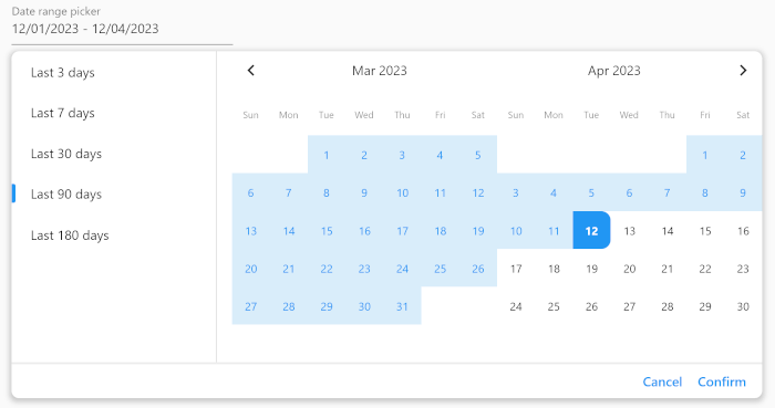
Date Range Picker is a user-friendly and simple package for Flutter that allows users to select a date range. It's designed to evolve over time, and its components are built to be reusable.
Date Range Picker
(Isn't it beautiful?)
Add the package to your pubspec.yaml file:
dependencies:
  date_range_picker: ^latest_version
Then, run flutter packages get in your terminal.
To use the Date Range Picker, simply import the package and create a DateRangePickerWidget:
DateRangePickerWidget(
    doubleMonth: doubleMonth,
    maximumDateRangeLength: 10,
    minimumDateRangeLength: 3,
    initialDateRange: selectedDateRange,
    disabledDates: [DateTime(2023, 11, 20)],
    initialDisplayedDate:
    selectedDateRange?.start ?? DateTime(2023, 11, 20),
    onDateRangeChanged: onDateRangeChanged,
);
You can also use the DateRangeField or DateRangeFormField to display a dialog asking the user to select a date range, and to display the selected range. Here is an example:
DateRangeField(
    decoration: InputDecoration(
        label: Text("Date range picker"),
        hintText: 'Please select a date range',
    ),
    onDateRangeSelected: (DateRange? value) {
    // Handle the selected date range here
    },
  selectedDateRange: selectedRange,
);
Lastly, you can use the showDateRangePickerDialog function to display a dialog asking the user to select a date range:
showDateRangePickerDialog(
    context: context,
    builder: datePickerBuilder
);
...

Widget datePickerBuilder(BuildContext context, dynamic Function(DateRange) onDateRangeChanged) => DateRangePickerWidget(
    doubleMonth: true,
    initialDateRange: selectedDateRange,
    onDateRangeChanged: onDateRangeChanged,
);
You can customize the appearance of the Date Range Picker by providing a custom CalendarTheme:
DateRangePickerWidget(
    onDateRangeChanged: (dateRange) {
    // Handle the selected dateRange here
    },
    theme: CalendarTheme(
    selectedColor: Colors.blue,
    dayNameTextStyle: TextStyle(color: Colors.black45, fontSize: 10),
    inRangeColor: Color(0xFFD9EDFA),
    inRangeTextStyle: TextStyle(color: Colors.blue),
    selectedTextStyle: TextStyle(color: Colors.white),
    todayTextStyle: TextStyle(fontWeight: FontWeight.bold),
    defaultTextStyle: TextStyle(color: Colors.black, fontSize: 12),
    radius: 10,
    tileSize: 40,
    disabledTextStyle: TextStyle(color: Colors.grey),
    )
,
);
This package is released under the MIT License.
We encourage and welcome contributions from the community to help improve and grow this project. If you would like to contribute, please feel free to fork the repository, make changes, and submit a pull request.
If you have any questions or need guidance, don't hesitate to reach out to the maintainer of this project. We appreciate your interest and support, and we look forward to collaborating with you!