
pin_code_text_field
PIN 코드 입력을 위한 매우 사용자 정의 가능한 Flutter 위젯입니다. 로그인 및 OTP와 같은 사용 사례에 적합합니다.
- 스타
- 366
- 포크
- 74
- 최근 푸시(UTC)
- 2024. 1. 30.
- 프로젝트 상태
- 보관됨
원본 README
아래는 영문 원문 스냅샷입니다. 최신 내용은 GitHub에서 확인하세요.


pin_code_text_field
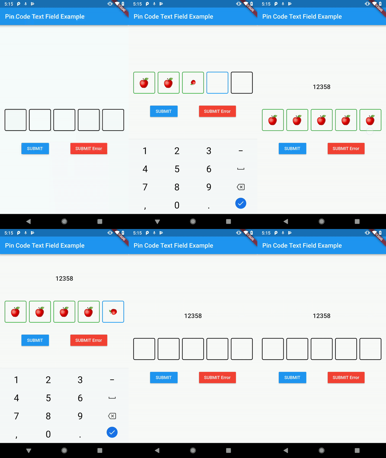
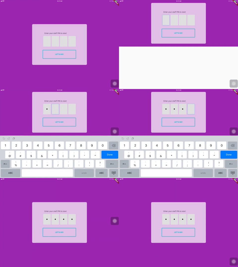
It's a beautiful and highly customizable Flutter widget for entering pin code. Suitable for use cases such as login and OTP.
Usage
Use this package as a library
- Depend on it Add this to your package's pubspec.yaml file:
dependencies:
  pin_code_text_field: <VERSION>
- Install it You can install packages from the command line: with Flutter:
$ flutter packages get
Alternatively, your editor might support flutter packages get. Check the docs for your editor to learn more.
- Import it Now in your Dart code, you can use:
import 'package:pin_code_text_field/pin_code_text_field.dart';
API
| name | type | default | description |
|---|---|---|---|
| isCupertino | bool | false | Application wrapped in CupertinoApp instead MaterialApp |
| maxLength | int | 4 | The total length of pin number & the number of pin boxes. |
| hideCharacter | bool | false | Show or hide the pin code. |
| highlight | bool | false | highlight the focused pin box. |
| highlightAnimation | bool | false | animated highlight of the focused pin box. |
| highlightAnimationBeginColor | Color | Colors.black | the starting color of the animated highlight. |
| highlightAnimationEndColor | Color | Color.white | the ending color of the animated highlight. |
| highlightAnimationDuration | Duration | 500ms | the duration of the highlight animation. |
| highlightColor | Color | Colors.black | Set color of the focused pin box. |
| pinBoxDecoration | BoxDecoration | ProvidedPinBoxDecoration._defaultPinBoxDecoration | Customization for the individual pin boxes. Check ProvidedPinBoxDecoration for possible options. |
| pinTextStyle | TextStyle | TextStyle for styling pin characters. | |
| maskCharacter | String | "\u25CF" | Special character to mask the pin code. Will only work if hideCharacter is set to true. |
| pinBoxHeight | double | 70.0 | Height of pin boxes. |
| pinBoxWidth | double | 70.0 | Width of pin boxes. |
| onDone | void Function(String) | Callback when the max length of pin code is reached. | |
| hasTextBorderColor | Color | Colors.black | Set color of pin box containing text. |
| pinTextAnimatedSwitcherTransition | Function(Widget child, Animation animation) | Animation of text appearing/disappearing, you can write your own or use a few presets: 1. PinCodeTextField.awesomeTransition 2. PinCodeTextField.defaultScalingTransition 3. PinCodeTextField.defaultRotateTransition | |
| pinTextAnimatedSwitcherDuration | Duration | const Duration() | Duration of pinTextAnimatedSwitcherTransition. Check ProvidedPinBoxTextAnimation for possible options. |
| errorBorderColor | Color | Colors.red | Highlight all textboxes to this color if hasError is set to true |
| onTextChange | Function(String) | callback that returns a text on input | |
| hasError | bool | false | set all border color to errorBorderColor |
| autofocus | bool | false | Autofocus on view entered |
| wrapAlignment | WrapAlignment | WrapAlignment.start | Alignment of the wrapped pin boxes |
| textDirection | TextDirection | TextDirection.ltr | The direction of the pin code |
| keyboardType | TextInputType | TextInputType.number | The type of the input keyboard |
| pinBoxColor | Color | null | Color of the pin boxes (Will be overridden by custom PinBoxDecoration) |
| pinBoxBorderWidth | double | 2 | Border Width of pin boxes |
| pinBoxRadius | double | 0 | The type of the input keyboard |
| hideDefaultKeyboard | boolean | false | The type of hide default keyboard |
| highlightPinBoxColor | Color | false | The background color of the pin box |
| hasUnderline | bool | false | Added underline to individual pin box |
Example
refer to example/lib/main.dart
Wishlist
Localization (L-R, R-L)Highlight animationPin Box animation- BoxDecoratorBuilder for customizing individual pin boxes
Tips and Tricks:
- Copy and pasting
Wrap the
PinCodeTextFieldinGestureDetector, the launch an AlertDialog to access theClipboardand paste the strings to theTextEditControllerof thePinCodeTextField
Contributors
Star 🌟 to show support!
More information

GitHub 작성자
Liew Jun Tung ↗
언어DartJavaSwiftKotlinObjective-C
사용 중인 의존성
의존성 목록 2 개
- flutter
{"sdk":"flutter"} - flutter_test개발 의존성
{"sdk":"flutter"}
프로젝트에 맞는 저장소를 선택하려면?
사용 목적에 따라 검색하고 개발 활동을 비교한 뒤 원본 저장소에서 요구 사항을 확인하세요.
- 이름, 작성자 또는 설명으로 검색하고 기술 주제로 범위를 좁힙니다.
- 스타, 포크, 최근 푸시를 함께 비교하세요. 스타는 관심의 지표이며 품질을 보장하지 않습니다.
- 사용하기 전에 GitHub에서 README, 라이선스, Issues를 확인하세요.
출처 및 관리
“A repository is the most basic element of GitHub.”
GitHub Docs — About repositories ↗