
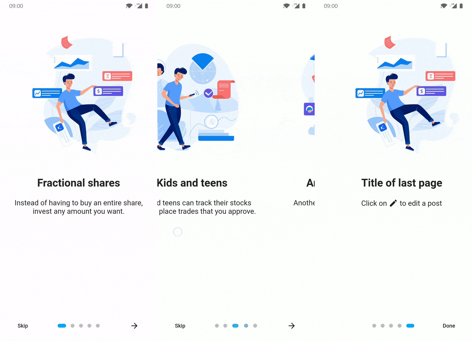
 v5.0.1
introduction_screen
Flutter 앱용 소개/온보딩 패키지이며, 일부 사용자 정의 가능성이 있습니다
3천좋아요 5.1만30일 다운로드160Pub 점수
AndroidiOSWebmacOSWindowsLinux
새로운 사용자에게 정보를 제공하기 위해 앱에 쉽게 소개 화면을 추가하세요

{"sdk":"flutter"}^1.18.0^5.0.0^7.0.1^1.0.0^6.0.0{"sdk":"flutter"}아래는 영문 원문 스냅샷입니다. 최신 내용은 GitHub에서 확인하세요.
Build Example App Run Project Tests
Introduction Screen allows you to have a screen on an app's first launch to, for example, explain your app. This widget is very customizable with a great design.
introduction_screen uses another package, dots_indicator, that I also created.
You just need to add introduction_screen as a dependency in your pubspec.yaml file.
dependencies:
  introduction_screen: ^5.0.1
Breaking change in 5.0.0: this package now uses the standalone
material_uipackage instead ofpackage:flutter/material.dart. Your app must also usematerial_ui(or keep the deprecatedMaterialUiCompatibilityBridge). Requires Flutter>=3.44.0and Dart^3.12.0. See the CHANGELOG for details.
Not all of the many parameters in each class are used in these examples. See Parameter Lists for the complete documentation for each class.
Note: if you want to display IntroductionScreen only once, like on the first start of your app, use
shared_preferences (or a similar strategy)
to save the status of whether it has been already displayed or not.
It's not responsibility of this package to handle this.
A list of PageViewModels is used for IntroductionScreen's pages parameter.
This example only defines the title, body, and image parameters.
(You can define image as any widget.)
PageViewModel(
  title: "Title of introduction page",
  body: "Welcome to the app! This is a description of how it works.",
  image: const Center(
    child: Icon(Icons.waving_hand, size: 50.0),
  ),
)
This example defines the color of the page using the decoration parameter.
The image link does not exist and is only for example.
PageViewModel(
  title: "Title of blue page",
  body: "Welcome to the app! This is a description on a page with a blue background.",
  image: Center(
    child: Image.network("https://example.com/image.png", height: 175.0),
  ),
  decoration: const PageDecoration(
    pageColor: Colors.blue,
  ),
)
This example defines custom TextStyles in the decoration parameter for the title and body.
PageViewModel(
  title: "Title of orange text and bold page",
  body: "This is a description on a page with an orange title and bold, big body.",
  image: const Center(
    child: Text("👋", style: TextStyle(fontSize: 100.0)),
  ),
  decoration: const PageDecoration(
    titleTextStyle: TextStyle(color: Colors.orange),
    bodyTextStyle: TextStyle(fontWeight: FontWeight.w700, fontSize: 20.0),
  ),
)
This example defines a footer for the page with a button.
The image does not exist and is only for example.
PageViewModel(
  title: "Title of custom button page",
  body: "This is a description on a page with a custom button below.",
  image: Image.asset("res/images/logo.png", height: 175.0),
  footer: ElevatedButton(
    onPressed: () {
      // On button pressed
    },
    child: const Text("Let's Go!"),
  ),
)
This example defines the page body using bodyWidget and a Widget, rather than with body and a String.
Only use body or bodyWidget.
The titleWidget parameter does the same thing for the title.
PageViewModel(
  title: "Title of custom body page",
  bodyWidget: Row(
    mainAxisAlignment: MainAxisAlignment.center,
    children: const [
      Text("Click on "),
      Icon(Icons.edit),
      Text(" to edit a post"),
    ],
  ),
  image: const Center(child: Icon(Icons.android)),
)
The IntroductionScreen Widget is the single object that holds all pages and related navigation and settings.
In these examples, listPagesViewModel is a list of pages.
A page is a PageViewModel object, like the examples in the previous section.
Note:
next parameter, the "Next" button will be not displayed. The parameter showNextButton must then be set to false.skip parameter and set showSkipButton to true.done parameter is only required if showDoneButton is true.This example only defines the pages, showNextButton, done, and onDone parameters.
IntroductionScreen(
  pages: listPagesViewModel,
  showNextButton: false,
  done: const Text("Done"),
  onDone: () {
    // On button pressed
  },
)
This example defines showSkipButton and skip to show the "Skip" button on all pages except the last one.
IntroductionScreen(
  pages: listPagesViewModel,
  showSkipButton: true,
  showNextButton: false,
  skip: const Text("Skip"),
  done: const Text("Done"),
  onDone: () {
    // On button pressed
  },
)
This example defines showBackButton and back to show the "Back" button on all pages except the first one.
IntroductionScreen(
  pages: listPagesViewModel,
  showBackButton: true,
  showNextButton: false,
  back: const Icon(Icons.arrow_back),
  done: const Text("Done"),
  onDone: () {
    // On button pressed
  },
)
This example defines dotsDecorator to show a custom implementation of the page progress dots.
This example also uses a custom style for the "Done" button, bolding it.
IntroductionScreen(
  pages: listPagesViewModel,
  showSkipButton: true,
  skip: const Icon(Icons.skip_next),
  next: const Text("Next"),
  done: const Text("Done", style: TextStyle(fontWeight: FontWeight.w700)),
  onDone: () {
    // On Done button pressed
  },
  onSkip: () {
    // On Skip button pressed
  },
  dotsDecorator: DotsDecorator(
    size: const Size.square(10.0),
    activeSize: const Size(20.0, 10.0),
    activeColor: Theme.of(context).colorScheme.secondary,
    color: Colors.black26,
    spacing: const EdgeInsets.symmetric(horizontal: 3.0),
    activeShape: RoundedRectangleBorder(
        borderRadius: BorderRadius.circular(25.0)
    ),
  ),
)
A custom style will be applied to all buttons using the baseBtnStyle parameter ("Back", "Skip", "Next", "Done").
Specific button style parameters may also be used: backStyle, skipStyle, nextStyle, doneStyle.
If both baseBtnStyle and a specific button style are defined, the baseBtnStyle will be merge with specific style.
The following is the default button style:
TextButton.styleFrom(
  shape: RoundedRectangleBorder(
    borderRadius: BorderRadius.circular(8.0),
  ),
)
This example will override the default in the following ways:
IntroductionScreen(
  pages: listPagesViewModel,
  showSkipButton: true,
  skip: const Text("Skip"),
  next: const Text("Next"),
  done: const Text("Done"),
  onDone: () {
    // When done button is press
  },
  baseBtnStyle: TextButton.styleFrom(
    backgroundColor: Colors.grey.shade200,
  ),
  skipStyle: TextButton.styleFrom(foregroundColor: Colors.red),
  doneStyle: TextButton.styleFrom(foregroundColor: Colors.green),
  nextStyle: TextButton.styleFrom(foregroundColor: Colors.blue),
)
key param to change page manuallyTo change page manually / programmatically, in response to user input or another event:
GlobalKey as part of the parent widget's stateIntroductionScreen key paramcurrentState member to access functions defined in IntroductionScreenState e.g.
next()previous()skipToEnd()animateScroll()This example moves to the next page after a delay:
class IntroScreenDemo extends StatefulWidget {
  @override
  State<IntroScreenDemo> createState() => _IntroScreenDemoState();
}

class _IntroScreenDemoState extends State<IntroScreenDemo> {
  // 1. Define a `GlobalKey` as part of the parent widget's state
  final _introKey = GlobalKey<IntroductionScreenState>();
  String _status = 'Waiting...';

  @override
  Widget build(BuildContext context) {
    return IntroductionScreen(
      // 2. Pass that key to the `IntroductionScreen` `key` param
      key: _introKey,
      pages: [
        PageViewModel(
            title: 'Page One',
            bodyWidget: Column(
              children: [
                Text(_status),
                ElevatedButton(
                    onPressed: () {
                      setState(() => _status = 'Going to the next page...');

                      // 3. Use the `currentState` member to access functions defined in `IntroductionScreenState`
                      Future.delayed(const Duration(seconds: 3),
                          () => _introKey.currentState?.next());
                    },
                    child: const Text('Start'))
              ],
            )),
        PageViewModel(
            title: 'Page Two', bodyWidget: const Text('That\'s all folks'))
      ],
      showNextButton: false,
      showDoneButton: false,
    );
  }
}
Many parameters can be used to customize your app introduction like you want! This is the full list:
PageViewModel), by adding pages: [..] parameter.rawPages: [..] parameter.
rawPages and pages parameter, pages will be used.onDone: () {} parameter.
done param, EXCEPT if you set showDoneButton: falseoverrideDone param, it will be ignored.onSkip: () {} parameter.
overrideSkip param, it will be ignored.onChange: (page) {} parameter.done: Text('Done')
overrideDone are required, EXCEPT if you set showDoneButton: falsedone, the parameter onDone is also required.next: Text('Next')
showNextButton: falseskip: Text('Skip')
showSkipButton: trueback: Text('Back')
showBackButton: trueIf you want to control pages, you can use key param. Search this repo's Issues for more detailed information.
overrideDone
done are required, EXCEPT if you set showDoneButton: falsedone parameter.overrideNext
next are required, EXCEPT if you set showNextButton: falsenext parameter.overrideSkip
skip are required if you set showSkipButton: trueskip parameter.overrideBack
back are required if you set showBackButton: trueskip parameter.customProgressshowSkipButton: false parameter.
falseshowNextButton: false parameter.
trueshowDoneButton: false parameter.
trueshowBackButton: false parameter.
falseisProgress: false parameter.
trueisProgressTap: false parameter.
truefreeze: true parameter.
falseanimationDuration: 400 parameter.
350initialPage: 2 parameter.
0scrollControllers: [..] parameter.
scrollControllers: [controller1]scrollControllers: [null, null, controller1]useScrollView is set to false in PageViewModel(s)globalBackgroundColor: Colors.blue parameter.
Colors.transparent to display an image as background (using Stack with IntroductionScreen inside for example)dotsDecorator: DotsDecorator(...)
dotsContainerDecorator: BoxDecorator(...)
skipOrBackFlex: 1 parameter.
1dotsFlex: 1 parameter.
1nextFlex: 1 parameter.
1curve: Curves.elasticIn parameter.
Curves.easeInbaseBtnStyle parameter.skipStyle: TextButton.styleFrom(alignment: Alignment.centerLeft) parameter.nextStyle: TextButton.styleFrom(alignment: Alignment.centerRight) parameter.doneStyle: TextButton.styleFrom(splashFactory: NoSplash.splashFactory) parameter.backStyle: TextButton.styleFrom(foregroundColor: Colors.red) parameter.skipSemantic: 'Skip introduction' parameter.nextSemantic: 'Go to next page' parameter.doneSemantic: 'Exit introduction' parameter.backSemantic: 'Go to previous page' parameter.showBottomPart: true parameter.hideBottomOnKeyboard parameter.controlsPosition: const Position(left: 0, right: 0, bottom: 100) parameter.
const Position(left: 0, right: 0, bottom: 0)controlsMargin: EdgeInsets.all(16.0) parameter.
EdgeInsets.zerocontrolsPadding: EdgeInsets.all(8.0) parameter.
EdgeInsets.all(16.0)globalHeader: Image.asset(...) parameter.globalFooter: ElevatedButton(...) parameter.pagesAxis: Axis.vertical.
Axis.horizontalscrollPhysics: ClampingScrollPhysics().
BouncingScrollPhysics()rtl: true.
falseallowImplicitScrolling: true
falseallowImplicitScrolling parametersafeAreaList: [true,true,true,true] parameter.You can provide many parameters to customize each pages:
title: "Title of the page" or titleWidget: Text("Custom widget for title")body: "Body of the page" or bodyWidget: Text("Custom widget for body")image: Image.asset(...) image of the page.
backgroundImage: 'assets/fullscreen.jpg' background image of the page (optional).
image parameter under the hood while making an asset span all over the screen.image nor fullscreen parameters: can be used together with them to build more complex layouts.footer: ElevatedButton(...), display a widget below body
decoration: PageDecoration(...), page decoration to customize page
reverse: true, reverse order of image and content (title/body). (Default: false)useScrollView: false, by default pages use a Scrollview to handle small screen or long body text. You can remove ScrollView by setting to false.scrollViewKeyboardDismissBehavior: ScrollViewKeyboardDismissBehavior.manual, by default the keyboard dismiss behavious is manual, you can change it.
pageColor: Colors.white, background color of the page
titleTextStyle: TextStyle(...), TextStyle of the titlebodyTextStyle: TextStyle(...), TextStyle of the bodyboxDecoration: BoxDecoration(...), BoxDecoration of page container
imageFlex: 2, flex ratio of the imagebodyFlex: 3, flex ratio of the content (title/body)footerFlex: 1, flex ratio of the content (title/body)footerFit: FlexFit.loose, flex ratio of the content (title/body)imagePadding: EdgeInsets.only(bottom: 12.0), padding of the image Widget. (Default EdgeInsets.only(bottom: 24.0))contentPadding: EdgeInsets.only(all: 24.0), padding of the content (title/body/footer) Widget. (Default EdgeInsets.all(16))titlePadding: EdgeInsets.only(bottom: 24.0), padding of the title text/Widget. (Default EdgeInsets.only(top: 16.0, bottom: 24.0))descriptionPadding: EdgeInsets.only(bottom: 24.0), padding of the body text/Widget. (Default EdgeInsets.zero)footerPadding: EdgeInsets.only(top: 24.0), padding of the footer text/Widget. (Default EdgeInsets.symmetric(vertical: 24.0))bodyAlignment: Align.center, content (title, body, footer) alignment. (Default Align.topCenter)imageAlignment: Align.center, image alignment. (Default Align.bottomCenter)fullScreen: true, Set image as fullscreen (background). (Default false)