
 v4.3.2
info_popup
선택한 위젯에 사용자에게 정보를 표시하는 간단한 방법입니다.
165좋아요 2.8만30일 다운로드150Pub 점수
AndroidiOSWebmacOSWindowsLinux
포장된 위젯 위에 간단하고 사용자 정의 가능한 팝업을 쉽게 표시할 수 있습니다.

{"sdk":"flutter"}{"path":"example"}^1.0.0{"sdk":"flutter"}아래는 영문 원문 스냅샷입니다. 최신 내용은 GitHub에서 확인하세요.
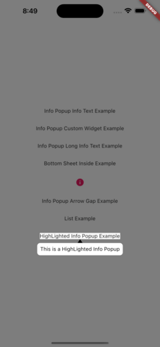
The info_popup package allows you to easily show a simple, customizable popup on your wrapped widget. The highlight feature, which can be activated at will, helps draw the user's attention to the desired location.
You can test it now on the Info Popup preview page. Note that the website experience may be different.
MainPresentation HighlightExample
To use this package, add info_popup as a dependency in your pubspec.yaml file.
dependencies:
  info_popup: ^3.0.0
Alternatively, you can add it to your project by running the following commands in your terminal:
with Dart:
$ dart pub add info_popup
with Flutter:
$ flutter pub add info_popup
To show a popup, wrap the widget that you want to display the popup on with the InfoPopupWidget widget. All you have to do is wrap it in the widget you want to show information with the InfoPopupWidget widget. With the InfoPopupController, you can customize it as you wish, and turn it on and off.
import 'package:info_popup/info_popup.dart';
	InfoPopupWidget(
		contentTitle: 'Info Popup Details',
		child: Icon(
			Icons.info,
			color: Colors.pink,
		),
	),
This is a normal info text displayed using the InfoPopupWidget widget with several optional parameters.
              InfoPopupWidget(
                contentTitle: 'Info Popup Details',
                arrowTheme: InfoPopupArrowTheme(
                  color: Colors.pink,
                  arrowDirection: ArrowDirection.up,
                ),
                contentTheme: InfoPopupContentTheme(
                  infoContainerBackgroundColor: Colors.black,
                  infoTextStyle: TextStyle(color: Colors.white),
                  contentPadding: const EdgeInsets.all(8),
                  contentBorderRadius: BorderRadius.all(Radius.circular(10)),
                  infoTextAlign: TextAlign.center,
                ),
                dismissTriggerBehavior: PopupDismissTriggerBehavior.onTapArea,
                areaBackgroundColor: Colors.transparent,
                indicatorOffset: Offset.zero,
                contentOffset: Offset.zero,
                onControllerCreated: (controller) {
                  print('Info Popup Controller Created');
                },
                onAreaPressed: (InfoPopupController controller) {
                  print('Area Pressed');
                },
                infoPopupDismissed: () {
                  print('Info Popup Dismissed');
                },
                onLayoutMounted: (Size size) {
                  print('Info Popup Layout Mounted');
                },
                child: Icon(
                  Icons.info,
                  color: Colors.pink,
                ),
              ),
"This is a custom popup example created using the InfoPopupWidget widget.
              InfoPopupWidget(
                customContent: Container(
                  decoration: BoxDecoration(
                    color: Colors.blueGrey,
                    borderRadius: BorderRadius.circular(10),
                  ),
                  padding: const EdgeInsets.all(10),
                  child: Column(
                    children: const <Widget>[
                      TextField(
                        decoration: InputDecoration(
                          hintText: 'Enter your name',
                          hintStyle: TextStyle(color: Colors.white),
                          enabledBorder: OutlineInputBorder(
                            borderSide: BorderSide(color: Colors.white),
                          ),
                        ),
                      ),
                      SizedBox(height: 10),
                      Center(
                        child: Text(
                          'Example of Info Popup inside a Bottom Sheet',
                          style: TextStyle(
                            color: Colors.white,
                          ),
                        ),
                      ),
                    ],
                  ),
                ),
                arrowTheme: const InfoPopupArrowTheme(
                  color: Colors.pink,
                  arrowDirection: ArrowDirection.up,
                ),
                dismissTriggerBehavior: PopupDismissTriggerBehavior.onTapArea,
                areaBackgroundColor: Colors.transparent,
                indicatorOffset: Offset.zero,
                contentOffset: Offset.zero,
                onControllerCreated: (controller) {
                  print('Info Popup Controller Created');
                },
                onAreaPressed: (InfoPopupController controller) {
                  print('Area Pressed');
                },
                infoPopupDismissed: () {
                  print('Info Popup Dismissed');
                },
                onLayoutMounted: (Size size) {
                  print('Info Popup Layout Mounted');
                },
                child: Icon(
                  Icons.info,
                  color: Colors.pink,
                ),
              ),
The info_popup package provides a simple and effective way to show a customizable popup on your wrapped widget. With the highlight feature, you can draw the user's attention to the desired location.
This project is licensed under the MIT License - see the LICENSE file for details.