
 v0.0.2
rounded_tabbar_widget
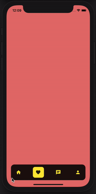
사용자 정의 탭바를 사용하여 TabBarView 레이아웃을 만드는 간단한 플러터 패키지입니다.
18좋아요 1130일 다운로드140Pub 점수
AndroidiOSWebmacOSWindowsLinux
사용자 정의 탭바를 사용하여 TabBarView 레이아웃을 만드는 간단한 플러터 패키지입니다.

{"sdk":"flutter"}{"sdk":"flutter"}아래는 영문 원문 스냅샷입니다. 최신 내용은 GitHub에서 확인하세요.
Language: English
A simple flutter package for creating a TabBarView layout with custom Tabbar.
Technical Notes: The layout for pages is built using TabbarView and layout of Tab buttons is customised. This package supports pages to be scrolled too.
https://github.com/TeaTalkInternal/github_assets/blob/master/gifs/rounded_tabbar_2.gif
the usage is very simple, just use the following
 RoundedTabbarWidget(
      tabIcons: [
        Icons.home,
        Icons.favorite,
        Icons.chat,
        Icons.person,
      ],
      pages: [
        HomePageWidget(),
        FavoritePageWidget(),
        MessagesPageWidget(),
        ProfilePageWidget(),
      ],
      selectedIndex: 0,
      onTabItemIndexChanged: (int index) {
        print('Index: $index');
      },
    ),
| parameter | description | default |
|---|---|---|
| onTabItemIndexChanged | Completion Handler which returns index of current tab page | (int index) {} |
| tabIcons | List of Tab Icons | Pass List of IconData parameter |
| pages | List of Tab Pages | Pass List of Tab widgets parameter |
| selectedIndex | Index of tab page to be shown selected initially | This is a optional parameter |
| itemNormalColor | Color of Tabbar item for normal state | This is a optional parameter |
| itemSelectedColor | Color of Tabbar item for selected state | This is a optional parameter |
| tabBarBackgroundColor | Background color of Tabbar | This is a optional parameter |
Please note the number of pages and tabIcons should be equal.