
 v1.3.0
flutter_custom_dialog
의미 있는 대화 | Made In YY.inc | 기여를 환영합니다
213좋아요 22530일 다운로드60Pub 점수
플랫폼 정보 없음
🚀🚀🚀 의미 있는 대화

{"sdk":"flutter"}{"sdk":"flutter"}아래는 영문 원문 스냅샷입니다. 최신 내용은 GitHub에서 확인하세요.
Global dialog function encapsulation, with a semantic way to fill the content inside the dialog, the current function provided
1、install
dependencies:
  flutter_custom_dialog: ^1.3.0
2、import
import 'package:flutter_custom_dialog/flutter_custom_dialog.dart';
dialog_demo
|
https://github.com/YYFlutter/flutter-custom-dialog/raw/master/image/png/1.png
divider ✅ |
https://github.com/YYFlutter/flutter-custom-dialog/raw/master/image/png/2.png
body ✅ |
https://github.com/YYFlutter/flutter-custom-dialog/raw/master/image/png/3.png
head&body ✅ |
https://github.com/YYFlutter/flutter-custom-dialog/raw/master/image/png/4.png
listTile ✅ |
https://github.com/YYFlutter/flutter-custom-dialog/raw/master/image/png/5.png
ListRadio ✅ |
|
https://github.com/YYFlutter/flutter-custom-dialog/raw/master/image/png/6.png
progress ✅ |
https://github.com/YYFlutter/flutter-custom-dialog/raw/master/image/png/7.png
progress&body ✅ |
https://github.com/YYFlutter/flutter-custom-dialog/raw/master/image/png/9.png
bottom sheet ✅ |
https://github.com/YYFlutter/flutter-custom-dialog/raw/master/image/png/10.png
notice ✅ |
https://github.com/YYFlutter/flutter-custom-dialog/raw/master/image/png/8.png
pop menu ✅ Support for custom locations |
dialog_gravity
|
https://github.com/YYFlutter/flutter-custom-dialog/raw/master/image/gif/1.gif
bottom ✅ |
https://github.com/YYFlutter/flutter-custom-dialog/raw/master/image/gif/2.gif
top ✅ |
https://github.com/YYFlutter/flutter-custom-dialog/raw/master/image/gif/3.gif
left ✅ |
https://github.com/YYFlutter/flutter-custom-dialog/raw/master/image/gif/4.gif
right ✅ |
https://github.com/YYFlutter/flutter-custom-dialog/raw/master/image/gif/5.gif
center ✅ |
|
https://github.com/YYFlutter/flutter-custom-dialog/raw/master/image/gif/111.gif
left bottom ✅ |
https://github.com/YYFlutter/flutter-custom-dialog/raw/master/image/gif/222.gif
left top ✅ |
https://github.com/YYFlutter/flutter-custom-dialog/raw/master/image/gif/333.gif
right bottom ✅ |
https://github.com/YYFlutter/flutter-custom-dialog/raw/master/image/gif/444.gif
right top ✅ |
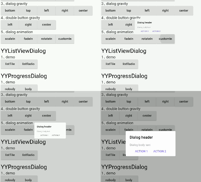
dialog_animation
|
https://github.com/YYFlutter/flutter-custom-dialog/raw/master/image/gif/6.gif
scaleIn ✅ |
https://github.com/YYFlutter/flutter-custom-dialog/raw/master/image/gif/7.gif
fadeIn ✅ |
https://github.com/YYFlutter/flutter-custom-dialog/raw/master/image/gif/8.gif
rotateIn ✅ |
https://github.com/YYFlutter/flutter-custom-dialog/raw/master/image/gif/9.gif
customIn ✅ Support for custom animations |
dialog property Settings can be called through the method of member variables, as detailed in the following table
YYDialog YYNoticeDialog() {
  return YYDialog().build()
    ..width = 120
    ..height = 110
    ..backgroundColor = Colors.black.withOpacity(0.8)
    ..borderRadius = 10.0
    ..showCallBack = () {
      print("showCallBack invoke");
    }
    ..dismissCallBack = () {
      print("dismissCallBack invoke");
    }
    ..widget(Padding(
      padding: EdgeInsets.only(top: 21),
      child: Image.asset(
        'images/success.png',
        width: 38,
        height: 38,
      ),
    ))
    ..widget(Padding(
      padding: EdgeInsets.only(top: 10),
      child: Text(
        "Success",
        style: TextStyle(
          fontSize: 15,
          color: Colors.white,
        ),
      ),
    ))
    ..animatedFunc = (child, animation) {
      return ScaleTransition(
        child: child,
        scale: Tween(begin: 0.0, end: 1.0).animate(animation),
      );
    }
    ..show();
}
Supported attributes
| property | description | default |
|---|---|---|
| width | Dialog width | 0 |
| height | Dialog height | Adaptive component height |
| duration | Dialog animation time | 250 ms |
| gravity | Where the dialog appears | center |
| gravityAnimationEnable | The dialog appears with the default animation available | false |
| margin | The margin of a dialog | EdgeInsets.all(0.0) |
| barrierColor | Dialog barrierColor | 30% of black |
| decoration | Dialog decoration | null |
| backgroundColor | Dialog backgroundColor | white |
| borderRadius | Dialog borderRadius | 0.0 |
| constraints | Dialog constraints | no constraints |
| animatedFunc | Animation of dialog | Emerge from the middle |
| showCallBack | dialog show callbacks | not |
| dismissCallBack | dialog dismiss callbacks | not |
| barrierDismissible | Whether to click to pop up the external disappear | true |
| useRootNavigator | Whether to use root navigation | true |
Supported method
| method | description |
|---|---|
| show[x,y] | show dialog |
| dismiss | dismiss dialog |
| isShowing | Is the dialog showing |
The contents of the components inside the dialog are encapsulated by semantic functions in advance to quickly build the dialog, as shown in the following table
YYDialog YYAlertDialogWithDivider(BuildContext context) {
  return YYDialog().build(context)
    ..width = 220
    ..borderRadius = 4.0
    ..text(
      padding: EdgeInsets.all(25.0),
      alignment: Alignment.center,
      text: "确定要退出登录吗?",
      color: Colors.black,
      fontSize: 14.0,
      fontWeight: FontWeight.w500,
    )
    ..divider()
    ..doubleButton(
      padding: EdgeInsets.only(top: 10.0),
      gravity: Gravity.center,
      withDivider: true,
      text1: "取消",
      color1: Colors.redAccent,
      fontSize1: 14.0,
      fontWeight1: FontWeight.bold,
      onTap1: () {
        print("取消");
      },
      text2: "确定",
      color2: Colors.redAccent,
      fontSize2: 14.0,
      fontWeight2: FontWeight.bold,
      onTap2: () {
        print("确定");
      },
    )
    ..show();
}
Semantic components supported
| method | description |
|---|---|
| text | text widget |
| doubleButton | two-button widget |
| listViewOfListTile | listTile widget |
| listViewOfRadioButton | listRadio widget |
| divider | divider widget |
| widget | custom semantic widget |
Customize dialog interior component content
Insert the component into the dialog through 'widget()'
YYDialog YYDialogDemo(BuildContext context) {
  return YYDialog().build(context)
    ..width = 220
    ..height = 500
    ..widget(
      Padding(
        padding: EdgeInsets.all(0.0),
        child: Align(
          alignment: Alignment.centerLeft,
          child: Text(
            "",
            style: TextStyle(
              color: Colors.black,
              fontSize: 14.0,
              fontWeight: FontWeight.w100,
            ),
          ),
        ),
      ),
    )
    ..show();
}
1、init
Call static methods before show dialog YYDialog.init(context);
class AppHome extends StatelessWidget {
  Widget build(BuildContext context) {
    //1、init context
    YYDialog.init(context);
    //2、Subsequent use may not be required context
    ......
  }
}
2、use
direct use YYDialog,Note that it must be called build()
YYDialog YYAlertDialogBody() {
  return YYDialog().build()
    ..width = 240
    ..text(
      text: "Hello YYDialog",
      color: Colors.grey[700],
    )
    ..show();
}
1、dismiss
var yyDialog = YYDialog();
yyDialog?.dismiss();
Apache License 2.0