
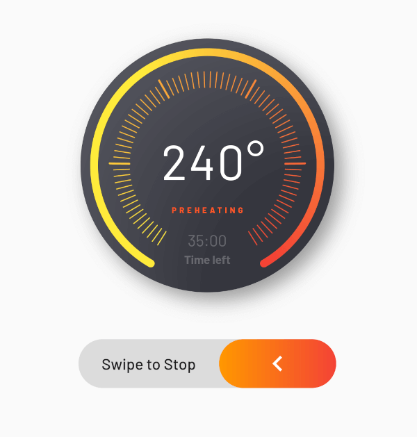
 v1.0.0+1
flutter_advanced_progress
여러 속성을 사용하여 완전히 맞춤화할 수 있는 고급 진행률 위젯입니다. 한번 시도해보고 즐겨보세요!
38좋아요 630일 다운로드150Pub 점수
AndroidiOSWebmacOSWindowsLinux
https://pub.dev/packages/flutter_advanced_progress

{"sdk":"flutter"}^2.1.0{"sdk":"flutter"}아래는 영문 원문 스냅샷입니다. 최신 내용은 GitHub에서 확인하세요.
An advanced progress widget, that can be fully customized with bunch of properties, just try it and enjoy!
| State 1 | State 2 |
|---|---|
| Flutter Advanced Progress Light | Flutter Advanced Progress Dark |
| Parameter | Description | Type | Default |
|---|---|---|---|
primaryValue |
Value for primary progress. | double | |
secondaryValue |
Value for secondary progress. | double | |
secondaryWidth |
Secondary progress width. | double | 10.0 |
radius |
Total radius for whole widget. | double | |
startAngle |
Progress start angle. | double | 120.0 |
maxDegrees |
Progress degrees from [startAngle]. | double | 300.0 |
progressGap |
Gap between primary and secondary progress. | double | 0.0 |
division |
Primary progress division. | int | 10 |
levelAmount |
Amount of levels on primary progress. | int | |
levelLowWidth |
Width of levels on primary progress. | double | 1.0 |
levelLowHeight |
Height of low levels on primary progress. | double | 8.0 |
levelHighWidth |
Height of high levels managed by [division] on primary progress. | double | 2.0 |
levelHighHeight |
Width of levels on primary progress. | double | 16.0 |
levelHighBeginEnd |
True if need to begin and end with high level. | bool | false |
primaryColor |
Primary color that used as a color for progress of first in gradient. | Color | |
secondaryColor |
Secondary color that used last in gradient. | Color | |
tertiaryColor |
Tertiary color that used for inactive part of progress. | Color | |
child |
Child widget. | Widget |