
 v4.0.2
star_menu
다양한 모양의 컨텍스트 팝업 메뉴와 애니메이션 및 위치를 세밀하게 조정할 수 있는 다양한 방법을 제공합니다. 메뉴 항목은 거의 모든 종류의 위젯일 수 있습니다.
234좋아요 1.4천30일 다운로드150Pub 점수
AndroidiOSWebmacOSWindowsLinux
다양한 모양의 Flutter 컨텍스트 팝업 메뉴와 애니메이션 및 위치를 세밀하게 조정할 수 있는 여러 가지 방법

{"sdk":"flutter"}^2.2.0{"sdk":"flutter"}^10.3.0아래는 영문 원문 스냅샷입니다. 최신 내용은 GitHub에서 확인하세요.
Pub Version Pub Likes Pub Likes Pub Likes GitHub repo size GitHub forks GitHub stars GitHub license
Image
Instead, a star would be wonderful! ;)
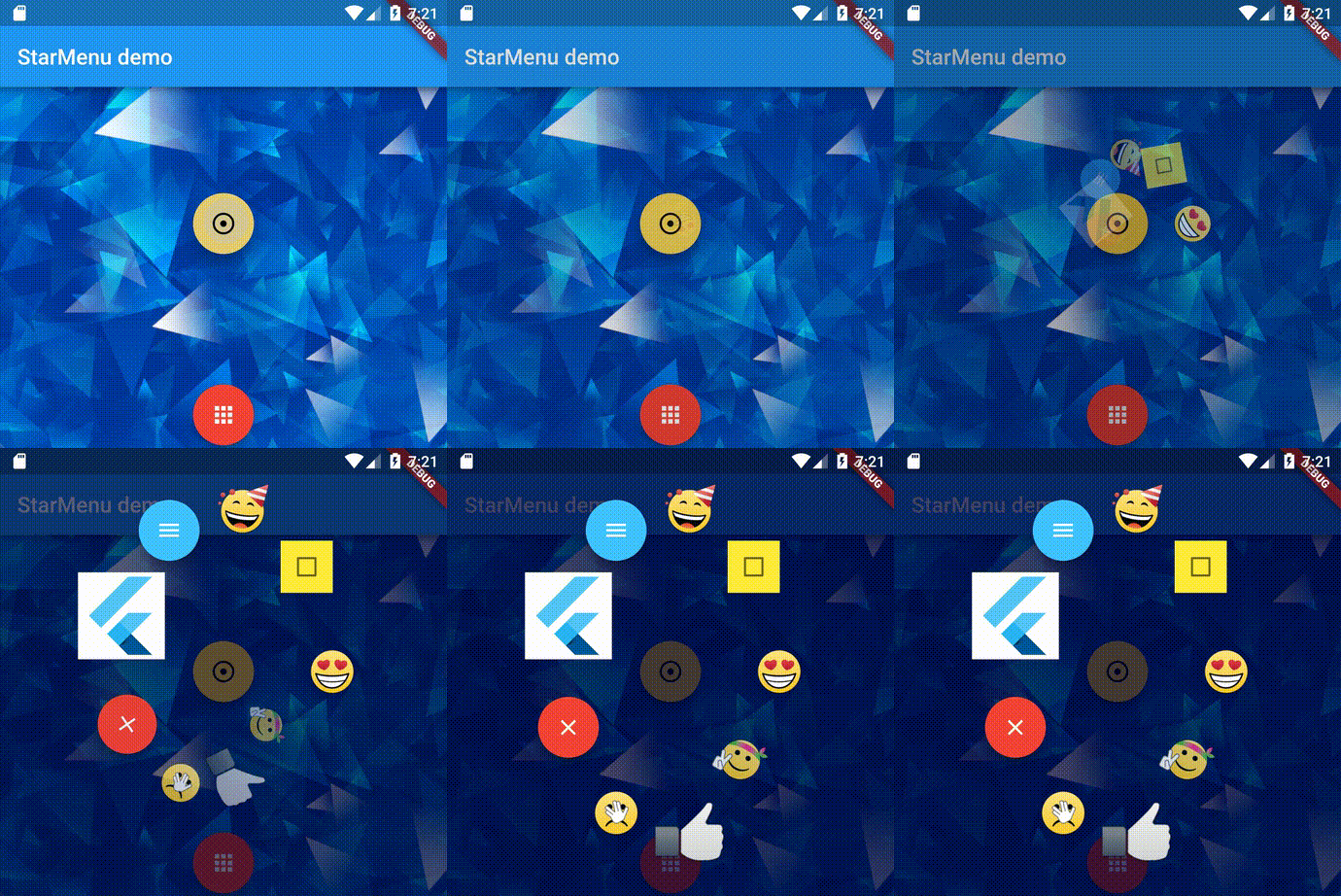
A simple way to attach a popup menu to any widget with any widget as menu entries. Menu entry widgets can bind a sub-menu with different shapes. Multiple ways to fine-tune animation and position.
Image Image
Every widgets can be tapped to display a popup menu! There are currently 3 shapes to choose:
linear: items are lined by a given angle with a given space between them and with a 3-way alignment.circle: items are lined up in a circle shape with a given radius and a star-end angle.grid: items are aligned in a grid shape with N columns and a given horizontal and vertical space.| Image | Image | Image |
|---|---|---|
| linear | circle | panel |
Please take a look at main.dart and main_more.dart in the example/lib dir for the examples.
Using the package is pretty simple:
flutter pub add star_menuitems parameter with the menu entry widgets listparams with StarMenuParameterschild with a widget you wish to press to open the menuStarMenu(
params: StarMenuParameters(),
onStateChanged: (state) => print('State changed: $state'),
onItemTapped: (index, controller) {
// here you can programmatically close the menu
if (index == 7)
controller.closeMenu();
print('Menu item $index tapped');
}),
items: entries,
child: FloatingActionButton(
onPressed: () {print('FloatingActionButton tapped');},
child: Icon(Icons.looks_one),
),
)
onStateChanged triggers menu state canges:enum MenuState {
closed,
closing,
opening,
open,
}
items parameter is used when entries are known.
If you want to build items in runtime use lazyItems,
ie when StarMenu is already builded in the widget tree, but the menu items changed:StarMenu(
...
lazyItems: () async{
return [
Container(
color: Color.fromARGB(255, Random().nextInt(255),
Random().nextInt(255), Random().nextInt(255)),
width: 60,
height: 40,
child: Text(userName),
),
...
];
}
)
lazyItems is a callback function which returns Future<List<Widget>> which is called before opening the menu.
Only lazyItems or items can be used.
StarMenu can be created also with addStarMenu() widget extension:
FloatingActionButton(
  onPressed: () {print('FloatingActionButton tapped');},
  child: Icon(Icons.looks_one),
).addStarMenu(
  items: items,
  params: StarMenuParameters(),
  controller: controller,
  onItemTapped: (index, controller) {}),
There are two ways to programmatically open a menu, for example when pressing a button:
  StarMenuController starMenuController = StarMenuController();

  StarMenu(
    params: StarMenuParameters(),
    controller: starMenuController,
    items: entries,
    child: ...,
  )
then in your button:
ElevatedButton(
  onPressed: () => starMenuController.openMenu!(),
  child: ...,
),
GlobalKey containerKey = GlobalKey();
...
Container(
  key: containerKey,
  width: 40,
  height: 40,
),
then in your button call StarMenuOverlay.displayStarMenu with the widget context:
ElevatedButton(
  onPressed: () {
    StarMenuOverlay.displayStarMenu(
      containerKey.currentContext!,
      StarMenu(
        params: StarMenuParameters(),
        items: entries,
        parentContext: containerKey.currentContext,
      ),
    );
  },
  child: ...
),
Only [items] or [lazyItems] can be passed, not both.
| Name | Type | Defaults | Description |
|---|---|---|---|
| params | class | StarMenuParameters | See below. |
| items | List? | - | Widget items entry list. |
| lazyItems | Future<List> Function()? | - | Function to build dynamically items list whenever the menu open occurs. |
| child | Widget | - | Widget that triggers the opening of the menu. Only [child] or [parentContext] is allowed |
| parentContext | BuildContext | - | Widget that triggers the opening of the menu. Only [child] or [parentContext] is allowed |
| controller | StarMenuController | - | context of the Widget where the menu will be opened. Only [child] or [parentContext] is allowed |
| onStateChanged | Function(MenuState state)? | - | Return current menu state. |
Class to define all the parameters for the shape, animation and menu behavior.
| Name | Type | Defaults | Description |
|---|---|---|---|
| shape | enum | MenuShape.circle | Menu shape kind. Could be [MenuShape.circle], [MenuShape.linear], [MenuShape.grid]. |
| boundaryBackground | class | - | See below. |
| linearShapeParams | class | - | See below. |
| circleShapeParams | class | - | See below. |
| gridShapeParams | class | - | See below. |
| backgroundParams | class | - | See below. |
| openDurationMs | int | 400 | Open animation duration ms. |
| closeDurationMs | int | 150 | Close animation duration ms. |
| rotateItemsAnimationAngle | double | 0.0 | Starting rotation angle of the items that will reach 0 DEG when animation ends. |
| startItemScaleAnimation | double | 0.3 | Starting scale of the items that will reach 1 when animation ends. |
| centerOffset | Offset | Offset.zero | Shift offset of menu center from the center of parent widget. |
| useScreenCenter | bool | false | Use the screen center instead of parent widget center. |
| useTouchAsCenter | bool | false | Use the touch coordinate as the menu center. |
| checkItemsScreenBoundaries | bool | false | Checks if the whole menu boundaries exceed screen edges, if so set it in place to be all visible. |
| checkMenuScreenBoundaries | bool | true | Checks if items exceed screen edges, if so set them in place to be visible. |
| animationCurve | Curve | Curves.fastOutSlowIn | Animation curve kind to use. |
| useLongPress | bool | false | Use long press instead of a tap to open the menu. |
| longPressDuration | Duration | 500 ms | The timing to trigger long press. |
| onHoverScale | double | 1.0 | Scale item when mouse is hover (desktop only) |
There are some StarMenuParameters factory presets with which you can set StarMenu.params
| StarMenuParameters.dropdown(BuildContext context) | Image |
| StarMenuParameters.panel(BuildContext context, {int columns = 3}) | Image |
StarMenuParameters.arc(BuildContext context, ArcType type, {double radiusX = 130, double radiusY = 130})
| type | result |
|---|---|
| ArcType.semiUp | Image |
| ArcType.semiDown | Image |
| ArcType.semiLeft | Image |
| ArcType.semiRight | Image |
| ArcType.quarterTopRight | Image |
| ArcType.quarterTopLeft | Image |
| ArcType.quarterBottomRight | Image |
| ArcType.quarterBottomLeft | Image |
| Name | Type | Defaults | Description |
|---|---|---|---|
| color | Color | 0x80000000 | color of the boundary background. |
| padding | EdgeInsets | EdgeInsets.all(8.0) | Padding of the boundary background. |
| decoration | Decoration | BorderRadius.circular(8) | background Container widget decoration. |
| blurSigmaX | double | 0.0 | horizontal blur of the boundary background. |
| blurSigmaY | double | 0.0 | vertical blur of the boundary background. |
| Name | Type | Defaults | Description |
|---|---|---|---|
| angle | double | 90.0 | Degree angle. Anticlockwise with 0° on 3 o'clock. |
| space | double | 0.0 | Space between items. |
| alignment | LinearAlignment | center | left, center, right, top, bottom. Useful when the linear shape is vertical or horizontal. |
| Name | Type | Defaults | Description |
|---|---|---|---|
| radiusX | double | 100.0 | Horizontal radius. |
| radiusY | double | 100.0 | Vertical radius. |
| startAngle | double | 0.0 | Starting angle for the 1st item. Anticlockwise with 0° on the right. |
| endAngle | double | 360.0 | Ending angle for the 1st item. Anticlockwise with 0° on the right. |
| Name | Type | Defaults | Description |
|---|---|---|---|
| columns | int | 3 | Number of columns. |
| columnsSpaceH | int | 0 | Horizontal space between items. |
| columnsSpaceV | int | 0 | Vertical space between items. |
| Name | Type | Defaults | Description |
|---|---|---|---|
| animatedBlur | bool | false | Animate background blur from 0.0 to sigma if true. |
| sigmaX | double | 0.0 | Horizontal blur. |
| sigmaY | double | 0.0 | Vertical blur. |
| animatedBackgroundColor | bool | false | If true animate from transparent to [backgroundColor]. |
| backgroundColor | Color | Colors.transparent | Background color. |