
 v0.6.0
rounded_background_text
둥근 모서리로 강조된 Text, TextField 및 TextSpan
101좋아요 2.5천30일 다운로드150Pub 점수
AndroidiOSWebmacOSWindowsLinux
둥근 모서리가 있는 텍스트 및 텍스트 필드

{"sdk":"flutter"}{"sdk":"flutter"}^2.0.1아래는 영문 원문 스냅샷입니다. 최신 내용은 GitHub에서 확인하세요.
https://img.shields.io/discord/809528329337962516?label=discord&logo=discord https://img.shields.io/pub/v/rounded_background_text.svg?style=popout&include_prereleases https://img.shields.io/github/license/bdlukaa/rounded_background_text https://img.shields.io/badge/web-example---?style=flat-square&color=e88d0c
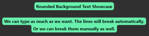
Highlight text with rounded corners
Import the package:
import 'package:rounded_background_text/rounded_background_text.dart';
RoundedBackgroundText(
  'A cool text to be highlighted',
  style: const TextStyle(fontWeight: FontWeight.bold),
  backgroundColor: Colors.white,
),
Simple Text
Multiline text is also supported
RoundedBackgroundText(
  'A cool text to be highlighted\nWith two lines or more',
  style: const TextStyle(fontWeight: FontWeight.bold),
  backgroundColor: Colors.amber,
),
Two Lines Text
You must use a TextEditingController
RoundedBackgroundTextField(
  backgroundColor: Colors.blue,
  style: const TextStyle(fontWeight: FontWeight.bold),
  textAlign: TextAlign.center,
),
The text will be highlighted as the user types
TextField Preview
The text highlight will follow the text field scroll position.
Highlight a small part of a text
RichText(
  text: TextSpan(
    text: 'Start your text and ',
    children: [
      RoundedBackgroundTextSpan(
        text: 'highlight something',
        backgroundColor: Colors.blue,
      ),
      const TextSpan(text: ' when necessary'),
    ],
  ),
),
TextSpan Highlight Preview
Use RoundedBackgroundText.selectable to make the text selectable:
RoundedBackgroundText.selectable(
  'A cool highlighted text to be selected',
  style: const TextStyle(fontWeight: FontWeight.bold),
  backgroundColor: Colors.white,
),
Selectable Text Preview
You can change the radius of the corners by setting innerRadius and outerRadius:
RoundedBackgroundText(
  'A cool text to be highlighted',
  style: const TextStyle(fontWeight: FontWeight.bold),
  backgroundColor: Colors.white,
  innerRadius: 15.0,
  outerRadius: 10.0,
),
The max allowed value is 20.0. The min is 0.0
This section explains, with details, how the background painting works.
RoundedBackgroundText doesn't use a Text widget under the hood. Instead, it uses a custom text painter to paint the text above the background. As soon as the RoundedBackgroundText widget is initialized, the line metrics for the text is calculated (See computeLineMetrics), and is recalculated when the text changes or when the parent width changes. This is done at built time, resulting in a smooth experience for the user.
To paint the background, the line metrics generated before is used. Each line has 4 properties:
x - where the line starts horizontally within the sizey - where the line starts vertically within the sizewidth - the horizontal size of the lineheight - the vertical size of the lineWith these values, we can generate the background for each line. The background is generated around the whole text: from top-left to bottom-left to bottom-right to top-right to top-left. This makes it easy to calculate when there is a corner, either outer or inner.
The inner and outer radius are dynamically calculated based on the line height, provided by the line metrics, and the given innerRadius and outerRadius, respectively. By default, innerRadius is 10.0 and outerRadius is 10.0. For safety, in order to keep the roundnesses correct, these values must be in the bounds of 0.0 (min) and 20.0 max, otherwise the painting would be out the line.
Feel free to file an issue if you find a problem or make pull requests.
All contributions are welcome!