
 v4.2.5
percent_indicator
백분율 기반으로 진행률 위젯을 표시할 수 있는 라이브러리로, 원형 또는 선형으로 사용할 수 있으며 필요에 따라 맞춤 설정할 수 있습니다.
2.8천좋아요 74.2만30일 다운로드140Pub 점수
AndroidiOSWebmacOSWindowsLinux
Flutter 퍼센트 인디케이터 라이브러리

{"sdk":"flutter"}{"sdk":"flutter"}아래는 영문 원문 스냅샷입니다. 최신 내용은 GitHub에서 확인하세요.
Circular, Linear and Multi-segment linear percent indicators
drawing drawing
You should ensure that you add the router as a dependency in your flutter project.
dependencies:
  percent_indicator: ^4.2.5
You should then run flutter packages upgrade or update your packages in IntelliJ.
There is a example project in the example folder. Check it out. Otherwise, keep reading to get up and running.
Need to include the import the package to the dart file where it will be used, use the below command,
import 'package:percent_indicator/percent_indicator.dart';
Circular percent indicator
Basic Widget
new CircularPercentIndicator(
                  radius: 60.0,
                  lineWidth: 5.0,
                  percent: 1.0,
                  center: new Text("100%"),
                  progressColor: Colors.green,
                )
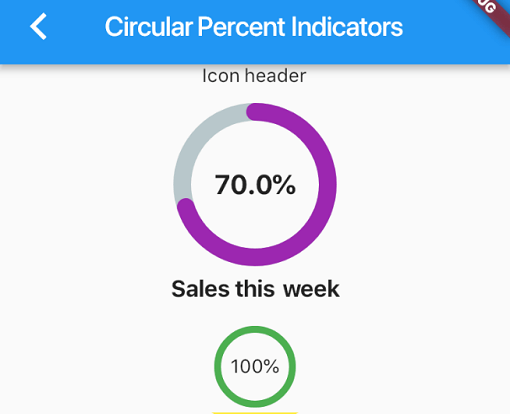
Complete example
  @override
  Widget build(BuildContext context) {
    return Scaffold(
      appBar: new AppBar(
        title: new Text("Circular Percent Indicators"),
      ),
          body: Center(
        child: ListView(
            children: <Widget>[
              new CircularPercentIndicator(
                radius: 100.0,
                lineWidth: 10.0,
                percent: 0.8,
                header: new Text("Icon header"),
                center: new Icon(
                  Icons.person_pin,
                  size: 50.0,
                  color: Colors.blue,
                ),
                backgroundColor: Colors.grey,
                progressColor: Colors.blue,
              ),
              new CircularPercentIndicator(
                radius: 130.0,
                animation: true,
                animationDuration: 1200,
                lineWidth: 15.0,
                percent: 0.4,
                center: new Text(
                  "40 hours",
                  style:
                      new TextStyle(fontWeight: FontWeight.bold, fontSize: 20.0),
                ),
                circularStrokeCap: CircularStrokeCap.butt,
                backgroundColor: Colors.yellow,
                progressColor: Colors.red,
              ),
              new CircularPercentIndicator(
                radius: 120.0,
                lineWidth: 13.0,
                animation: true,
                percent: 0.7,
                center: new Text(
                  "70.0%",
                  style:
                      new TextStyle(fontWeight: FontWeight.bold, fontSize: 20.0),
                ),
                footer: new Text(
                  "Sales this week",
                  style:
                      new TextStyle(fontWeight: FontWeight.bold, fontSize: 17.0),
                ),
                circularStrokeCap: CircularStrokeCap.round,
                progressColor: Colors.purple,
              ),
              Padding(
                padding: EdgeInsets.all(15.0),
                child: new CircularPercentIndicator(
                  radius: 60.0,
                  lineWidth: 5.0,
                  percent: 1.0,
                  center: new Text("100%"),
                  progressColor: Colors.green,
                ),
              ),
              Container(
                padding: EdgeInsets.all(15.0),
                child: new Row(
                  mainAxisAlignment: MainAxisAlignment.center,
                  children: <Widget>[
                    new CircularPercentIndicator(
                      radius: 45.0,
                      lineWidth: 4.0,
                      percent: 0.10,
                      center: new Text("10%"),
                      progressColor: Colors.red,
                    ),
                    new Padding(
                      padding: EdgeInsets.symmetric(horizontal: 10.0),
                    ),
                    new CircularPercentIndicator(
                      radius: 45.0,
                      lineWidth: 4.0,
                      percent: 0.30,
                      center: new Text("30%"),
                      progressColor: Colors.orange,
                    ),
                    new Padding(
                      padding: EdgeInsets.symmetric(horizontal: 10.0),
                    ),
                    new CircularPercentIndicator(
                      radius: 45.0,
                      lineWidth: 4.0,
                      percent: 0.60,
                      center: new Text("60%"),
                      progressColor: Colors.yellow,
                    ),
                    new Padding(
                      padding: EdgeInsets.symmetric(horizontal: 10.0),
                    ),
                    new CircularPercentIndicator(
                      radius: 45.0,
                      lineWidth: 4.0,
                      percent: 0.90,
                      center: new Text("90%"),
                      progressColor: Colors.green,
                    )
                  ],
                ),
              )
            ]),
      ),
    );
  }
https://media.giphy.com/media/35LCxze8UGUXcZ9TIu/giphy.gif
Linear percent indicator
Basic Widget
new LinearPercentIndicator(
                width: 140.0,
                lineHeight: 14.0,
                percent: 0.5,
                backgroundColor: Colors.grey,
                progressColor: Colors.blue,
              ),
Complete example
@override
  Widget build(BuildContext context) {
    return Scaffold(
      appBar: new AppBar(
        title: new Text("Linear Percent Indicators"),
      ),
      body: Center(
        child: Column(
          mainAxisAlignment: MainAxisAlignment.center,
          children: <Widget>[
            Padding(
              padding: EdgeInsets.all(15.0),
              child: new LinearPercentIndicator(
                width: 140.0,
                lineHeight: 14.0,
                percent: 0.5,
                center: Text(
                  "50.0%",
                  style: new TextStyle(fontSize: 12.0),
                ),
                trailing: Icon(Icons.mood),
                linearStrokeCap: LinearStrokeCap.roundAll,
                backgroundColor: Colors.grey,
                progressColor: Colors.blue,
              ),
            ),
            Padding(
              padding: EdgeInsets.all(15.0),
              child: new LinearPercentIndicator(
                width: 170.0,
                animation: true,
                animationDuration: 1000,
                lineHeight: 20.0,
                leading: new Text("left content"),
                trailing: new Text("right content"),
                percent: 0.2,
                center: Text("20.0%"),
                linearStrokeCap: LinearStrokeCap.butt,
                progressColor: Colors.red,
              ),
            ),
            Padding(
              padding: EdgeInsets.all(15.0),
              child: new LinearPercentIndicator(
                width: MediaQuery.of(context).size.width - 50,
                animation: true,
                lineHeight: 20.0,
                animationDuration: 2000,
                percent: 0.9,
                center: Text("90.0%"),
                linearStrokeCap: LinearStrokeCap.roundAll,
                progressColor: Colors.greenAccent,
              ),
            ),
            Padding(
              padding: EdgeInsets.all(15.0),
              child: new LinearPercentIndicator(
                width: MediaQuery.of(context).size.width - 50,
                animation: true,
                lineHeight: 20.0,
                animationDuration: 2500,
                percent: 0.8,
                center: Text("80.0%"),
                linearStrokeCap: LinearStrokeCap.roundAll,
                progressColor: Colors.green,
              ),
            ),
            Padding(
              padding: EdgeInsets.all(15.0),
              child: Column(
                children: <Widget>[
                  new LinearPercentIndicator(
                    width: 100.0,
                    lineHeight: 8.0,
                    percent: 0.2,
                    progressColor: Colors.red,
                  ),
                  new LinearPercentIndicator(
                    width: 100.0,
                    lineHeight: 8.0,
                    percent: 0.5,
                    progressColor: Colors.orange,
                  ),
                  new LinearPercentIndicator(
                    width: 100.0,
                    lineHeight: 8.0,
                    percent: 0.9,
                    progressColor: Colors.blue,
                  )
                ],
              ),
            ),
          ],
        ),
      ),
    );
  }
Multi-segment linear indicator
Basic Widget
new MultiSegmentLinearIndicator(
                width: MediaQuery.of(context).size.width - 64,
                lineHeight: 30.0,
                segments: [
                  SegmentLinearIndicator(
                    percent: 0.25,
                    color: Color(0xFF4285F4),
                    enableStripes: true,
                  ),
                  SegmentLinearIndicator(
                    percent: 0.4,
                    color: Color(0xFF6DD5F6),
                  ),
                  SegmentLinearIndicator(
                    percent: 0.35,
                    color: Color(0xFFEFEFEF),
                  ),
                ],
                barRadius: Radius.circular(10.0),
                animation: true,
                animationDuration: 1000,
                curve: Curves.easeInOut,
                animateFromLastPercent: true,
                onAnimationEnd: () {
                  ScaffoldMessenger.of(context).showSnackBar(
                    const SnackBar(
                      content: Text('Animation completed!'),
                      duration: Duration(seconds: 1),
                    ),
                  );
                },
              ),
Complete example
@override
  Widget build(BuildContext context) {
    return Scaffold(
      appBar: AppBar(
        title: Text('Multi Segment Progress'),
      ),
      body: Center(
        child: Padding(
          padding: const EdgeInsets.all(20.0),
          child: Column(
            mainAxisAlignment: MainAxisAlignment.center,
            children: [
              MultiSegmentLinearIndicator(
                width: MediaQuery.of(context).size.width - 64,
                lineHeight: 30.0,
                segments: [
                  SegmentLinearIndicator(
                    percent: 0.25,
                    color: Color(0xFF4285F4),
                    enableStripes: true,
                  ),
                  SegmentLinearIndicator(
                    percent: 0.4,
                    color: Color(0xFF6DD5F6),
                  ),
                  SegmentLinearIndicator(
                    percent: 0.35,
                    color: Color(0xFFEFEFEF),
                  ),
                ],
                barRadius: Radius.circular(10.0),
                animation: true,
                animationDuration: 1000,
                curve: Curves.easeInOut,
                animateFromLastPercent: true,
                onAnimationEnd: () {
                  ScaffoldMessenger.of(context).showSnackBar(
                    const SnackBar(
                      content: Text('Animation completed!'),
                      duration: Duration(seconds: 1),
                    ),
                  );
                },
              ),
              SizedBox(height: 10),
              Text(
                'Static with easeInOut: 25% - 40% - 35%',
                style: TextStyle(fontSize: 16),
              ),
              SizedBox(height: 30),
              MultiSegmentLinearIndicator(
                width: MediaQuery.of(context).size.width - 40,
                lineHeight: 20.0,
                segments: [
                  SegmentLinearIndicator(
                    percent: 0.3,
                    color: Color(0xFFBA0521),
                  ),
                  SegmentLinearIndicator(
                    percent: 0.4,
                    color: Color(0xFF071437),
                    enableStripes: true,
                  ),
                  SegmentLinearIndicator(
                    percent: 0.3,
                    color: Color(0xFFFF9205),
                  ),
                ],
                barRadius: Radius.circular(20),
              ),
              SizedBox(height: 10),
              Text(
                'Static: 30% - 40% - 30%',
                style: TextStyle(fontSize: 16),
              ),
              SizedBox(height: 30),
              MultiSegmentLinearIndicator(
                width: MediaQuery.of(context).size.width - 40,
                lineHeight: 20.0,
                segments: [
                  SegmentLinearIndicator(
                    percent: firstSegment,
                    color: Colors.green,
                    enableStripes: true,
                  ),
                  SegmentLinearIndicator(
                    percent: secondSegment,
                    color: Colors.blue,
                    enableStripes: true,
                  ),
                  SegmentLinearIndicator(
                    percent: thirdSegment,
                    color: Colors.orange,
                  ),
                ],
                animation: true,
                animateFromLastPercent: true,
                animationDuration: 1000,
                curve: Curves.easeInOut,
                barRadius: Radius.circular(10),
              ),
              SizedBox(height: 10),
              Text(
                'Progress: ${(firstSegment * 100).toInt()}% - ${(secondSegment * 100).toInt()}% - ${(thirdSegment * 100).toInt()}%',
                style: TextStyle(fontSize: 16),
              ),
              SizedBox(height: 30),
              MultiSegmentLinearIndicator(
                width: MediaQuery.of(context).size.width - 64,
                lineHeight: 30.0,
                segments: [
                  SegmentLinearIndicator(
                    percent: 0.15,
                    color: Color(0xFFBA0521),
                    enableStripes: true,
                  ),
                  SegmentLinearIndicator(
                      percent: 0.4, color: Color(0xFFAEFAB00)),
                  SegmentLinearIndicator(
                      percent: 0.45, color: Color(0xFFEFEFEF)),
                ],
                animation: true,
                animationDuration: 1000,
                curve: Curves.decelerate,
                animateFromLastPercent: true,
              ),
              SizedBox(height: 10),
              Text(
                'Static with decelerate: 25% - 40% - 35%',
                style: TextStyle(fontSize: 16),
              ),
              SizedBox(height: 30),
            ],
          ),
        ),
      ),
    );
  }
https://media1.giphy.com/media/v1.Y2lkPTc5MGI3NjExYWt5Y2hwMmF0eXhnd2NsNTV4eWY3ajRqcDRoeGFsOTh6ODY4dW0wYyZlcD12MV9pbnRlcm5hbF9naWZfYnlfaWQmY3Q9Zw/EQ760ehLdfONjPQWvk/giphy.gif
You can follow me on twitter @diegoveloper