
spannablegrid-flutter
Flutter SpannableGrid 위젯

- 스타
- 25
- 포크
- 10
- 최근 푸시(UTC)
- 2023. 7. 31.
- 프로젝트 상태
- 활성
원본 README
아래는 영문 원문 스냅샷입니다. 최신 내용은 GitHub에서 확인하세요.
Spannable Grid


The SpannableGrid is a Flutter widget that allows its cells to span columns and rows and supports moving cells inside the grid.
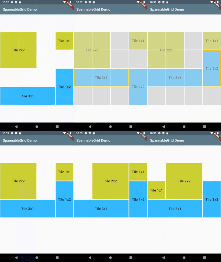
Features
- The widget is sized itself to fit its parent width and/or height
- The number of columns and rows is fixed
- Cells can span columns and rows
- Supports editing mode, in which cells can be moved inside the grid to available places
- Various editing strategies
- Styling the grid and its cells
Usage
In the dependencies: section of your pubspec.yaml, add the following line:
dependencies:
  spannable_grid: ^0.3.0
Import the package
import 'package:spannable_grid/spannable_grid.dart';
Create grid items
The SpannableGrid widget requires the list of SpannableGridCellData objects that define cells appearance.
    final cells = <SpannableGridCellData>[];
    cells.add(SpannableGridCellData(
      column: 1,
      row: 1,
      columnSpan: 2,
      rowSpan: 2,
      id: "Test Cell 1",
      child: Container(
        color: Colors.lime,
        child: Center(
          child: Text("Tile 2x2",
            style: Theme.of(context).textTheme.title,
          ),
        ),
      ),
    ));
    cells.add(SpannableGridCellData(
      column: 4,
      row: 1,
      columnSpan: 1,
      rowSpan: 1,
      id: "Test Cell 2",
      child: Container(
        color: Colors.lime,
        child: Center(
          child: Text("Tile 1x1",
            style: Theme.of(context).textTheme.title,
          ),
        ),
      ),
    ));
Add SpannableGrid widget
SpannableGrid(
  columns: 4,
  rows: 4,
  cells: cells,
  onCellChanged: (cell) { print('Cell ${cell.id} changed'); },
),
Editing mode
In the editing mode user can move cells to another empty place withing the grid.
Use editingStrategy parameter to define the behaviour in the editing mode.
It has following options:
| Name | Description |
|---|---|
allowed |
User can move the cells |
enterOnLongTap |
User should use a long tap on the cell to enter the editing mode |
exitOnTap |
When finished moving the cell, user should tap the cell to exit the editing mode |
immediate |
User can move cells immediately, just by starting dragging them |
moveOnlyToNearby |
The cell can be moved only to nearby empty cells |
User can enter editing mode by long press on the cell.
In the editing mode the editing cell is highlighted, other cells are faded and the grid structure becomes visible. User can move editing cell to another available place inside the grid.
The updated cell is returned in onCellChanged callback.
Styling
Use the style parameter to style the appearance of the grid and its cells.
The following options are supported:
| Name | Description |
|---|---|
backgroundColor |
It is used to display empty cells, when the emptyCellView parameter is not specified. |
contentOpacity |
It is used in the editing mode to make the content cells transparent, so the underlying grid structure becomes visible. |
selectedCellDecoration |
An additional decoration that is applied to the selected cell to highlight it in the editing mode. |
spacing |
A space between gird cells. |
When the showGrid parameter is true the grid's structure is always visible. Otherwise it appears only in the editing mode.
Full example
You can find demo app in the example project.
More
Changelog
Please check the Changelog page for the latest version and changes.
License
Author: Evgeny Cherkasov.
This package is published under MIT License.
Contributions
Feel free to contribute to this project.

Evgeny Cherkasov ↗
분류
사용 중인 의존성
의존성 목록 2 개
- flutter
{"sdk":"flutter"} - flutter_test개발 의존성
{"sdk":"flutter"}
프로젝트에 맞는 저장소를 선택하려면?
사용 목적에 따라 검색하고 개발 활동을 비교한 뒤 원본 저장소에서 요구 사항을 확인하세요.
- 이름, 작성자 또는 설명으로 검색하고 기술 주제로 범위를 좁힙니다.
- 스타, 포크, 최근 푸시를 함께 비교하세요. 스타는 관심의 지표이며 품질을 보장하지 않습니다.
- 사용하기 전에 GitHub에서 README, 라이선스, Issues를 확인하세요.
출처 및 관리
“A repository is the most basic element of GitHub.”
GitHub Docs — About repositories ↗