
 v15.0.2
extended_text
인라인 이미지 또는 @어떤 사람과 같은 특수 텍스트를 빠르게 만들 수 있도록 확장된 공식 텍스트입니다. 사용자 정의 배경, 사용자 정의 오버플로우, 그라데이션 및 사용자 정의 선택 도구 모음과 핸들을 지원합니다.
307좋아요 35.1만30일 다운로드130Pub 점수
AndroidiOSWebmacOSWindowsLinux
특별한 텍스트(이미지,@누군가), 사용자 정의 배경, 사용자 정의 오버플로우, 텍스트 선택을 지원하는 강력한 확장 공식 텍스트입니다.

^12.0.1{"sdk":"flutter"}{"sdk":"flutter"}아래는 영문 원문 스냅샷입니다. 최신 내용은 GitHub에서 확인하세요.
pub package GitHub stars GitHub forks GitHub license GitHub issues FlutterCandies QQ 群
Language: English | 中文简体
Extended official text to build special text like inline image or @somebody quickly,it also support custom background,custom over flow and custom selection toolbar and handles.
ExtendedText is a third-party extension library for Flutter's official Text component. The main extended features are as follows:
| Feature | ExtendedText | Text |
|---|---|---|
| Customized text overflow effects | Supported, allows customizing the overflow widget and controlling overflow positions (before, middle, after) | Not supported (26748,45336) |
| Copying the actual value of special text | Supported, enables copying the actual value of the text, not just the placeholder value of WidgetSpan | Can only copy the placeholder value of WidgetSpan (\uFFFC) |
| Quick construction of rich text based on text format | Supported, enables quick construction of rich text based on text format | Not supported |
HarmonyOSis supported. Please use the latest version which containsohostag. You can check it inVersionstab.
dependencies:
  extended_text: 10.0.1-ohos //  3.7.12
  extended_text: 13.0.2      //  3.22.0
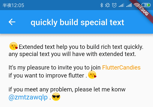
https://github.com/fluttercandies/Flutter_Candies/blob/master/gif/extended_text/special_text.jpg
extended text helps to convert your text to speical textSpan quickly.
for example, follwing code show how to create @xxxx speical textSpan.
class AtText extends SpecialText {
  AtText(TextStyle textStyle, SpecialTextGestureTapCallback onTap,
      {this.showAtBackground = false, this.start})
      : super(flag, ' ', textStyle, onTap: onTap);
  static const String flag = '@';
  final int start;

  /// whether show background for @somebody
  final bool showAtBackground;

  @override
  InlineSpan finishText() {
    final TextStyle textStyle =
        this.textStyle?.copyWith(color: Colors.blue, fontSize: 16.0);

    final String atText = toString();

    return showAtBackground
        ? BackgroundTextSpan(
            background: Paint()..color = Colors.blue.withOpacity(0.15),
            text: atText,
            actualText: atText,
            start: start,

            ///caret can move into special text
            deleteAll: true,
            style: textStyle,
            recognizer: (TapGestureRecognizer()
              ..onTap = () {
                if (onTap != null) {
                  onTap(atText);
                }
              }))
        : SpecialTextSpan(
            text: atText,
            actualText: atText,
            start: start,
            style: textStyle,
            recognizer: (TapGestureRecognizer()
              ..onTap = () {
                if (onTap != null) {
                  onTap(atText);
                }
              }));
  }
}
create your SpecialTextSpanBuilder
class MySpecialTextSpanBuilder extends SpecialTextSpanBuilder {
  MySpecialTextSpanBuilder({this.showAtBackground = false});

  /// whether show background for @somebody
  final bool showAtBackground;
  @override
  TextSpan build(String data,
      {TextStyle textStyle, SpecialTextGestureTapCallback onTap}) {
    if (kIsWeb) {
      return TextSpan(text: data, style: textStyle);
    }

    return super.build(data, textStyle: textStyle, onTap: onTap);
  }

  @override
  SpecialText createSpecialText(String flag,
      {TextStyle textStyle, SpecialTextGestureTapCallback onTap, int index}) {
    if (flag == null || flag == '') {
      return null;
    }

    ///index is end index of start flag, so text start index should be index-(flag.length-1)
    if (isStart(flag, AtText.flag)) {
      return AtText(
        textStyle,
        onTap,
        start: index - (AtText.flag.length - 1),
        showAtBackground: showAtBackground,
      );
    } else if (isStart(flag, EmojiText.flag)) {
      return EmojiText(textStyle, start: index - (EmojiText.flag.length - 1));
    } else if (isStart(flag, DollarText.flag)) {
      return DollarText(textStyle, onTap,
          start: index - (DollarText.flag.length - 1));
    }
    return null;
  }
}
https://github.com/fluttercandies/Flutter_Candies/blob/master/gif/extended_text/custom_image.gif
show inline image by using ImageSpan.
class ImageSpan extends ExtendedWidgetSpan {
  ImageSpan(
    ImageProvider image, {
    Key key,
    @required double imageWidth,
    @required double imageHeight,
    EdgeInsets margin,
    int start = 0,
    ui.PlaceholderAlignment alignment = ui.PlaceholderAlignment.bottom,
    String actualText,
    TextBaseline baseline,
    BoxFit fit= BoxFit.scaleDown,
    ImageLoadingBuilder loadingBuilder,
    ImageFrameBuilder frameBuilder,
    String semanticLabel,
    bool excludeFromSemantics = false,
    Color color,
    BlendMode colorBlendMode,
    AlignmentGeometry imageAlignment = Alignment.center,
    ImageRepeat repeat = ImageRepeat.noRepeat,
    Rect centerSlice,
    bool matchTextDirection = false,
    bool gaplessPlayback = false,
    FilterQuality filterQuality = FilterQuality.low,
    GestureTapCallback onTap,
    HitTestBehavior behavior = HitTestBehavior.deferToChild,
  })
| parameter | description | default |
|---|---|---|
| image | The image to display(ImageProvider). | - |
| imageWidth | The width of image(not include margin) | required |
| imageHeight | The height of image(not include margin) | required |
| margin | The margin of image | - |
| actualText | Actual text, take care of it when enable selection,something likes "[love]" | '\uFFFC' |
| start | Start index of text,take care of it when enable selection. | 0 |
https://github.com/fluttercandies/Flutter_Candies/blob/master/gif/extended_text/selection.gif
It works with SelectionArea now.
override [SelectionArea.contextMenuBuilder] and [TextSelectionControls] to custom your toolbar widget or handle widget
const double _kHandleSize = 22.0;

/// Android Material styled text selection controls.

class MyTextSelectionControls extends TextSelectionControls
    with TextSelectionHandleControls {
  MyTextSelectionControls({this.joinZeroWidthSpace = false});
  final bool joinZeroWidthSpace;

  /// Returns the size of the Material handle.
  @override
  Size getHandleSize(double textLineHeight) =>
      const Size(_kHandleSize, _kHandleSize);

  /// Builder for material-style text selection handles.
  @override
  Widget buildHandle(
      BuildContext context, TextSelectionHandleType type, double textLineHeight,
      [VoidCallback? onTap, double? startGlyphHeight, double? endGlyphHeight]) {
    final Widget handle = SizedBox(
      width: _kHandleSize,
      height: _kHandleSize,
      child: Image.asset(
        'assets/40.png',
      ),
    );

    // [handle] is a circle, with a rectangle in the top left quadrant of that
    // circle (an onion pointing to 10:30). We rotate [handle] to point
    // straight up or up-right depending on the handle type.
    switch (type) {
      case TextSelectionHandleType.left: // points up-right
        return Transform.rotate(
          angle: math.pi / 4.0,
          child: handle,
        );
      case TextSelectionHandleType.right: // points up-left
        return Transform.rotate(
          angle: -math.pi / 4.0,
          child: handle,
        );
      case TextSelectionHandleType.collapsed: // points up
        return handle;
    }
  }

  /// Gets anchor for material-style text selection handles.
  ///
  /// See [TextSelectionControls.getHandleAnchor].
  @override
  Offset getHandleAnchor(TextSelectionHandleType type, double textLineHeight,
      [double? startGlyphHeight, double? endGlyphHeight]) {
    switch (type) {
      case TextSelectionHandleType.left:
        return const Offset(_kHandleSize, 0);
      case TextSelectionHandleType.right:
        return Offset.zero;
      default:
        return const Offset(_kHandleSize / 2, -4);
    }
  }
}

class CommonSelectionArea extends StatelessWidget {
  const CommonSelectionArea({
    super.key,
    required this.child,
    this.joinZeroWidthSpace = false,
  });
  final Widget child;
  final bool joinZeroWidthSpace;

  @override
  Widget build(BuildContext context) {
    SelectedContent? _selectedContent;
    return SelectionArea(
      contextMenuBuilder:
          (BuildContext context, SelectableRegionState selectableRegionState) {
        return AdaptiveTextSelectionToolbar.buttonItems(
          buttonItems: <ContextMenuButtonItem>[
            ContextMenuButtonItem(
              onPressed: () {
                // TODO(zmtzawqlp):  how to get Selectable
                // and  _clearSelection is not public
                // https://github.com/flutter/flutter/issues/126980

                //  onCopy: () {
                //   _copy();

                //   // In Android copy should clear the selection.
                //   switch (defaultTargetPlatform) {
                //     case TargetPlatform.android:
                //     case TargetPlatform.fuchsia:
                //       _clearSelection();
                //     case TargetPlatform.iOS:
                //       hideToolbar(false);
                //     case TargetPlatform.linux:
                //     case TargetPlatform.macOS:
                //     case TargetPlatform.windows:
                //       hideToolbar();
                //   }
                // },

                // if (_selectedContent != null) {
                //   String content = _selectedContent!.plainText;
                //   if (joinZeroWidthSpace) {
                //     content = content.replaceAll(zeroWidthSpace, '');
                //   }

                //   Clipboard.setData(ClipboardData(text: content));
                //   selectableRegionState.hideToolbar(true);
                //   selectableRegionState._clearSelection();
                // }

                selectableRegionState
                    .copySelection(SelectionChangedCause.toolbar);

                // remove zeroWidthSpace
                if (joinZeroWidthSpace) {
                  Clipboard.getData('text/plain').then((ClipboardData? value) {
                    if (value != null) {
                      // remove zeroWidthSpace
                      final String? plainText =
                          value.text?.replaceAll(ExtendedTextLibraryUtils.zeroWidthSpace, '');
                      if (plainText != null) {
                        Clipboard.setData(ClipboardData(text: plainText));
                      }
                    }
                  });
                }
              },
              type: ContextMenuButtonType.copy,
            ),
            ContextMenuButtonItem(
              onPressed: () {
                selectableRegionState.selectAll(SelectionChangedCause.toolbar);
              },
              type: ContextMenuButtonType.selectAll,
            ),
            ContextMenuButtonItem(
              onPressed: () {
                launchUrl(Uri.parse(
                    'mailto:xxx@live.com?subject=extended_text_share&body=${_selectedContent?.plainText}'));
                selectableRegionState.hideToolbar();
              },
              type: ContextMenuButtonType.custom,
              label: 'like',
            ),
          ],
          anchors: selectableRegionState.contextMenuAnchors,
        );
        // return AdaptiveTextSelectionToolbar.selectableRegion(
        //   selectableRegionState: selectableRegionState,
        // );
      },
      // magnifierConfiguration: TextMagnifierConfiguration(
      //   magnifierBuilder: (
      //     BuildContext context,
      //     MagnifierController controller,
      //     ValueNotifier<MagnifierInfo> magnifierInfo,
      //   ) {
      //     return TextMagnifier(
      //       magnifierInfo: magnifierInfo,
      //     );
      //     // switch (defaultTargetPlatform) {
      //     //   case TargetPlatform.iOS:
      //     //     return CupertinoTextMagnifier(
      //     //       controller: controller,
      //     //       magnifierInfo: magnifierInfo,
      //     //     );
      //     //   case TargetPlatform.android:
      //     //     return TextMagnifier(
      //     //       magnifierInfo: magnifierInfo,
      //     //     );
      //     //   case TargetPlatform.fuchsia:
      //     //   case TargetPlatform.linux:
      //     //   case TargetPlatform.macOS:
      //     //   case TargetPlatform.windows:
      //     //     return null;
      //     // }
      //   },
      // ),
      // selectionControls: MyTextSelectionControls(),
      onSelectionChanged: (SelectedContent? value) {
        print(value?.plainText);
        _selectedContent = value;
      },
      child: child,
    );
  }
}
https://github.com/fluttercandies/Flutter_Candies/blob/master/gif/extended_text/background.png
refer to issues 24335/24337 about background
  BackgroundTextSpan(
      text:
          "This text has nice background with borderradius,no mattter how many line,it likes nice",
      background: Paint()..color = Colors.indigo,
      clipBorderRadius: BorderRadius.all(Radius.circular(3.0))),
| parameter | description | default |
|---|---|---|
| background | Background painter | - |
| clipBorderRadius | Clip BorderRadius | - |
| paintBackground | Paint background call back, you can paint background by self | - |
| https://github.com/fluttercandies/Flutter_Candies/blob/master/gif/extended_text/overflow.jpg | https://github.com/HarmonyCandies/HarmonyCandies/blob/main/gif/extended_text/textOverflowPosition_auto.png |
|---|---|
refer to issue 26748
| parameter | description | default |
|---|---|---|
| child | The widget of TextOverflow. | @required |
| maxHeight | The maxHeight of [TextOverflowWidget], default is preferredLineHeight. | preferredLineHeight |
| align | The Align of [TextOverflowWidget], left/right. | right |
| position | The position which TextOverflowWidget should be shown. | TextOverflowPosition.end |
  ExtendedText(
   overflowWidget: TextOverflowWidget(
     position: TextOverflowPosition.end,
     align: TextOverflowAlign.center,
     // just for debug
     debugOverflowRectColor: Colors.red.withOpacity(0.1),
     child: Container(
       child: Row(
         mainAxisSize: MainAxisSize.min,
         children: <Widget>[
           const Text('\u2026 '),
           InkWell(
             child: const Text(
               'more',
             ),
             onTap: () {
               launch(
                   'https://github.com/fluttercandies/extended_text');
             },
           )
         ],
       ),
     ),
   ),
  )
https://github.com/fluttercandies/Flutter_Candies/blob/master/gif/extended_text/JoinZeroWidthSpace.jpg
refer to issue 18761
if [ExtendedText.joinZeroWidthSpace] is true, it will join '\u{200B}' into text, make line breaking and overflow style better.
  ExtendedText(
      joinZeroWidthSpace: true,
    )
or you can convert by following method:
String input='abc'.joinChar();
     InlineSpan innerTextSpan;
     innerTextSpan = joinChar(
        innerTextSpan,
        Accumulator(),
        zeroWidthSpace,
    );
Take care of following things:
the word is not a word, it will not working when you want to double tap to select a word.
text is changed, you should override TextSelectionControls and remove zeroWidthSpace.
class MyTextSelectionControls extends TextSelectionControls {

  @override
  void handleCopy(TextSelectionDelegate delegate,
      ClipboardStatusNotifier? clipboardStatus) {
    final TextEditingValue value = delegate.textEditingValue;

    String data = value.selection.textInside(value.text);
    // remove zeroWidthSpace
    data = data.replaceAll(zeroWidthSpace, '');

    Clipboard.setData(ClipboardData(
      text: value.selection.textInside(value.text),
    ));
    clipboardStatus?.update();
    delegate.textEditingValue = TextEditingValue(
      text: value.text,
      selection: TextSelection.collapsed(offset: value.selection.end),
    );
    delegate.bringIntoView(delegate.textEditingValue.selection.extent);
    delegate.hideToolbar();
  }
}
Configuration for applying gradients to text.
[gradient] is the gradient that will be applied to the text.
[ignoreWidgetSpan] determines whether WidgetSpan elements should be
included in the gradient application. By default, widget spans are ignored.
[renderMode] specifies how the gradient should be applied to the text. The default is [GradientRenderMode.fullText], meaning the gradient will apply to the entire text.
[ignoreRegex] is a regular expression used to exclude certain parts of the text from the gradient effect. For example, it can be used to exclude specific characters or words (like emojis or special symbols) from the gradient application.
[beforeDrawGradient] A callback function that is called before the gradient is drawn on the text.
[blendMode] The blend mode to be used when applying the gradient. default: [BlendMode.srcIn] (i.e., the gradient will be applied to the text). It's better to use [BlendMode.srcIn] or [BlendMode.srcATop].
  GradientConfig _config = GradientConfig(
    gradient: const LinearGradient(
      colors: <Color>[Colors.blue, Colors.red],
    ),
    ignoreRegex: GradientConfig.ignoreEmojiRegex,
    ignoreWidgetSpan: true,
    renderMode: GradientRenderMode.fullText,
  );
The InlineSpan will always ignore the gradient.
class IgnoreGradientTextSpan extends TextSpan with IgnoreGradientSpan {
  IgnoreGradientTextSpan({String? text, List<InlineSpan>? children})
      : super(
          text: text,
          children: children,
        );
}