
 v2.2.2+1
shimmer_animation
이 샤이머 애니메이션 위젯은 간단하면서도 아름다운 스켈레톤 로더를 쉽게 프로젝트에 적용할 수 있도록 도와줍니다.
517좋아요 9.5천30일 다운로드160Pub 점수
AndroidiOSWebmacOSWindowsLinux
Shimmer 애니메이션은 간단하고 사용자 정의 가능한 위젯을 제공하여 스켈레톤 로더 및 플레이스홀더 효과를 쉽게 만들 수 있습니다.

{"sdk":"flutter"}{"sdk":"flutter"}^5.1.1아래는 영문 원문 스냅샷입니다. 최신 내용은 GitHub에서 확인하세요.
pub package Libraries.io dependency status for latest release License
Supports Null Safety
This shimmer animation widget can help you bring simple yet beautiful skeleton loaders to your project with ease.
Shimmer is very widely used as the default animation for skeleton loaders or placeholder widgets throughout the development community. Therefore, having an easy to use, yet customizable widget ready to use for Android, iOS and Web, gives developers an advantage to focus on their actual functionality, let shimmer make the loading experience smoother.
An example can be found in the example directory of this repository.
A list of detailed examples can be found in this Examples Repository
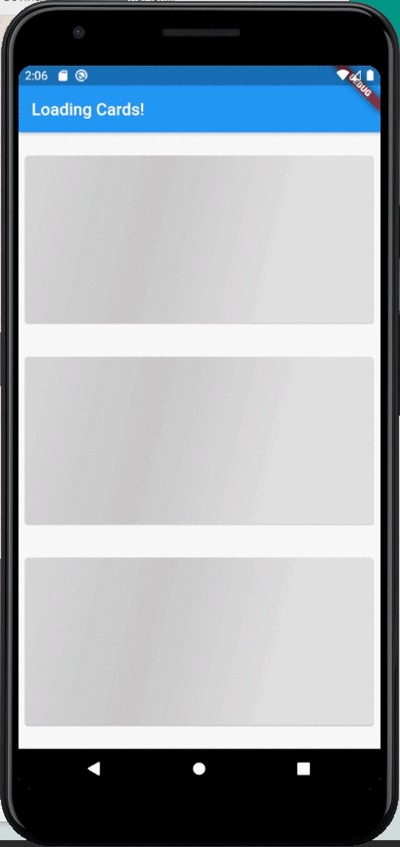
| Full Screen | Loading Widgets | Loading Buttons |
|---|---|---|
| https://github.com/maddyb99/shimmer_animation/blob/master/screenshots/shimmer.gif?raw=true | https://github.com/maddyb99/shimmer_examples/blob/master/loading_cards/screenshots/shimmer.gif?raw=true | https://github.com/maddyb99/shimmer_examples/blob/master/buttons/screenshots/shimmer.gif?raw=true |
Add shimmer_animation to pubspec.yaml of your project:
dependencies:
  shimmer_animation: ^2.1.0
Import it in your Dart code:
import 'package:shimmer_animation/shimmer_animation.dart';
Wrap any widget with Shimmer() widget to apply animaton:
  Shimmer(
    child: Container(
      color: Colors.deepPurple,
    ),
  ),
A number of parameters can be passed to customise the look and feel of this animation:
  Shimmer(
    duration: Duration(seconds: 3), //Default value
    interval: Duration(seconds: 5), //Default value: Duration(seconds: 0)
    color: Colors.white, //Default value
    colorOpacity: 0, //Default value
    enabled: true, //Default value
    direction: ShimmerDirection.fromLTRB(),  //Default Value
    child: Container(
      color: Colors.deepPurple,
    ),
  ),
A detailed API Reference can be found here.