
 v1.4.0
flutter95
Flutter 앱용 Windows95 UI 컴포넌트. 이 사용 가능한 UI 컴포넌트 세트로 오래된 운영 체제의 낭만적인 외관과 느낌을 되살립니다.
171좋아요 10630일 다운로드140Pub 점수
AndroidiOSWebmacOSWindowsLinux
Flutter 앱용 Windows95 UI 컴포넌트. 이 사용 가능한 UI 컴포넌트 세트로 오래된 운영 체제의 낭만적인 외관과 느낌을 되살립니다.

{"sdk":"flutter"}{"sdk":"flutter"}^3.0.0아래는 영문 원문 스냅샷입니다. 최신 내용은 GitHub에서 확인하세요.
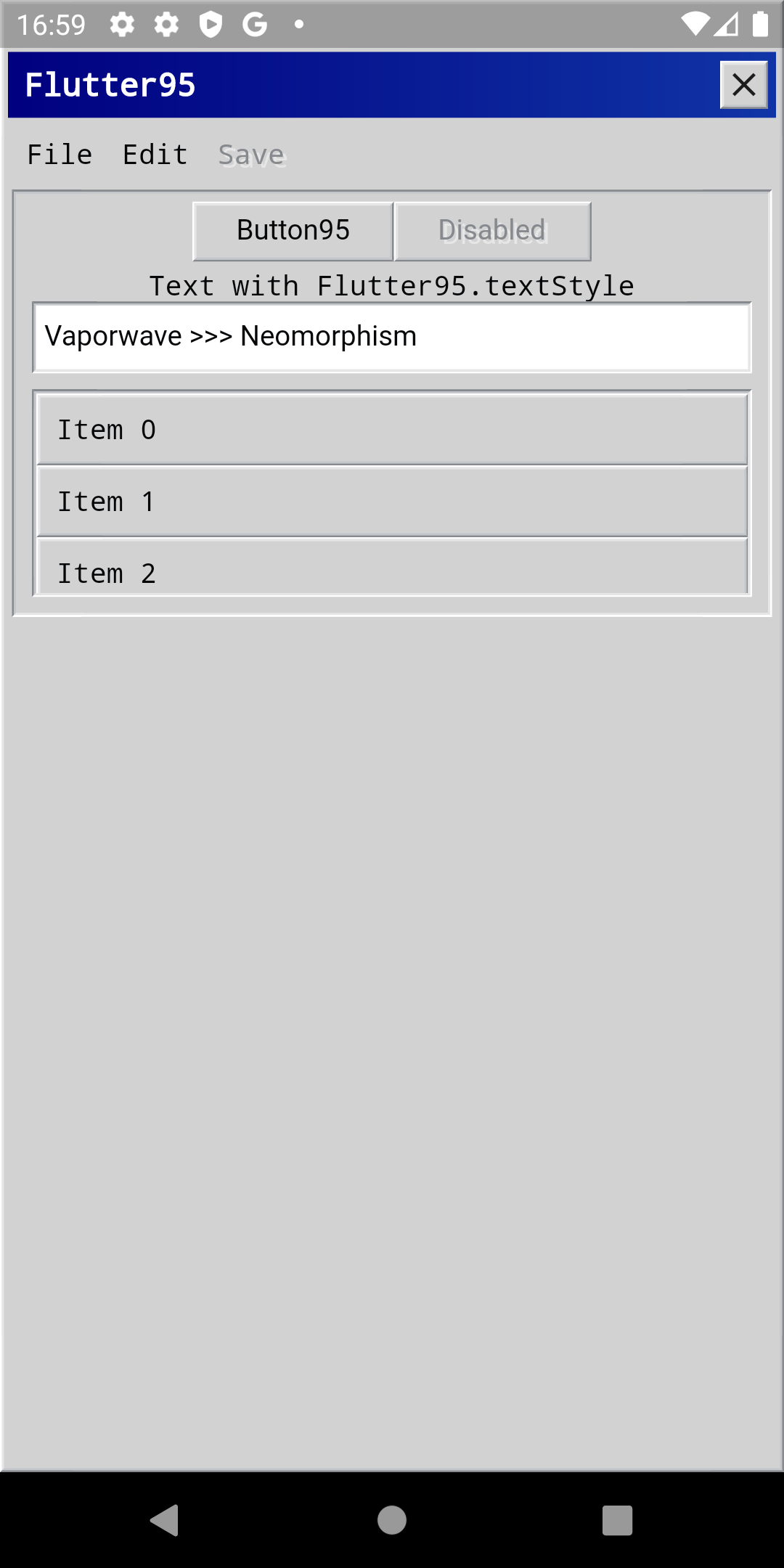
Windows95 UI components for Flutter apps.
Scaffold as a Windows95 styled window.
Item95 action items.canPop (meaning it is not a root of the app) then a close button appears.Scaffold95(
title: 'Flutter95',
toolbar: Toolbar95(
actions: [
Item95(
label: 'File',
onTap: () {},
),
],
),
body: Container(),
)
You can provide a custom WindowHeader95 to override the default Scaffold95 header.
Scaffold95(
  customHeader: WindowHeader95(
    child: Row(/* etc */),
  ),
  body: Container(),
)
Windows95 styled menu.
ScreenshotshowMenu.Menu95(
items: [
MenuItem95(
value: 1,
label: 'New',
),
MenuItem95(
value: 2,
label: 'Open',
),
MenuItem95(
value: 3,
label: 'Exit',
),
],
onItemSelected: (item) {},
);
show(context, position).menu.show(
context,
Offset(50, 100),
);
Item95(
  label: 'File',
  menu: Menu95(...),
),
Windows95 styled button.
onTap is null, acts as a disabled button.Button95(
onTap: () {},
child: Text('Button95'),
)
Windows95 styled checkbox
onChanged is null, acts as a disabled checkbox.Checkbox95(
value: value,
label: "Some Label", // optional, if null no label is shown
onChanged: (value) {}, // optional, if null acts as a disabled checkbox
)
TextField styled as a Windows95 text field.
TextField95()
A tooltip widget designed in Windows95 style.
Tooltip.Tooltip95(
message: 'Hello from Flutter95!',
child: Text('I have a tooltip for you!'),
)
A divider widget designed in Windows95 style.
Divider.Divider95()
Creates an effect of deepness and elevation around Widgets.
Elevation95(
  child: Text('Elevated Text')
)
TextStyle ready to use that copies the Windows95 text style.
Text(
  'Text with Flutter95.textStyle',
  style: Flutter95.textStyle,
);
showDialog95(
  context: context,
  title: 'Error',
  message: 'Task failed successfully',
);
You can contribute in different ways:
Heavily inspired by React95.
Featured in My Windows 95 ChatGPT app by @filiph.