
 v6.2.1
responsive_navigation_bar
반응형 하단 탐색 바. 매우 초보자 친화적입니다. 기여해 주세요.
83좋아요 76530일 다운로드160Pub 점수
AndroidiOSWebmacOSWindowsLinux
nohli/responsive_navigation_bar open-source repository details.
아래는 영문 원문 스냅샷입니다. 최신 내용은 GitHub에서 확인하세요.
Very easy to set up, beginner friendly
Everything is documented + you will be asked to add required values - the rest is optional (with sound null safety)
By default, fontSize, iconSize and padding are responsive (change size with screen size)
Set iconSize to control icon size independently (defaults to fontSize if not specified)
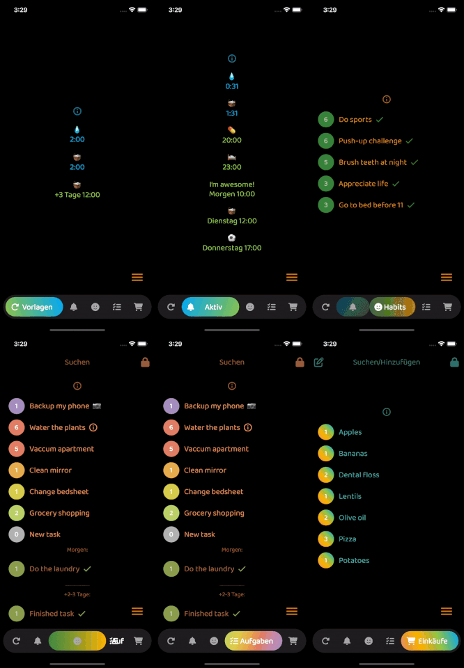
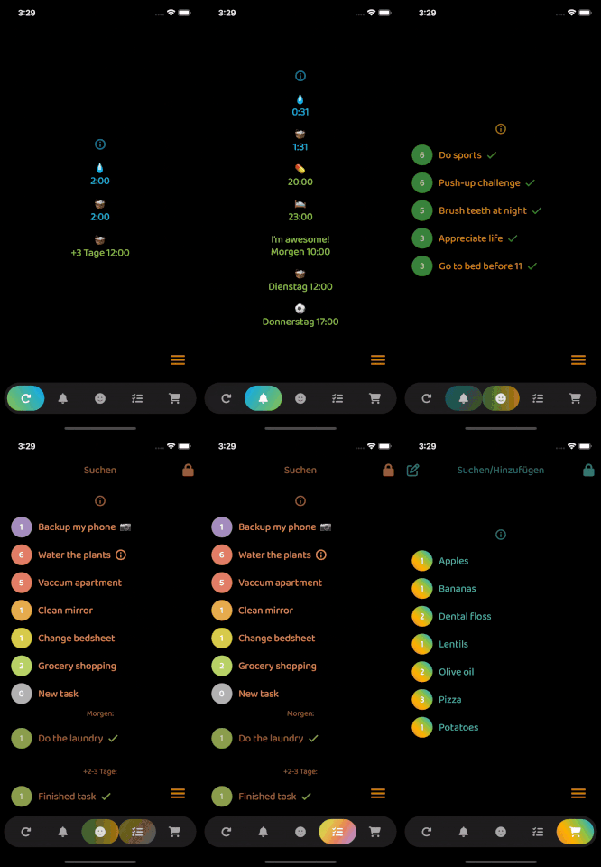
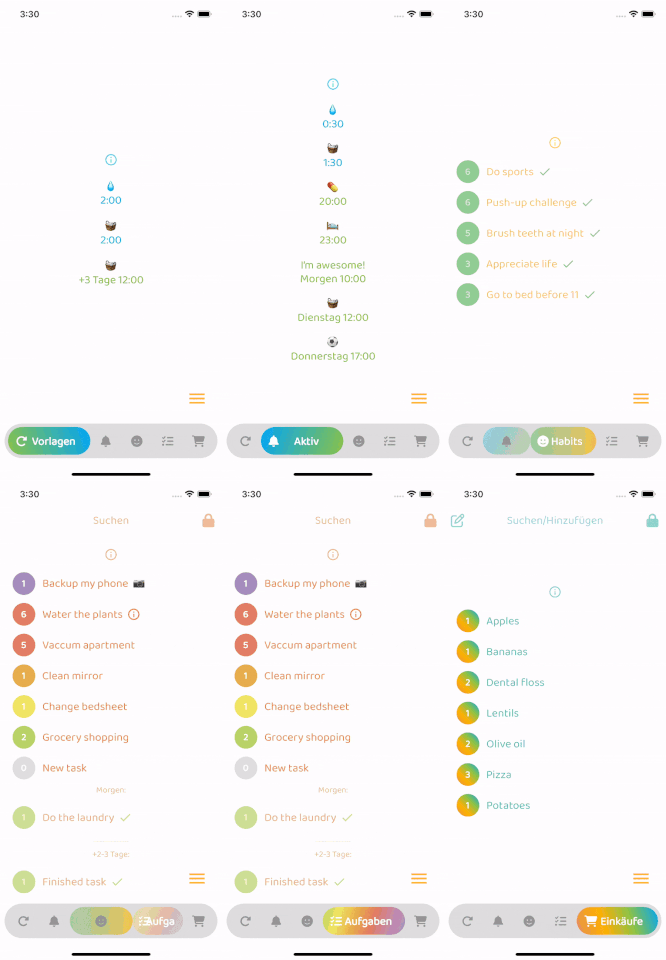
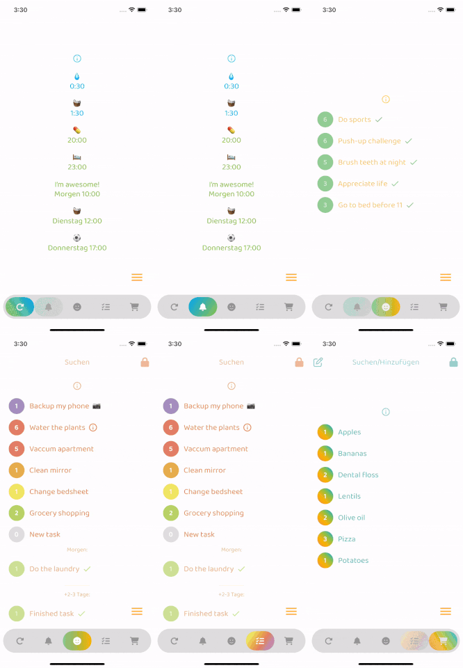
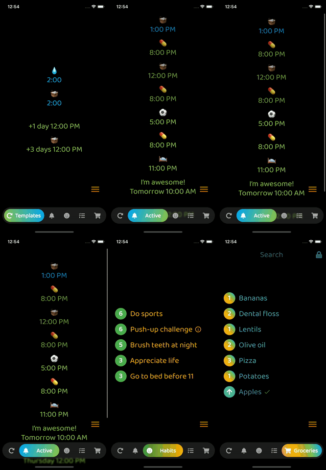
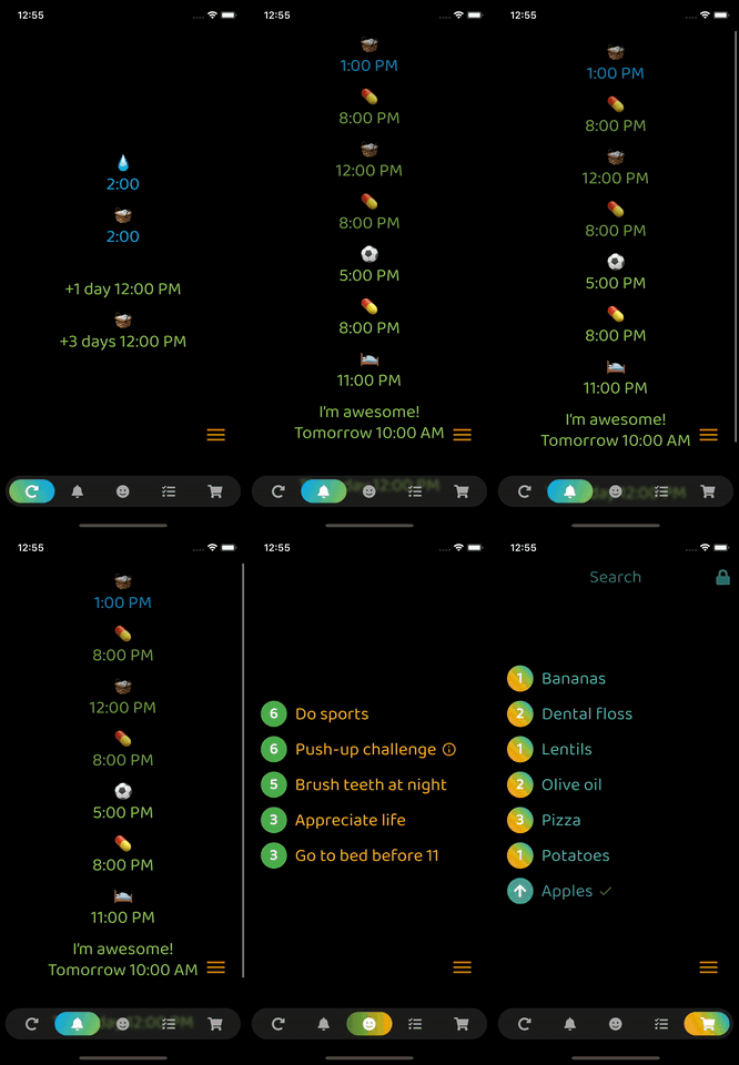
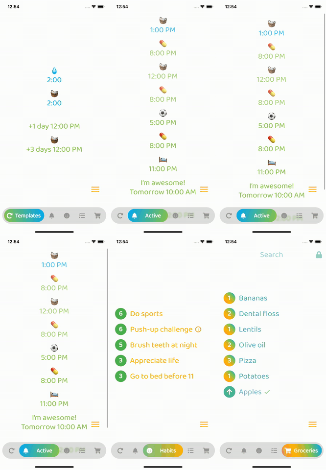
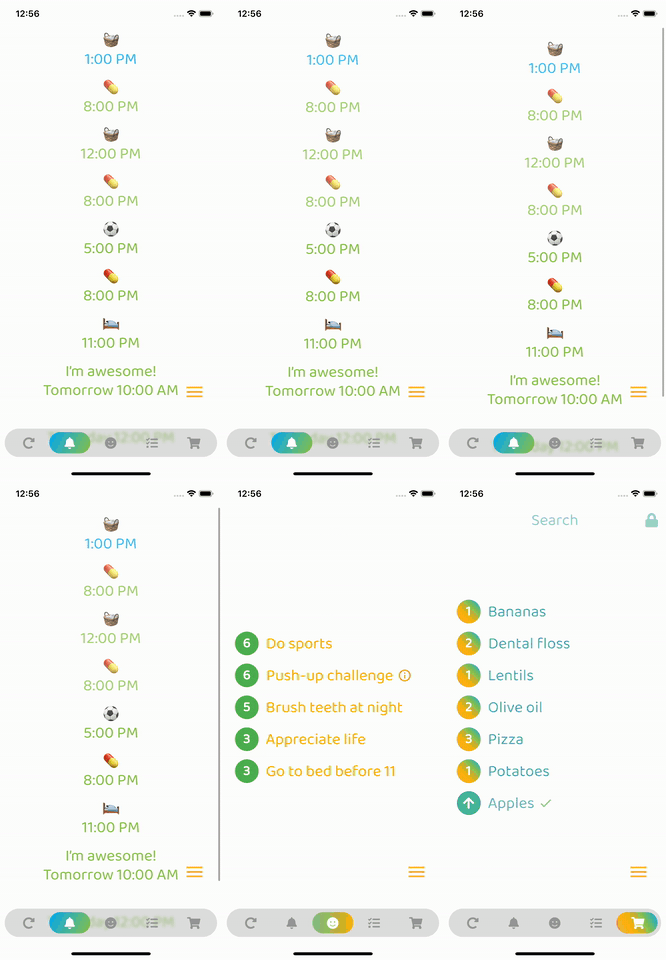
Optional: Beautiful gradient (backgroundGradient) for navigation bar and/or buttons (or solid colors)
Optional: Colored borders (border) for navigation bar and/or buttons
Optional: Change the opacity (backgroundOpacity) of the menu bar
Optional: Blurred background (backgroundBlur) from the top of the navigation bar to the bottom of the screen
Optional: Separate border radius controls (borderRadius, buttonBorderRadius)
Optional: Control button spacing (buttonSpacing)
By default shows text on selected button, optionally show on inactive buttons too (showInactiveButtonText)
Only StatelessWidgets
How to make the bottomNavigationBar float above the Scaffold's body:
Scaffold(
  extendBody: true,
  body: SafeArea(bottom: false, ...),
  bottomNavigationBar: ...
  ...
)
backgroundColor:
    Theme.of(context).brightness == Brightness.dark
        ? const Color(0xff3c3c3c)
        : const Color(0xffbebebe),
inactiveIconColor:
    Theme.of(context).brightness == Brightness.dark
        ? const Color(0xffaaaaaa)
        : const Color(0xff969696),

의존성 목록 3 개
{"sdk":"flutter"}^6.0.0{"sdk":"flutter"}사용 목적에 따라 검색하고 개발 활동을 비교한 뒤 원본 저장소에서 요구 사항을 확인하세요.
“A repository is the most basic element of GitHub.”
GitHub Docs — About repositories ↗