
 v2.1.0
anydrawer
왼쪽, 오른쪽, 위, 아래 어느 쪽에서든 슬라이드할 수 있는 강력한 Flutter 드로어입니다. Scaffold가 필요하지 않습니다. 백드롭 블러, 드래그 제스처, 반환 값, 여러 드로어, 에지에서 스와이프 및 선언형 API를 지원합니다.
39좋아요 50730일 다운로드150Pub 점수
AndroidiOSWebmacOSWindowsLinux
anydrawer 패키지는 Flutter 애플리케이션에서 화면의 어느 수평 측면에서도 사용자 정의 가능한 드로어를 쉽게 표시할 수 있도록 해줍니다. 기본 스크래프트 드로어는 스크래프트 자체에서만 표시될 수 있는 반면, 이 패키지는 앱의 UI 다양한 부분에 드로어를 표시할 수 있는 유연성을 제공합니다.

{"sdk":"flutter"}^6.0.0{"sdk":"flutter"}^10.3.0아래는 영문 원문 스냅샷입니다. 최신 내용은 GitHub에서 확인하세요.
AnyDrawer - Drawers from any edge, no Scaffold needed
Beautiful drawers from any edge. No Scaffold needed.
Pub Version Pub Likes Pub Points Popularity License
Very Good Analysis GitHub Issues
Android iOS Web macOS Windows Linux
Flutter's built-in Drawer widget is tied to Scaffold, limited to left/right, and gives you little control. AnyDrawer removes all those constraints.
| Feature | Flutter Drawer | AnyDrawer |
|---|---|---|
| No Scaffold required | ❌ | ✅ |
| Slide from any edge (L/R/T/B) | ❌ Left/Right only | ✅ All four sides |
| Backdrop blur (frosted glass) | ❌ | ✅ |
| Return results (Future) | ❌ | ✅ |
| Multiple drawers at once | ❌ | ✅ |
| Drag to dismiss with callbacks | ❌ | ✅ |
| Swipe-from-edge gesture | ❌ | ✅ |
| Declarative widget API | ❌ | ✅ |
| Elevation and shadow | ❌ | ✅ |
| Custom barrier builder | ❌ | ✅ |
| Programmatic open/close/state | ❌ | ✅ |
| Width constraints (min/max) | ❌ | ✅ |
| Custom animation curve | ❌ | ✅ |
| Works with dialogs on top | ❌ | ✅ |
| Barrier tap-through | ❌ | ✅ |
| Accessibility (semantics) | Partial | ✅ |
showDrawer<T>() returns Future<T?> like showDialogAnyDrawerController to open/close from codeAnyDrawer widget for embedding in the widget treeAnyDrawerRegion detects edge swipes to openbarrierPenetrable lets taps reach widgets behind the drawermaxWidth and minWidth for responsive layoutsWeb / Tablet — grid layout with settings drawer
Web example with settings drawer
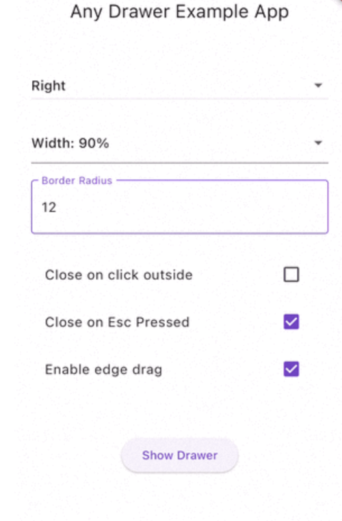
Mobile — dialog over drawer · return results · drawer settings
Dialog over drawer Return result from drawer Drawer settings panel
dependencies:
  anydrawer: ^2.1.0
flutter pub get
import 'package:anydrawer/anydrawer.dart';

showDrawer(
  context,
  builder: (context) {
    return const Center(
      child: Text('Hello from the drawer!'),
    );
  },
);
final controller = AnyDrawerController();

// In your widget tree:
AnyDrawer(
  controller: controller,
  builder: (context) => const MyDrawerContent(),
  config: const DrawerConfig(side: DrawerSide.left),
);

// Open/close from anywhere:
controller.open();
controller.close();
AnyDrawerRegion(
  side: DrawerSide.left,
  builder: (context) => const NavigationMenu(),
  config: const DrawerConfig(side: DrawerSide.left, dragEnabled: true),
  child: const MyPageContent(),
)
Pass a DrawerConfig to customize behavior and appearance:
showDrawer(
  context,
  builder: (context) => const MyDrawerContent(),
  config: const DrawerConfig(
    side: DrawerSide.left,
    widthPercentage: 0.4,
    borderRadius: 24,
    backdropOpacity: 0.5,
    backdropBlur: 5.0,
    closeOnClickOutside: true,
    closeOnEscapeKey: true,
    closeOnResume: true,       // Android only
    closeOnBackButton: true,   // Requires a route navigator
    dragEnabled: true,
    curve: Curves.easeOutCubic,
    maxWidth: 400,
    elevation: 8,
    semanticsLabel: 'Navigation drawer',
  ),
  onOpen: () => print('Drawer opened'),
  onClose: () => print('Drawer closed'),
  onDragUpdate: (details) => print('Dragging: ${details.primaryDelta}'),
  onDragEnd: (details) => print('Drag ended'),
);
| Property | Type | Default | Description |
|---|---|---|---|
side |
DrawerSide |
right |
Side the drawer slides in from |
widthPercentage |
double? |
auto | Size fraction of primary axis (0.1 – 0.99) |
borderRadius |
double |
20 |
Corner radius of the drawer edge |
backdropOpacity |
double |
0.4 |
Opacity of the dark backdrop (0 – 1) |
backdropBlur |
double |
0.0 |
Blur sigma for frosted glass backdrop |
animationDuration |
Duration |
300ms | Slide animation duration |
curve |
Curve |
Curves.easeInOut |
Animation curve for the slide transition |
closeOnClickOutside |
bool |
true |
Close when tapping the backdrop |
closeOnEscapeKey |
bool |
true |
Close on Escape key press |
closeOnResume |
bool |
false |
Close when app resumes (Android only) |
closeOnBackButton |
bool |
false |
Close on Android back button |
dragEnabled |
bool |
false |
Allow drag to dismiss |
maxDragExtent |
double |
300 |
Maximum drag distance |
maxWidth |
double? |
— | Maximum pixel size constraint |
minWidth |
double? |
— | Minimum pixel size constraint |
elevation |
double |
0.0 |
Material shadow elevation |
shadowColor |
Color? |
— | Shadow color when elevation is set |
barrierBuilder |
BarrierBuilder? |
— | Custom barrier widget builder |
barrierPenetrable |
bool |
false |
Allow pointer pass-through (closeOnClickOutside ignored) |
semanticsLabel |
String? |
— | Accessibility label for screen readers |
resizable |
bool |
false |
Enable animated runtime size changes |
showDrawer returns a Future<T?>, just like showDialog:
final result = await showDrawer<String>(
  context,
  builder: (context) {
    return Center(
      child: ElevatedButton(
        onPressed: () => Navigator.of(context).pop('selected!'),
        child: const Text('Select'),
      ),
    );
  },
);
print(result); // 'selected!'
Use AnyDrawerController to open and close the drawer from code:
final controller = AnyDrawerController();

showDrawer(
  context,
  builder: (context) => MyDrawerContent(),
  controller: controller,
  onClose: () {
    // Safe to dispose here — onClose is deferred automatically
    controller.dispose();
  },
);

// Check state
print(controller.isOpen); // true

// Close the drawer later
controller.close();
Show drawers from any edge of the screen:
// Bottom panel (like a custom bottom sheet)
showDrawer(
  context,
  builder: (context) => const DetailsPanel(),
  config: const DrawerConfig(
    side: DrawerSide.bottom,
    widthPercentage: 0.4,  // 40% of screen height
    borderRadius: 20,
  ),
);

// Top notification bar
showDrawer(
  context,
  builder: (context) => const NotificationBar(),
  config: const DrawerConfig(
    side: DrawerSide.top,
    widthPercentage: 0.15,
    backdropOpacity: 0.2,
  ),
);
Add a frosted glass effect behind the drawer:
showDrawer(
  context,
  builder: (context) => const MyDrawerContent(),
  config: const DrawerConfig(
    backdropBlur: 8.0,
    backdropOpacity: 0.2,
  ),
);
Provide a completely custom barrier widget:
showDrawer(
  context,
  builder: (context) => const MyDrawerContent(),
  config: DrawerConfig(
    barrierBuilder: (context, animation) {
      return GestureDetector(
        onTap: () => Navigator.of(context).pop(),
        child: AnimatedBuilder(
          animation: animation,
          builder: (context, child) => Container(
            color: Colors.purple.withValues(alpha: 0.3 * animation.value),
          ),
        ),
      );
    },
  ),
);
Allow taps to reach widgets behind the drawer route:
showDrawer(
  context,
  builder: (context) => const MyDrawerContent(),
  config: const DrawerConfig(
    barrierPenetrable: true,
  ),
);
Dialogs, bottom sheets, and menus work seamlessly from inside the drawer:
showDrawer(
  context,
  builder: (context) {
    return Center(
      child: ElevatedButton(
        onPressed: () {
          showDialog(
            context: context,
            builder: (context) => AlertDialog(
              title: Text('Hello!'),
              content: Text('This dialog appears above the drawer.'),
            ),
          );
        },
        child: Text('Show Dialog'),
      ),
    );
  },
);
You can open multiple drawers simultaneously — for example, a left navigation drawer and a right details panel:
// Open left drawer
showDrawer(
  context,
  builder: (context) => const NavigationMenu(),
  config: const DrawerConfig(
    side: DrawerSide.left,
    widthPercentage: 0.35,
    backdropOpacity: 0.1,
    closeOnClickOutside: false,
  ),
);

// Open right drawer on top
showDrawer(
  context,
  builder: (context) => const DetailsPanel(),
  config: const DrawerConfig(
    side: DrawerSide.right,
    widthPercentage: 0.35,
  ),
);
You can also open nested drawers from inside an existing drawer.
Open a drawer in response to a deep link or push notification:
MaterialApp(
  onGenerateRoute: (settings) {
    if (settings.name == '/settings') {
      return MaterialPageRoute(
        builder: (context) {
          WidgetsBinding.instance.addPostFrameCallback((_) {
            showDrawer(
              context,
              builder: (ctx) => const SettingsDrawer(),
              config: const DrawerConfig(side: DrawerSide.right),
            );
          });
          return const HomePage();
        },
      );
    }
    return null;
  },
);
showDrawer returns Future<T?> — previously returned void. Callers that ignore the return value need no changes.DrawerSide has new values — top and bottom were added. If you have exhaustive switch statements on DrawerSide, add cases for the new values.closeOnClickOutside or closeOnEscapeKey had to be true. Now both can be false.Pull requests are welcome! For major changes, please open an issue first to discuss what you would like to change.
If you find this package useful, consider:
This project is licensed under the MIT License.