


 v0.0.5
modular_ui
material-tailwind 및 shadcn/ui에서 영감을 받은 사전 구축된 아름다운 Flutter 위젯
118좋아요 2730일 다운로드150Pub 점수
AndroidiOSWebmacOSWindowsLinux
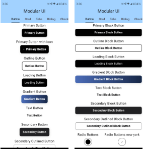
Modular UI의 유연한 빌드 블록을 사용하여 일순간에 일관되고 반응형 크로스플랫폼 Flutter 앱 인터페이스를 생성하세요.

아래는 영문 원문 스냅샷입니다. 최신 내용은 GitHub에서 확인하세요.



Craft beautiful, accessible, and responsive Flutter UIs with a Modular-UI Design-inspired component library
Run this command in your terminal
flutter pub add modular_ui
Add this line to import the package.
import 'package:modular_ui/modular_ui.dart';
Primary Button
 MUIPrimaryButton(
      text: "Primary Button",
      onPressed: () => onButtonPressed("Primary Button"),
    ),
Primary Card
  MUIPrimaryCard(
          title: 'UI/UX Review Check',
          description:
              'The place is close to Barceloneta Beach and bus stop just 2 min by walk and near to "Naviglio" where you can enjoy the main night life in Barcelona',
          image: Image.network(
            'https://images.unsplash.com/photo-1540553016722-983e48a2cd10?ixlib=rb-1.2.1&ixid=MnwxMjA3fDB8MHxwaG90by1wYWdlfHx8fGVufDB8fHx8&auto=format&fit=crop&w=800&q=80',
            fit: BoxFit.cover,
          ),
          buttons: [
            MUIPrimaryButton(
              text: 'Read More',
              onPressed: () {},
            ),
          ],
        ),
Primary Carousal
  MUICarousel(
            images: [
              "https://github.com/shadcn.png",
              "https://github.com/shadcn.png",
              "https://github.com/shadcn.png",
              "https://github.com/shadcn.png",
              "https://github.com/shadcn.png"
            ],
            indicatorType: CarouselIndicatorType.dot,
            duration: Duration(seconds: 2),
          ),
For more code samples, you can head on to our documentaion at . https://modularui.site
Calling on all the trendsetting Flutter enthusiasts! ❤️🔥 Join forces as we pioneer the creation of the ultimate, expansive, and seamless UI Library for Flutter. Let's make waves together! 🚀 Please refer to our contribution guidelines for details and don't forget to drop a Hi at discord
의존성 목록 3 개
{"sdk":"flutter"}{"sdk":"flutter"}^3.0.1사용 목적에 따라 검색하고 개발 활동을 비교한 뒤 원본 저장소에서 요구 사항을 확인하세요.
“A repository is the most basic element of GitHub.”
GitHub Docs — About repositories ↗