

 v1.2.2
wheel_slider
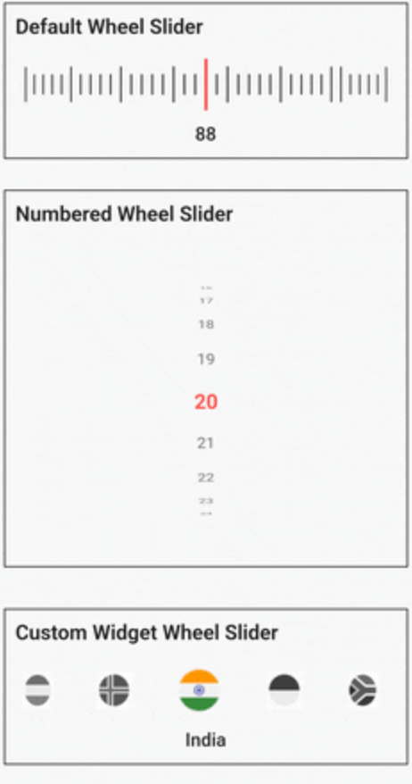
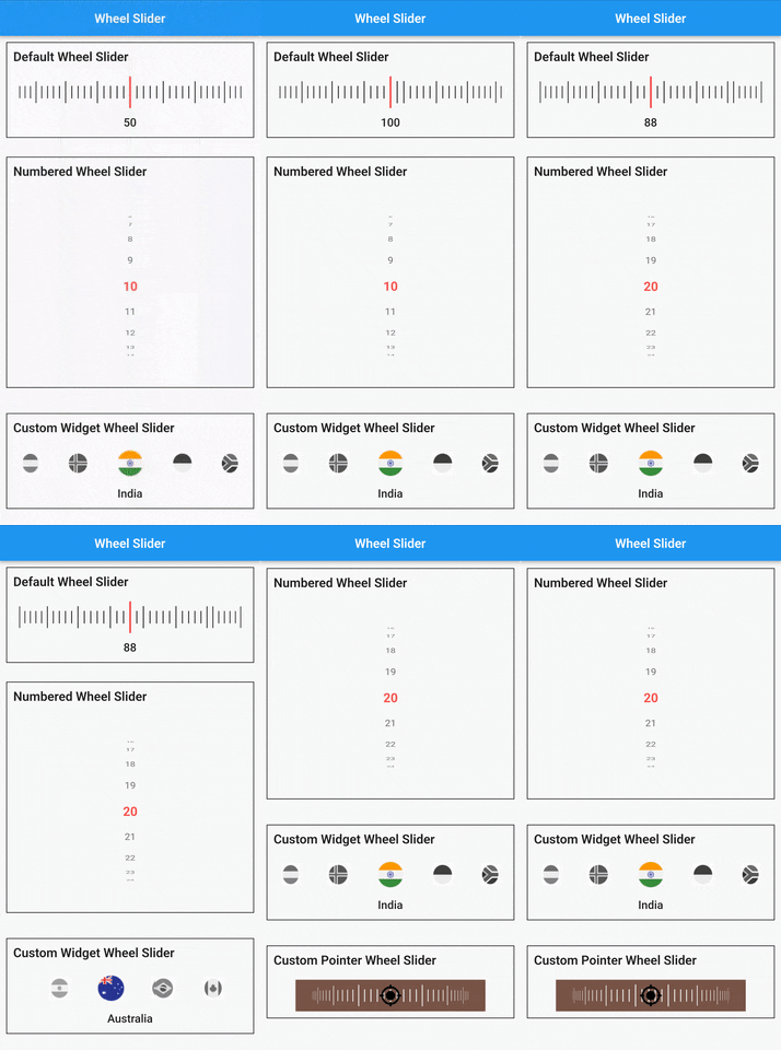
Wheel Slider는 많은 사용자 정의 기능을 제공하며, 휠처럼 생긴 외관으로 스크롤할 수 있게 해줍니다.
133좋아요 7천30일 다운로드150Pub 점수
AndroidiOSWebmacOSWindowsLinux
휠 슬라이더는 휠처럼 스크롤할 수 있게 해주며, 다양한 사용자 정의 기능을 제공합니다.

아래는 영문 원문 스냅샷입니다. 최신 내용은 GitHub에서 확인하세요.
A versatile and highly customizable slider widget for Flutter, with a wheel-like scrolling appearance.


Built on top of
wheel_chooserfor an enhanced experience.
Add the following to your pubspec.yaml under dependencies:
  dependencies:
    wheel_slider:
import 'package:wheel_slider/wheel_slider.dart';
Add the vibration permission to your AndroidManifest.xml file:
<uses-permission android:name="android.permission.VIBRATE"/>
Supports vibration with duration and pattern on CoreHaptics devices. On older devices, the pattern is emulated with 500ms long vibrations.
To use Line Slider:
WheelSlider(
    totalCount: _totalCount,
    initValue: _initValue,
    onValueChanged: (val) {
        setState(() {
          _currentValue = val;
        });
    },
    hapticFeedbackType: HapticFeedbackType.vibrate,
),
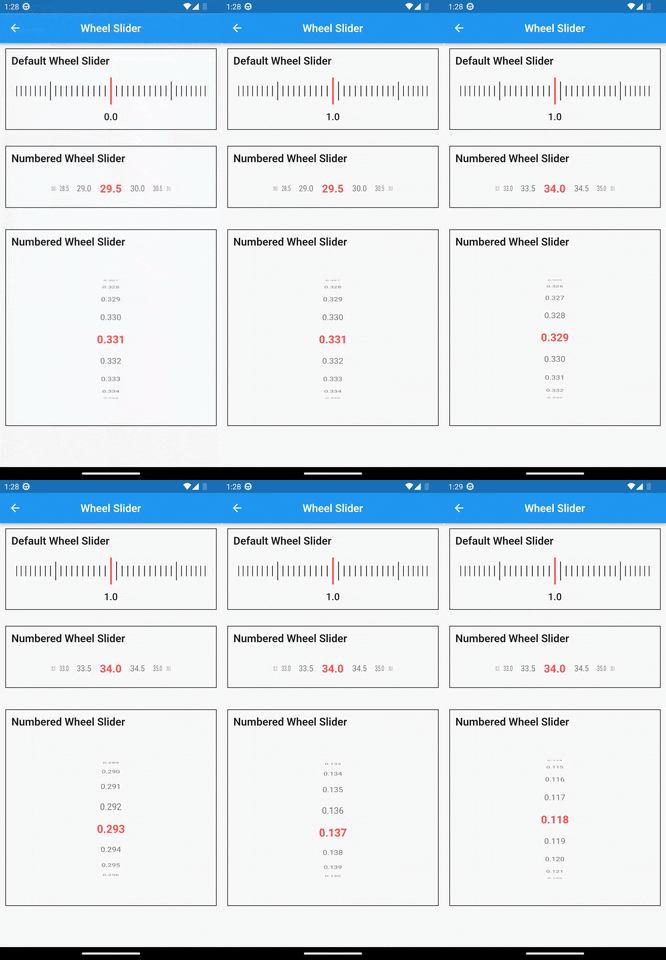
To use Line Slider with displaying double value:
WheelSlider(
    interval: 0.5,  // this field is used to show decimal/double values
    totalCount: _totalCount,
    initValue: _initValue,
    onValueChanged: (val) {
        setState(() {
          _currentValue = val;
        });
    },
    hapticFeedbackType: HapticFeedbackType.vibrate,
),
To use Number Slider:
WheelSlider.number(
    perspective: 0.01,
    totalCount: _nTotalCount,
    initValue: _nInitValue,
    unSelectedNumberStyle: const TextStyle(
        fontSize: 12.0,
        color: Colors.black54,
    ),
    currentIndex: _nCurrentValue,
    onValueChanged: (val) {
        setState(() {
          _nCurrentValue = val;
        });
    },
    hapticFeedbackType: HapticFeedbackType.heavyImpact,
),
To use Number Slider with displaying double value:
WheelSlider.number(
    interval: 0.5, // this field is used to show decimal/double values
    perspective: 0.01,
    totalCount: _nTotalCount,
    initValue: _nInitValue,
    unSelectedNumberStyle: const TextStyle(
        fontSize: 12.0,
        color: Colors.black54,
    ),
    currentIndex: _nCurrentValue,
    onValueChanged: (val) {
        setState(() {
          _nCurrentValue = val;
        });
    },
    hapticFeedbackType: HapticFeedbackType.heavyImpact,
),
To use Custom Widget Slider:
WheelSlider.customWidget(
    totalCount: 12,
    initValue: 5,
    isInfinite: false,
    scrollPhysics: const BouncingScrollPhysics(),
    children: List.generate(12, (index) => const Center(
        child: FlutterLogo(
            size: 100,
        ),
    )),
    onValueChanged: (val) {
        setState(() {
          _cCurrentValue = val;
        });
    },
    hapticFeedbackType: HapticFeedbackType.vibrate,
    showPointer: false,
    itemSize: 80,
),
controller - A FixedExtentScrollController that allows you to manage and control the scroll position of the slider.interval - To display decimal values. By default it is set to 1, when changed totalCount also to be updated accordingly.currentIndex - Gets the current value as you scroll the Number Slider.perspective - Change the way you want the slider to look from a flat to a wheel like shape and the value must be <= 0.01.squeeze - Adjust the spacing between each item in the slider.isVibrate - To turn on/off vibration while scrolling.hapticFeedbackType - Allows you to change the vibration type.itemSize - Size of each item in the slider.background - Use any widget to add as a background to the slider.allowPointerTappable:
false scroll functionality won't work for the occupied region.false to enable gestures.true.의존성 목록 4 개
{"sdk":"flutter"}^1.1.2{"sdk":"flutter"}^1.0.0사용 목적에 따라 검색하고 개발 활동을 비교한 뒤 원본 저장소에서 요구 사항을 확인하세요.
“A repository is the most basic element of GitHub.”
GitHub Docs — About repositories ↗