

 v11.2.0
mongol
수직 몽골어 텍스트를 표시하고 편집하기 위한 Flutter 위젯 패키지입니다.
61좋아요 2.5천30일 다운로드155Pub 점수
AndroidiOSWebmacOSWindowsLinux
Flutter 앱용 몽골어 수직 글꼴 위젯

아래는 영문 원문 스냅샷입니다. 최신 내용은 GitHub에서 확인하세요.
This library is a collection of Flutter widgets for displaying traditional Mongolian vertical text.
The primary widgets include:
MongolText: vertical version of TextMongolTextField: vertical version of TextFieldMongolListTile: vertical version of ListTile, for use in horizontal list views and menusMongolPopupMenuButton: vertical version of PopupMenuButton, for displaying menusMongolAlertDialog: vertical version of AlertDialogMongolText is a vertical text version of Flutter's Text widget. Left-to-right line wrapping is supported.
MongolText('ᠨᠢᠭᠡ ᠬᠣᠶᠠᠷ ᠭᠤᠷᠪᠠ ᠳᠦᠷᠪᠡ ᠲᠠᠪᠤ ᠵᠢᠷᠭᠤᠭᠠ ᠳᠣᠯᠣᠭᠠ ᠨᠠᠢᠮᠠ ᠶᠢᠰᠦ ᠠᠷᠪᠠ'),
The library supports mobile, web, and desktop.

The library rotates emoji and CJK (Chinese, Japanese, and Korean) characters for proper orientation.

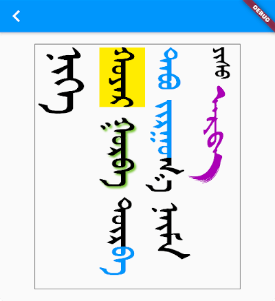
You add styling using TextSpan and/or TextStyle, just as you would for a Text widget.
MongolText.rich(
  textSpan,
  textScaleFactor: 2.5,
),
where textSpan is defined like so:
const textSpan = TextSpan(
style: TextStyle(fontSize: 30, color: Colors.black),
children: [
TextSpan(text: 'ᠨᠢᠭᠡ\n', style: TextStyle(fontSize: 40)),
TextSpan(text: 'ᠬᠣᠶᠠᠷ', style: TextStyle(backgroundColor: Colors.yellow)),
TextSpan(
text: ' ᠭᠤᠷᠪᠠ ',
style: TextStyle(shadows: [
Shadow(
blurRadius: 3.0,
color: Colors.lightGreen,
offset: Offset(3.0, -3.0),
),
]),
),
TextSpan(text: 'ᠳᠦᠷ'),
TextSpan(text: 'ᠪᠡ ᠲᠠᠪᠤ ᠵᠢᠷᠭᠤ', style: TextStyle(color: Colors.blue)),
TextSpan(text: 'ᠭᠠ ᠨᠠᠢᠮᠠ '),
TextSpan(text: 'ᠶᠢᠰᠦ ', style: TextStyle(fontSize: 20)),
TextSpan(
text: 'ᠠᠷᠪᠠ',
style:
TextStyle(fontFamily: 'MenksoftAmuguleng', color: Colors.purple)),
],
);

This all assumes you've added one or more Mongolian fonts to your app assets.
The library does not include a Mongolian font. This allows the library to be smaller and also gives developers the freedom to choose any Mongolian font they like.
Since it's likely that some of your users' devices won't have a Mongolian font installed, you should include at least one Mongolian font with your project. Here is what you need to do:
You can find a font from the following sources:
You can get directions to do that here and here.
Basically you just need to create an assets/fonts folder for it and then declare the font in pubspec.yaml like this:
flutter:
  fonts:
    - family: MenksoftQagan
      fonts:
        - asset: assets/fonts/MQG8F02.ttf
You can call the family name whatever you want, but this string is what you will use in the next step.
In your main.dart file, set the fontFamily for the app theme.
MaterialApp(
  theme: ThemeData(fontFamily: 'MenksoftQagan'),
  // ...
);
Now you won't have to manually set the font for every Mongolian text widget. If you want to use a different font for some widgets, though, you can still set the fontFamily as you normally would inside TextStyle.
You may also consider using mongol_code with a Menksoft font if your users have devices that don't support OpenType Unicode font rendering. mongol_code converts Unicode to Menksoft code, which a Menksoft font can display without any special rendering requirements.
You can use MongolTextField to receive and edit text from the system keyboard. This widget includes most of the functionality of the standard Flutter TextField widget.

Here is it on iOS and Android interacting with a system keyboard:

If you want to use an outlined text field with a label, use MongolOutlineInputBorder:

Note: There is currently a bug in the
MongolTextFieldformaxLines: null. PRs are welcome!
MongolTextField(
  decoration: InputDecoration(
    border: MongolOutlineInputBorder(),
    labelText: 'ᠨᠢᠭᠡ ᠬᠤᠶᠠᠷ ᠭᠤᠷᠪᠠ',
  ),
),
In order to correctly handle right/left and up/down keys on the web and desktop (or for physical keyboards connected to a mobile app), you need to return the MongolTextEditingShortcuts widget from the builder method of your MaterialApp (or CupertinoApp or WidgetsApp) at the top of your widget tree:
MaterialApp(
  builder: (context, child) => MongolTextEditingShortcuts(child: child),
  // ...
)
You can display horizontally scrolling lists with the standard ListView widget. All you need to do is set the scroll direction to horizontal.
ListView(
  scrollDirection: Axis.horizontal,
  children: [
    MongolText('ᠨᠢᠭᠡ'),
    MongolText('ᠬᠣᠶᠠᠷ'),
    MongolText('ᠭᠤᠷᠪᠠ'),
  ],
),
For something a little fancier, you can also use the MongolListTile widget just like you would use ListTile. Here is an example from the example project:
Card(
child: MongolListTile(
leading: FlutterLogo(size: 56.0),
title: MongolText('ᠨᠢᠭᠡ ᠬᠣᠶᠠᠷ ᠭᠤᠷᠪᠠ'),
subtitle: MongolText('ᠳᠦᠷᠪᠡ ᠲᠠᠪᠤ ᠵᠢᠷᠭᠤᠭᠠ ᠳᠣᠯᠣᠭᠠ ᠨᠠᠢᠮᠠ'),
trailing: Icon(Icons.more_vert),
),
),

As visible in the image above, in addition to MongolListTile, there is also:
MongolCheckboxListTileMongolRadioListTileMongolSwitchListTileTo add a popup menu with horizontal items, you can use MongolPopupMenuButton. It is customizable in all the ways that the standard PopupMenuButton is.
Scaffold(
  appBar: AppBar(
    title: const Text('MongolPopupMenuButton'),
    actions: [
      MongolPopupMenuButton(
        itemBuilder: (context) => const [
          MongolPopupMenuItem(child: MongolText('ᠨᠢᠭᠡ'), value: 1),
          MongolPopupMenuItem(child: MongolText('ᠬᠣᠶᠠᠷ'), value: 2),
          MongolPopupMenuItem(child: MongolText('ᠭᠤᠷᠪᠠ'), value: 3),
        ],
        tooltip: 'vertical tooltip text',
        onSelected: (value) => print(value),
      ),
    ],
  ),
  body: Container(),
);

There are Mongol equivalents to all of the Flutter buttons:
MongolTextButtonMongolOutlinedButtonMongolElevatedButtonMongolFilledButtonMongolFilledButton.tonalMongolTextButton.iconMongolOutlinedButton.iconMongolElevatedButton.iconMongolFilledButton.iconMongolFilledButton.tonalIconMongolIconButtonMongolIconButton.filledMongolIconButton.filledTonalMongolIconButton.outlined
The reason for the Mongol icon button is to provide a vertical tooltip that will appear for a longpress on mobile and for a mouse hover on desktop and web.
This alert dialog works mostly the same as the Flutter AlertDialog.

WidgetSpan.MongolTextAlign.bottom don't count final space in line heightMongolSelectableText widget의존성 목록 10 개
{"sdk":"flutter"}^1.2.1{"sdk":"flutter"}^2.0.1anyanyanyanyanyany사용 목적에 따라 검색하고 개발 활동을 비교한 뒤 원본 저장소에서 요구 사항을 확인하세요.
“A repository is the most basic element of GitHub.”
GitHub Docs — About repositories ↗