
 v0.0.3
wolt_responsive_layout_grid
Wolt 반응형 레이아웃 그리드 라이브러리는 다양한 화면 크기에 자연스럽게 조정되는 동적이고 적응형 그리드 레이아웃을 만들 수 있도록 도와줍니다.
131좋아요 2.2천30일 다운로드150Pub 점수
AndroidiOSWebmacOSWindowsLinux
Wolt 반응형 레이아웃 그리드 라이브러리는 Material Design의 반응형 레이아웃 그리드를 위한 Flutter 구현을 제공합니다. 이는 장치나 운영 체제에 관계없이 일관성과 시각적 무결성을 보장하는 통합된 다중 플랫폼 그리드 시스템을 제공합니다.

{"sdk":"flutter"}^2.0.1{"sdk":"flutter"}—아래는 영문 원문 스냅샷입니다. 최신 내용은 GitHub에서 확인하세요.
Creating responsive grid layouts in Flutter applications can be a challenging task. Developers often struggle with achieving consistent and adaptive designs across various screen sizes and orientations. With the Wolt Responsive Layout Grid library, building responsive grid layouts becomes much simpler.
Wolt Responsive Layout Grid library introduces the Flutter implementation of Material Design's responsive layout grid. It provides a unified, multi-platform grid system that ensures consistency and visual integrity regardless of the device or operating system being used.
An animated image of the sample app
The Wolt Responsive Layout Grid library offers the following key features:
Responsive Grid Layout: The WoltResponsiveLayoutGrid widget enables the creation of responsive grid layouts that adapt to different screen sizes and orientations.
Material Design Adaptation: The library implements Material Design's responsive layout grid, guaranteeing consistency and adhering to established design principles.
Customizable Spacing: By adjusting the gutter and margin properties of the WoltResponsiveLayoutGrid widget, developers have full control over the spacing, allowing developers to create layouts that match the design requirements.
Screen Width Adaptation: The WoltScreenWidthAdaptiveWidget allows developers to adapt the child widget based on the screen width, dynamically adjusting the layout and content presentation. By providing different child widgets for small and large screens, the WoltScreenWidthAdaptiveWidget automatically switches between them based on the screen width, ensuring a seamless user experience across various devices.
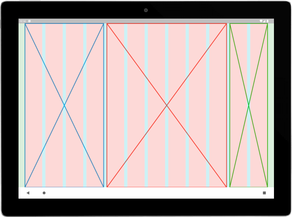
Overlay for Visual Debugging: During development, it's often helpful to have a visual representation of the grid layout to fine-tune and verify its structure. The Wolt Responsive Layout Grid library includes an overlay feature that enables you to visualize the grid layout. This overlay renders colored boxes for each column and gutter, making it easier to debug and ensure proper alignment. The overlay can be enabled or disabled based on debugging needs.
To use this plugin, add wolt_responsive_layout_grid as a dependency in your pubspec.yaml file.
The WoltResponsiveLayoutGrid widget is the centerpiece of the library. By utilizing a list of WoltColumnSpanCell objects, you can define the content and column spans for each cell. This allows for the grouping of one or more columns to create sections or content within the available space.
WoltResponsiveLayoutGrid(
  isOverlayVisible: true,
  gutter: 16,
  margin: 32,
  columnSpanCells: [
    WoltColumnSpanCell(
      columnCellWidget: Placeholder(color: Colors.blue, strokeWidth: 4),
      columnSpan: 4,
    ),
    WoltColumnSpanCell(
      columnCellWidget: Placeholder(color: Colors.red, strokeWidth: 4),
      columnSpan: 6,
    ),
    WoltColumnSpanCell(
      columnCellWidget: Placeholder(color: Colors.green, strokeWidth: 4),
      columnSpan: 2,
    ),
  ],
)
https://raw.githubusercontent.com/woltapp/wolt-responsive-layout-grid/main/doc/example_app_2.png\
Centered Constructor
WoltResponsiveLayoutGrid widget provides a factory constructor centered that simplifies the creation of centered layouts with a child widget and specified column counts. This constructor takes the following parameters:
child: The child widget to be centered within the grid layout.
centerWidgetColumnCount: The number of columns that the child widget should occupy.
paddedColumnCountPerSide: The number of padded columns to be added on each side of the child widget. These padded columns create empty spaces around the centered widget, resulting in a visually balanced and appealing layout.
WoltResponsiveLayoutGrid.centered(
  centerWidgetColumnCount: 3,
  paddedColumnCountPerSide: 2,
  margin: 32,
  gutter: 16,
  isOverlayVisible: true,
  child: DecoratedBox(
    decoration: BoxDecoration(border: Border.all(color: Colors.black, width: 2)),
    child: Text(
      'Center Widget',
      style: Theme.of(context).textTheme.displayLarge,
      textAlign: TextAlign.center,
    ),
  ),
),
| Tablet - Portrait | Tablet - Landscape |
|---|---|
| https://raw.githubusercontent.com/woltapp/wolt-responsive-layout-grid/main/doc/centered_vertical.png | https://raw.githubusercontent.com/woltapp/wolt-responsive-layout-grid/main/doc/centered_horizontal.png |
The WoltScreenWidthAdaptiveWidget is designed to provide adaptive rendering based on the screen width. It allows developers to define two child widgets: one for small screens and another for large screens. The widget automatically switches between the child widgets based on the screen width, ensuring that the interface adapts seamlessly to different device sizes.
WoltScreenWidthAdaptiveWidget(
  smallScreenWidthChild: Icon(Icons.store, size: 16, color: Colors.black),
  largeScreenWidthChild: Text(isOnline ? 'Online' : 'Offline'),
),
To learn more, you can check the following blog posts: