
 v4.0.1
settings_ui
몇 분 만에 Flutter 앱용 네이티브 설정을 생성하세요. 단일 인터페이스를 사용하여 빌드합니다
1천좋아요 33.2만30일 다운로드160Pub 점수
AndroidiOSWebmacOSWindowsLinux
몇 분 안에 Flutter 앱용 네이티브 설정을 만드세요.

{"sdk":"flutter"}{"sdk":"flutter"}^5.0.0아래는 영문 원문 스냅샷입니다. 최신 내용은 GitHub에서 확인하세요.
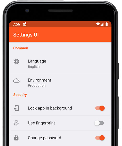
A Flutter package for building settings screens that look native on Android, iOS, and Web — all from a single API. The UI automatically adapts to each platform's visual style: Material for Android, Cupertino for iOS, and a card-based Web layout. Also runs on macOS, Windows, Linux, and Fuchsia (macOS/Windows use the Cupertino style; Linux uses Material).
https://raw.githubusercontent.com/yako-dev/flutter-settings-ui/master/assets/v2/settings_ui_cover.png
Add to your pubspec.yaml:
dependencies:
  settings_ui: ^3.0.1
Then import:
import 'package:settings_ui/settings_ui.dart';
class SettingsScreen extends StatefulWidget {
  const SettingsScreen({super.key});

  @override
  State<SettingsScreen> createState() => _SettingsScreenState();
}

class _SettingsScreenState extends State<SettingsScreen> {
  bool _notificationsEnabled = true;
  bool _darkMode = false;

  @override
  Widget build(BuildContext context) {
    return Scaffold(
      appBar: AppBar(title: const Text('Settings')),
      body: SettingsList(
        sections: [
          SettingsSection(
            title: const Text('General'),
            tiles: [
              SettingsTile.navigation(
                leading: const Icon(Icons.language),
                title: const Text('Language'),
                value: const Text('English'),
                onPressed: (context) { /* navigate */ },
              ),
            ],
          ),
          SettingsSection(
            title: const Text('Appearance'),
            tiles: [
              SettingsTile.switchTile(
                leading: const Icon(Icons.dark_mode),
                title: const Text('Dark mode'),
                initialValue: _darkMode,
                onToggle: (value) => setState(() => _darkMode = value),
              ),
              SettingsTile.switchTile(
                leading: const Icon(Icons.notifications),
                title: const Text('Notifications'),
                description: const Text('Alerts, sounds, badges'),
                initialValue: _notificationsEnabled,
                onToggle: (value) =>
                    setState(() => _notificationsEnabled = value),
              ),
            ],
          ),
        ],
      ),
    );
  }
}
SettingsTile — basic tileA tappable tile with optional leading icon, description, and trailing widget.
SettingsTile(
  leading: const Icon(Icons.storage),
  title: const Text('Storage'),
  description: const Text('30% used — 5.60 GB free'),
  onPressed: (context) { /* ... */ },
)
SettingsTile.navigation — navigation tileAdds a platform-appropriate trailing chevron. Right arrow in LTR, left arrow in RTL.
SettingsTile.navigation(
  leading: const Icon(Icons.language),
  title: const Text('Language'),
  value: const Text('English'),
  titleDescription: const Text('Choose your preferred language'),
  onPressed: (context) {
    Navigator.of(context).push(/* language screen */);
  },
)
SettingsTile.switchTile — switch tileRenders a Switch on Material platforms and a CupertinoSwitch on iOS/macOS.
SettingsTile.switchTile(
  leading: const Icon(Icons.fingerprint),
  title: const Text('Use biometrics'),
  description: const Text('Unlock with fingerprint or Face ID'),
  initialValue: _biometricsEnabled,
  onToggle: (value) => setState(() => _biometricsEnabled = value),
)
CustomSettingsTile — any widget as a tileCustomSettingsTile(
child: Padding(
padding: const EdgeInsets.symmetric(horizontal: 16, vertical: 12),
child: LinearProgressIndicator(value: 0.3),
),
)
CustomSettingsSection — any widget as a sectionCustomSettingsSection(
child: Padding(
padding: const EdgeInsets.all(16),
child: Text(
'Signed in as Danny Yako',
style: Theme.of(context).textTheme.bodySmall,
),
),
)
SettingsList detects the platform automatically. You can override it:
SettingsList(
  platform: DevicePlatform.iOS,  // force Cupertino style
  sections: [ /* ... */ ],
)
https://raw.githubusercontent.com/yako-dev/flutter-settings-ui/master/assets/v3/android_settings.png https://raw.githubusercontent.com/yako-dev/flutter-settings-ui/master/assets/v3/ios_cupertino.png https://raw.githubusercontent.com/yako-dev/flutter-settings-ui/master/assets/v3/web_chrome.png
Android (Material) • iOS (Cupertino) • Web
DevicePlatform |
Style |
|---|---|
device (default) |
Auto-detected at runtime |
android, fuchsia, linux |
Material |
iOS, macOS, windows |
Cupertino |
web |
Web (card layout) |
On Android and Web, colors are automatically derived from your app's ColorScheme. No extra configuration needed — seed colors, light/dark mode, and custom ColorScheme all work out of the box.
https://raw.githubusercontent.com/yako-dev/flutter-settings-ui/master/assets/v3/android_material3.png
MaterialApp(
  theme: ThemeData(
    colorSchemeSeed: Colors.indigo,
    useMaterial3: true,
  ),
  home: const SettingsScreen(),
)
Any field left null falls back to the platform default derived from your ColorScheme.
SettingsList(
  lightTheme: const SettingsThemeData(
    settingsListBackground: Color(0xFFF2F2F7),
    settingsSectionBackground: Colors.white,
    titleTextColor: Colors.indigo,
  ),
  darkTheme: const SettingsThemeData(
    settingsListBackground: Color(0xFF1C1C1E),
    settingsSectionBackground: Color(0xFF2C2C2E),
    titleTextColor: Colors.indigoAccent,
  ),
  sections: [ /* ... */ ],
)
SettingsList(
  lightTheme: SettingsThemeData(
    tileTextStyle: const TextStyle(fontFamily: 'Roboto', fontSize: 16),
    tileDescriptionTextStyle: const TextStyle(fontSize: 12),
    titleTextStyle: const TextStyle(
      fontWeight: FontWeight.bold,
      fontSize: 13,
      letterSpacing: 0.5,
    ),
  ),
  sections: [ /* ... */ ],
)
SettingsTile.switchTile(
  title: const Text('Feature'),
  initialValue: false,
  onToggle: null,   // null disables interaction
  enabled: false,
)

// Control the disabled switch color:
SettingsList(
  lightTheme: const SettingsThemeData(
    inactiveSwitchColor: Colors.grey,
  ),
  sections: [ /* ... */ ],
)
final _controller = ScrollController();

SettingsList(
  scrollController: _controller,
  sections: [
    SettingsSection(
      tiles: [
        SettingsTile(
          title: const Text('Jump to bottom'),
          onPressed: (_) => _controller.animateTo(
            _controller.position.maxScrollExtent,
            duration: const Duration(milliseconds: 300),
            curve: Curves.easeOut,
          ),
        ),
      ],
    ),
  ],
)
SettingsTile(
  title: const Text('Option'),
  compact: true,  // halves the vertical padding
)
SettingsList(
  shrinkWrap: true,
  physics: const NeverScrollableScrollPhysics(),
  sections: [ /* ... */ ],
)
On screens wider than 810 dp, the list auto-centers. To left-align:
SettingsList(
  crossAxisAlignment: CrossAxisAlignment.start,
  sections: [ /* ... */ ],
)
// Pure CupertinoApp:
SettingsList(
  applicationType: ApplicationType.cupertino,
  sections: [ /* ... */ ],
)

// MaterialApp on Android, CupertinoApp on iOS:
SettingsList(
  applicationType: ApplicationType.both,
  sections: [ /* ... */ ],
)
SettingsList| Parameter | Type | Default | Description |
|---|---|---|---|
sections |
List<AbstractSettingsSection> |
required | Sections to display |
platform |
DevicePlatform? |
device |
Force a specific platform style |
lightTheme |
SettingsThemeData? |
— | Overrides for light mode |
darkTheme |
SettingsThemeData? |
— | Overrides for dark mode |
brightness |
Brightness? |
— | Override brightness detection |
applicationType |
ApplicationType |
material |
material, cupertino, or both |
scrollController |
ScrollController? |
— | Programmatic scroll control |
shrinkWrap |
bool |
false |
Shrink-wrap to content height |
physics |
ScrollPhysics? |
— | Custom scroll physics |
contentPadding |
EdgeInsetsGeometry? |
— | Override list padding |
crossAxisAlignment |
CrossAxisAlignment |
center |
Horizontal alignment on wide screens |
SettingsSection| Parameter | Type | Description |
|---|---|---|
tiles |
List<AbstractSettingsTile> |
The tiles in this section |
title |
Widget? |
Section header |
margin |
EdgeInsetsDirectional? |
Override section margin |
SettingsTile| Parameter | Type | Applies to | Description |
|---|---|---|---|
title |
Widget |
all | Tile label |
description |
Widget? |
all | Secondary text below the title |
leading |
Widget? |
all | Icon or widget at the start |
trailing |
Widget? |
all | Widget at the end |
enabled |
bool |
all | Grays out and disables interaction |
compact |
bool |
all | Halves the vertical padding |
onPressed |
Function(BuildContext)? |
all | Tap callback |
value |
Widget? |
simple, navigation | Widget shown before the chevron |
titleDescription |
Widget? |
navigation | Text below title (iOS/macOS/Windows) |
initialValue |
bool? |
switchTile | Initial switch state |
onToggle |
Function(bool)? |
switchTile | Toggle callback; null disables the switch |
activeSwitchColor |
Color? |
switchTile | Active switch color override |
SettingsThemeData| Field | Type | Description |
|---|---|---|
settingsListBackground |
Color? |
Background of the whole list |
settingsSectionBackground |
Color? |
Background of each section card |
dividerColor |
Color? |
Divider color between tiles |
tileHighlightColor |
Color? |
Tile press highlight color |
titleTextColor |
Color? |
Section header text color |
titleTextStyle |
TextStyle? |
Section header text style |
settingsTileTextColor |
Color? |
Tile title text color |
tileTextStyle |
TextStyle? |
Tile title text style |
tileDescriptionTextColor |
Color? |
Description/value text color |
tileDescriptionTextStyle |
TextStyle? |
Description/value text style |
leadingIconsColor |
Color? |
Leading icon color |
trailingTextColor |
Color? |
Trailing text color |
inactiveTitleColor |
Color? |
Tile title color when disabled |
inactiveSubtitleColor |
Color? |
Description color when disabled |
inactiveSwitchColor |
Color? |
Switch color when disabled |
Apache License 2.0 — see the LICENSE file for details.