

 v1.1.1
square_progress_bar
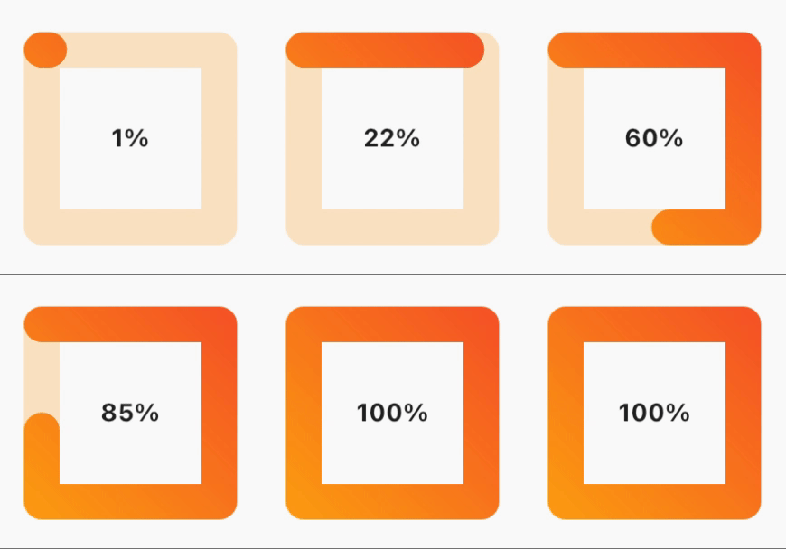
간편하게 사용할 수 있는 사각형 진행률 바입니다. 0.0에서 1.0 사이의 진행률을 제공하기만 하면 됩니다.
29좋아요 8330일 다운로드150Pub 점수
AndroidiOSWebmacOSWindowsLinux
yasirdx777/square_progress_bar open-source repository details.

아래는 영문 원문 스냅샷입니다. 최신 내용은 GitHub에서 확인하세요.

dependencies:
  square_progress_bar: ^1.1.1
Just provide the progress in a range from 0.0 to 1.0 and you are set to go.
              SquareProgressBar(
                width: 100, // default: max available space
                height: 100, // default: max available space
                progress: _progress, // provide the progress in a range from 0.0 to 1.0
                isAnimation: false, // default: false, animate the progress of the bar
                solidBarColor: Colors.amber, // default: blue, main bar color
                emptyBarColor: Colors.orange.withOpacity(0.2), // default: gray, empty bar color
                strokeWidth: 20, // default: 15, bar width
                barStrokeCap: StrokeCap.round, // default: StrokeCap.round, bar cap shape
                isRtl: false, // default: false, bar start point
                gradientBarColor: const LinearGradient(
                  begin: Alignment.topRight,
                  end: Alignment.bottomLeft,
                  colors: <Color>[Colors.red, Colors.amber],
                  tileMode: TileMode.repeated,
                ), // default: null, if you pass gradient color it will be used instead of solid color for the main bar
                child: Center(
                  child: Text(
                    _percentageLabel,
                    style: const TextStyle(fontWeight: FontWeight.bold),
                  ),
                ),
              )
MIT Free Software, Hell Yeah!
의존성 목록 3 개
{"sdk":"flutter"}{"sdk":"flutter"}^1.0.0사용 목적에 따라 검색하고 개발 활동을 비교한 뒤 원본 저장소에서 요구 사항을 확인하세요.
“A repository is the most basic element of GitHub.”
GitHub Docs — About repositories ↗