
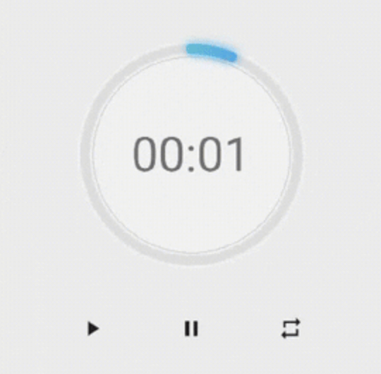
 v0.0.8
neon_circular_timer
아름다운 UI로 빠르게 타이머를 만들 수 있도록 도와주는 패키지입니다. 매우 사용자 정의가 가능하여 타이머의 색상, 두께, 시계 텍스트 스타일을 변경할 수 있습니다.
69좋아요 11030일 다운로드140Pub 점수
AndroidiOSWebmacOSWindowsLinux
아름다운 네온 효과와 아름다운 UI를 갖춘 타이머 앱 만들기

{"sdk":"flutter"}{"sdk":"flutter"}아래는 영문 원문 스냅샷입니다. 최신 내용은 GitHub에서 확인하세요.
Make a timer application with a fancy neon effect and beautiful UI
v0.0.3 and above now the timer has also a neumorphic border
example preview
Use neumorphicEffect to show or hide the neumorphic border
Use isTimerTextShown to show or hide the text
With neumorphicEffect is true and isTimerTextShown is false
  NeonCircularTimer(
                width: 200,
                    duration: 20,
                    controller : your_controller
                    isTimerTextShown: false,
                    neumorphicEffect: true,
                    innerFillGradient: LinearGradient(colors: [
                      Colors.greenAccent.shade200,
                      Colors.blueAccent.shade400
                    ]),
                    neonGradient: LinearGradient(colors: [
                      Colors.greenAccent.shade200,
                      Colors.blueAccent.shade400
                    ]),
                   ),
neum no text
neumorphicEffect is false and isTimerTextShown is false
  NeonCircularTimer(
                width: 200,
                    duration: 20,
                    controller : your_controller
                    isTimerTextShown: false,
                    neumorphicEffect: false,
                    innerFillGradient: LinearGradient(colors: [
                      Colors.greenAccent.shade200,
                      Colors.blueAccent.shade400
                    ]),
                    neonGradient: LinearGradient(colors: [
                      Colors.greenAccent.shade200,
                      Colors.blueAccent.shade400
                    ]),
                   ),
no txt nor neum
| Name | Type | Default Value | Description |
|---|---|---|---|
key |
Key |
null | Key for Countdown Timer. |
neon |
double |
4.0 | The itensity of the neon |
duration |
int |
required | Countdown duration in Seconds. |
initialDuration |
int |
0 | Countdown initial elapsed Duration in Seconds. |
controller |
CountDownController |
required | Controls (i.e Start, Pause, Resume, Restart) the Countdown Timer. |
width |
double |
required | Width of the rectangle that surrounds the circle ( Diameter of the Countdown Timer). |
neonColor |
Color |
Colors.white54 | neon Color for Countdown Widget. |
neonGradient |
Gradient |
null | neon Gradient for Countdown Widget. Note that neonColor will not be effective if gradient is provided. |
neumorphicEffect |
bool |
true | show neumorphic border |
innerFillColor |
Color |
Colors.black12 | Filling Color for Countdown Widget. |
innerFillGradient |
Gradient |
null | Filling Gradient for Countdown Widget. Note that fillColor will not be effective if gradient is provided. |
outerStrokeColor |
Color |
Colors.white | border Color for Countdown Widget. |
backgroundColor |
Color |
Colors.white54 | must be provided if you choose to use neumorphic effect . |
outerStrokeGradient |
Gradient |
null | border Gradient for Countdown Widget. Note that backgroundColor will not be effective if gradient is provided. |
strokeWidth |
double |
10.0 | Border Thickness of the Countdown Ring. |
strokeCap |
StrokeCap |
StrokeCap.round | Begin and end contours with a flat edge and no extension. |
textStyle |
TextStyle |
Theme.of(context).textTheme.headline3 | Text Style for Countdown Text. |
textFormat |
String |
TextFormat.MM_SS | Format for the Countdown Text. |
isReverse |
bool |
false | Handles Countdown Timer (true for Reverse Countdown (max to 0), false for Forward Countdown (0 to max)). |
isReverseAnimation |
bool |
false | Handles Animation Direction (true for Reverse Animation, false for Forward Animation). |
isTimerTextShown |
bool |
true | Handles visibility of the Countdown Text. |
autoStart |
bool |
true | Handles the timer start. |
onStart |
VoidCallback |
null | This Callback will execute when the Countdown Starts. |
onComplete |
VoidCallback |
null | This Callback will execute when the Countdown Ends. |
to get the time in seconds use :
controller.getCurrentTimeInSeconds();
to get the time formated into the selected TextFormat use:
controller.getTime();
to control the timer use :
controller.restart(); // to reset the timer
controller.start(); // to start the timer from 0
controller.pause(); // to pause the timer
controller.resume(); // to continue from the value where the timer stopped