
 v0.1.3
user_profile_avatar
간단한 위젯으로 원형 프로필 사진을 표시하고 이미지가 로드되는 동안 네이티브 원형 진행률 표시기를 표시합니다.
37좋아요 4630일 다운로드140Pub 점수
AndroidiOSmacOSWindowsLinux
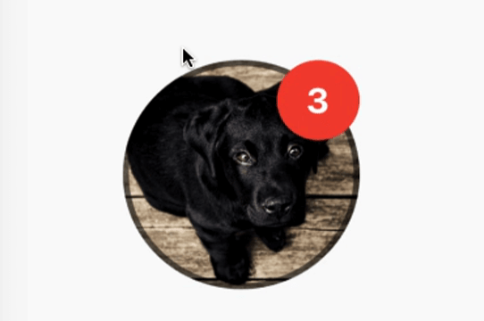
네트워크에서 이미지를 가져와서 원형 프로필 사진을 표시하는 간단한 위젯이며, 이미지가 로드되는 동안 원형 진행률 인디케이터를 표시합니다. 또한 알림 버블을 표시할 수 있는 기능도 있습니다.

{"sdk":"flutter"}^3.4.0{"sdk":"flutter"}아래는 영문 원문 스냅샷입니다. 최신 내용은 GitHub에서 확인하세요.
A simple widget that display round profile picture where the picture is fetched from network and displays circular progress indicator whilst the image is being loaded. Also, has the ability to display notification bubble.
https://raw.githubusercontent.com/zeshanghayoomi/flutter_user_profile_avatar/master/repo_assets/simulator.gif
UserProfileAvatar(
        avatarUrl: 'https://picsum.photos/id/237/5000/5000',
        onAvatarTap: () {
          print('Avatar Tapped..');
        },
        notificationCount: 10,
        notificationBubbleTextStyle: TextStyle(
          fontSize: 30,
          color: Colors.white,
          fontWeight: FontWeight.bold,
        ),
        avatarSplashColor: Colors.purple,
        radius: 100,
        isActivityIndicatorSmall: false,
        avatarBorderData: AvatarBorderData(
          borderColor: Colors.white,
          borderWidth: 5.0,
        ),
      )
onAvatarTap
Use this to perform any action when the avatar gets tapped.
notificationCount
Pass an int to display the notification bubble. 99+ gets displayed if notification count was larger than 100.
notificationBubbleTextStyle
Used to style the notification count, if null then the default one will be applied.
avatarSplashColor
Splash color when user taps on the avatar.
radius
Use this to size the avatar.
isActivityIndicatorSmall
use this to display small/large circular progress indicator (native) when image is loading, default is true.