animated_botton_navigation
GitHub license
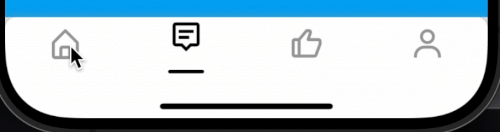
An animated bottom navigation bar for Flutter, designed to provide a smooth and visually appealing transition between tabs.
preview
Animation
Features
- Animated navigation bar with customizable animations.
- Customizable colors for selected and unselected icons.
- Customizable indicator and item decorations.
- Supports custom heights for the navigation bar.
- Allows setting custom
BoxDecoration for the bottom navigation bar and its items.
Getting started
Add the dependency to your pubspec.yaml file:
dependencies:
  ...
  animated_bottom_navigation: [latest version]
Basic Usage
import 'package:flutter/material.dart';
import 'package:animated_botton_navigation/animated_botton_navigation.dart';

void main() {
  runApp(MyApp());
}

class MyApp extends StatelessWidget {
  @override
  Widget build(BuildContext context) {
    return MaterialApp(
      home: HomeScreen(),
    );
  }
}

class HomeScreen extends StatefulWidget {
  @override
  _HomeScreenState createState() => _HomeScreenState();
}

class _HomeScreenState extends State<HomeScreen> {
  int _currentIndex = 0;

  final List<Widget> _pages = [
    Center(child: Text('Home Page')),
    Center(child: Text('Search Page')),
    Center(child: Text('Profile Page')),
  ];

  @override
  Widget build(BuildContext context) {
    return Scaffold(
      appBar: AppBar(
        backgroundColor: Colors.black,
        title: Text('Animated botton navigation'),
      ),
      body: _pages[_currentIndex],
      bottomNavigationBar: AnimatedBottomNavigation(
        height: 70,
        indicatorSpaceBotton: 25,
        icons: [
          Icons.home,
          Icons.search,
          Icons.person,
        ],
        currentIndex: _currentIndex,
        onTapChange: (index) {
          setState(() {
            _currentIndex = index;
          });
        },
      ),
    );
  }
}
Parameters
icons: A list of icons to be displayed in the bottom navigation bar.onTapChange: This is required for change pages you can see example to better use of that.currentIndex: This parameter allows you to control the currently selected tab index.iconSize: The height of icon.backgroundColor: The background color of the bottom navigation bar.selectedColor: The color of the selected icon.unselectedColor: The color of unselected icons.animationDuration: The duration of the tab transition animation.animationIndicatorCurve: The curve used for the tab transition animation for indicator.animationIconCurve: The curve used for the tab transition animation for icons.indicatorDecoration: Decoration for the indicator that shows the selected tab.itemDecoration: Decoration for the individual navigation items.bottonNavigationDecoration: Decoration for the bottom navigation bar.height: The height of the bottom navigation bar.indicatorHeight: The height of the indicator.indicatorSpaceBotton: The space between the indicator and the bottom of the bar.
LinkedIn
Connect with me on LinkedIn


 v0.0.8