
 v0.1.0
popup_card
Forma simples de mostrar algumas informações ao usuário quando for necessário um input.
51Curtidas 270Downloads em 30 dias130Pontos Pub
AndroidiOSWebmacOSWindowsLinux
Pacote simples para exibir um widget de cartão suspenso.

{"sdk":"flutter"}{"sdk":"flutter"}Texto original em inglês. Visite o GitHub para a versão atual.
GitHub issues GitHub stars GitHub forks
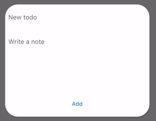
An awesome and simple card-styled dialog with a beautiful animation.
screenshot
There are many similar dialog projects that display a dialog, but popup_card features a beautiful transition, Hero style.
Follow these steps and you will be up and running in no time!
dependencies:
  popup_card: [latest_version]
flutter pub get in terminal.popup_card works in two steps: you wrap the widget with the package's custom gesture detector, and then provide it some info
with a popUp property to display the actual popup item.
PopUpItemDetector and provide it with a tag:PopupItemLauncher(
tag: 'test',
child: Material(
color: Colors.white,
elevation: 2,
shape:
RoundedRectangleBorder(borderRadius: BorderRadius.circular(32)),
child: const Icon(
Icons.add_rounded,
size: 56,
),
),
popUp: ...
),
popUp: PopUpItem(
        padding: EdgeInsets.all(8), // Padding inside of the card
        color: Colors.white, // Color of the card
        shape: RoundedRectangleBorder(borderRadius: BorderRadius.circular(32)), // Shape of the card
        elevation: 2, // Elevation of the card
        tag: 'test', // MUST BE THE SAME AS IN `PopupItemLauncher`
        child: PopUpItemBody(), // Your custom child widget.
      ),
Contributions are what make the open source community such an amazing place to be learn, inspire, and create. Any contributions you make are greatly appreciated.
git checkout -b feature/AmazingFeature)git commit -m 'Add some AmazingFeature')git push origin feature/AmazingFeature)Distributed under the MIT License. See LICENSE for more information.