
multi_select_flutter
Um pacote flexível de seleção múltipla para Flutter. Crie widgets de seleção múltipla do jeito que quiser.
- Estrelas
- 240
- Forks
- 227
- Último push (UTC)
- 26 de jul. de 2024
- Status do projeto
- Ativo
README original
Texto original em inglês. Visite o GitHub para a versão atual.
Multi Select Flutter

Multi Select Flutter is a package for creating multi-select widgets in a variety of ways.
 Dialog |
 BottomSheet |
 ChoiceChip |
|---|
Features
- Supports FormField features like validator.
- Neutral default design.
- Dialog, BottomSheet, or ChoiceChip style widgets.
- Make your multi select
searchablefor larger lists.
Usage
MultiSelectDialogField / MultiSelectBottomSheetField


These widgets provide an InkWell button which open the dialog or bottom sheet and are equipped with FormField features. You can customize it using the provided parameters.
To store the selected values, you can use the onConfirm parameter. You could also use onSelectionChanged for this.
By default these widgets render a MultiSelectChipDisplay below the field. This can be overridden with the chipDisplay parameter or removed completely by using chipDisplay: MultiSelectChipDisplay.none().
MultiSelectDialogField(
  items: _animals.map((e) => MultiSelectItem(e, e.name)).toList(),
  listType: MultiSelectListType.CHIP,
  onConfirm: (values) {
    _selectedAnimals = values;
  },
),
MultiSelectDialog / MultiSelectBottomSheet


If you prefer to create your own button for opening the dialog or bottom sheet, you may do so and then make a call to a function like this:
MultiSelectDialog can be used in the builder of showDialog().
void _showMultiSelect(BuildContext context) async {
  await showDialog(
    context: context,
    builder: (ctx) {
      return  MultiSelectDialog(
        items: _items,
        initialValue: _selectedAnimals,
        onConfirm: (values) {...},
      );
    },
  );
}
MultiSelectBottomSheet can be used in the builder of showModalBottomSheet().
void _showMultiSelect(BuildContext context) async {
  await showModalBottomSheet(
    isScrollControlled: true, // required for min/max child size
    context: context,
    builder: (ctx) {
      return  MultiSelectBottomSheet(
        items: _items,
        initialValue: _selectedAnimals,
        onConfirm: (values) {...},
        maxChildSize: 0.8,
      );
    },
  );
}
MultiSelectChipDisplay

To display the selected items, this widget can be used alongside your own button or it can be specified as a chipDisplay parameter of widgets like MultiSelectDialogField.
You can also remove items from the source list in the onTap function.
MultiSelectChipDisplay(
  items: _selectedAnimals.map((e) => MultiSelectItem(e, e)).toList(),
  onTap: (value) {
    setState(() {
      _selectedAnimals.remove(value);
    });
  },
),
A MultiSelectChipDisplay that is part of a MultiSelectDialogField still renders outside the BoxDecoration of the MultiSelectDialogField as seen here:
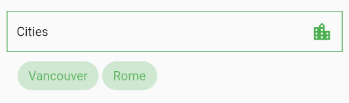
If you want to encapsulate the MultiSelectChipDisplay, wrap the MultiSelectDialogField in a Container and apply the decoration to that instead:
Container(
  decoration: BoxDecoration(...),
  child: MultiSelectDialogField(
    items: _items,
    chipDisplay: MultiSelectChipDisplay(...),
  ),
),
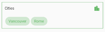
MultiSelectChipField
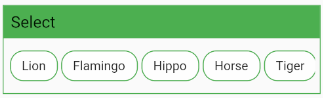
This widget is similar to MultiSelectChipDisplay, except these chips are the primary interface for selecting items.
MultiSelectChipField<Animal>(
  items: _items,
  icon: Icon(Icons.check),
  onTap: (values) {
    _selectedAnimals = values;
  },
),
Using itemBuilder to create custom items:
MultiSelectChipField<Animal>(
  items: _items,
  key: _multiSelectKey,
  validator: (values) {...}
  itemBuilder: (item, state) {
    // return your custom widget here
    return InkWell(
      onTap: () {
        _selectedAnimals.contains(item.value)
			      ? _selectedAnimals.remove(item.value)
			      : _selectedAnimals.add(item.value);
	      state.didChange(_selectedAnimals);
	      _multiSelectKey.currentState.validate();
	    },
	    child: Text(item.value.name),
    );
  },
),
The itemBuilder param takes a function that will create a widget for each of the provided items.
In order to use validator and other FormField features with custom widgets, you must call state.didChange(_updatedList) any time the list of selected items is updated.
Using scrollControl to auto scroll:
MultiSelectChipField(
  items: _items,
  scrollControl: (controller) {
    _startAnimation(controller);
  },
)

// waits 5 seconds, scrolls to end slow, then back fast
void _startAnimation(ScrollController controller) {
  // when using more than one animation, use async/await
  Future.delayed(const Duration(milliseconds: 5000), () async {
    await controller.animateTo(
      controller.position.maxScrollExtent,
      duration: Duration(milliseconds: 8000),
      curve: Curves.linear);

    await controller.animateTo(
      controller.position.minScrollExtent,
      duration: Duration(milliseconds: 1250),
      curve: Curves.fastLinearToSlowEaseIn);
  });
}
Contributing
Pull requests are welcome. For major changes, please open an issue first to discuss what you would like to change.

CHB61 ↗
Dependências usadas
Lista de dependências 3 itens
- flutter
{"sdk":"flutter"} - collection
^1.15.0 - flutter_testDesenvolvimento
{"sdk":"flutter"}
Como escolher um repositório para seu projeto?
Filtre pelo caso de uso, compare a atividade e confira o projeto original antes de adotá-lo.
- Busque por nome, autor ou descrição e filtre por tema.
- Compare estrelas, forks e envios recentes. Estrelas indicam interesse, mas não garantem qualidade.
- Confira o README, a licença e as issues no GitHub antes de usar o projeto.
Fontes e manutenção
“A repository is the most basic element of GitHub.”
GitHub Docs — About repositories ↗