
 v2.0.2
selection_menu
Um menu de seleção/personalização altamente personalizável, que abre/fecha com um toque no gatilho, opcionalmente fornece busca.
71Curtidas 192Downloads em 30 dias70Pontos Pub
Plataformas indisponíveis
Um widget do Flutter altamente personalizável para selecionar um item de uma lista de itens.

{"sdk":"flutter"}{"sdk":"flutter"}Texto original em inglês. Visite o GitHub para a versão atual.
A highly customizable selection/select menu to choose an item from a list, with optional search feature.
The package provides two libraries:
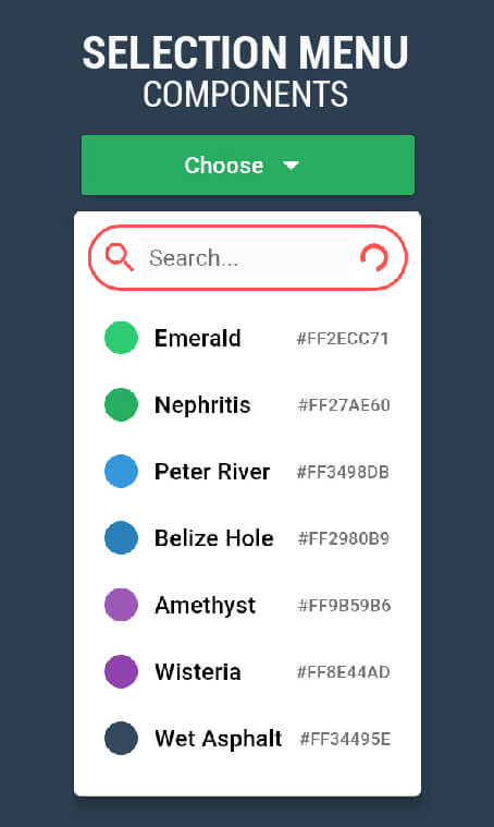
The image shows the same SelectionMenu Widget with three different ComponentsConfigurations.
Select Menu in different styles
import 'package:selection_menu/selection_menu.dart';

SelectionMenu<String>(
    itemsList: <String>['A','B','C'],
    onItemSelected: (String selectedItem)
    {
      print(selectedItem);
    },
    itemBuilder: (BuildContext context, String item, OnItemTapped onItemTapped)
    {
       return Material(
         InkWell(
           onTap: onItemTapped,
           child: Text(item),
         ),
       );
    },
    // other Properties...
);
Using A ComponentsConfiguration
import 'package:selection_menu/selection_menu.dart';

// IMPORT this package to get access to configuration classes.
import 'package:selection_menu/components_configurations.dart';

SelectionMenu<String>(
  itemsList: <String>['A','B','C'],
  onItemSelected: (String selectedItem)
  {
    print(selectedItem);
  },
  itemBuilder: (BuildContext context, String item, OnItemTapped onItemTapped)
  {
    return Material(
      InkWell(
        onTap: onItemTapped,
        child: Text(item),
      ),
    );
  },
  componentsConfigurations: DropdownComponentsConfigurations<String>(),
);
The menu is divided into parts called Components which allows to
change one part while the others remain intact.
A ComponentsConfiguration is simply a container for all Components
and configurations.
Reading the examples is recommended because there are a lot of things to cover and an intro page shouldn't be that long.
A series of examples can be found here.
You may make changes and open pull requests on GitHub. :)