
 v1.1.1
flutter_multiple_loaders
Um pacote Flutter que fornece uma coleção de animações de carregamento personalizáveis para seus aplicativos Flutter.
26Curtidas 3 milDownloads em 30 dias160Pontos Pub
AndroidiOSWebmacOSWindowsLinux
Mahesh-Langote/flutter_multiple_loaders open-source repository details.

{"sdk":"flutter"}{"sdk":"flutter"}^5.0.0Texto original em inglês. Visite o GitHub para a versão atual.
https://pub.dev/packages/flutter_multiple_loaders
A Flutter package providing a collection of customizable loading animations for your Flutter applications.
https://img.shields.io/codefactor/grade/github/mahesh-langote/flutter_multiple_loaders/main https://img.shields.io/github/license/Mahesh-Langote/flutter_multiple_loaders?style=flat-square https://img.shields.io/pub/points/flutter_multiple_loaders?style=flat-square https://img.shields.io/pub/v/flutter_multiple_loaders?style=flat-square
Experience all the loaders in action: Flutter Multiple Loaders Demo
This package includes multiple loading animation styles with customizable properties:
MultipleLoaders.showOverlay — One-line modal loading barrier that blocks user interaction during async tasksLoaderFutureBuilder<T> — Drop-in FutureBuilder wrapper that auto-shows a loader while waitingAll loaders feature:
| Loader | Preview | Loader | Preview |
|---|---|---|---|
| Spinner Loader | Spinner Loader | Pulse Loader | Pulse Loader |
| Bounce Loader | Bounce Loader | Wave Loader | Wave Loader |
| Circle Loader | Circle Loader | Dots Loader | Dots Loader |
| Rotating Square Loader | Rotating Square Loader | Glowing Loader | Glowing Loader |
| Typing Loader | Typing Loader | Ripple Loader | Ripple Loader |
| HeartBeat Loader | Heartbeat Loader | Hourglass Loader | (screenshot coming soon) |
| Clock Loader | (screenshot coming soon) |
| Loader | Preview | Loader | Preview |
|---|---|---|---|
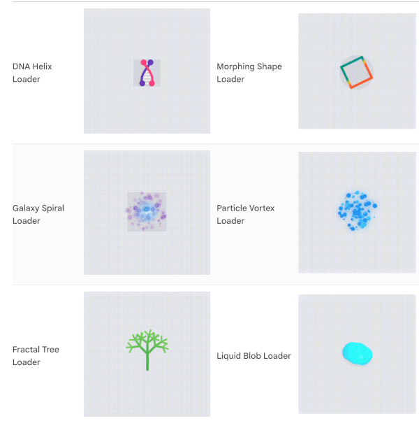
| DNA Helix Loader | DNA Helix Loader | Morphing Shape Loader | Morphing Shape Loader |
| Galaxy Spiral Loader | Galaxy Spiral Loader | Particle Vortex Loader | Particle Vortex Loader |
| Fractal Tree Loader | Fractal Tree Loader | Liquid Blob Loader | Liquid Blob Loader |
| Flipping Card Loader | Flipping Card Loader |
Add the dependency to your pubspec.yaml:
dependencies:
  flutter_multiple_loaders: ^1.1.0
Then run:
flutter pub get
Import the package:
import 'package:flutter_multiple_loaders/flutter_multiple_loaders.dart';
Use any of the loaders with default options:
// Simple spinner animation
SpinnerLoader();

// Pulse animation
PulseLoader();

// Bounce animation
BounceLoader();

// Wave animation
WaveLoader();

// Circle animation
CircleLoader();

// Blinking animation with different shapes
BlinkingLoader();  // default is circle

// Book animation
PageTurningLoader(
  pageCount: 20,
  options: LoaderOptions(
    color: Colors.indigo,
    secondaryColor: Colors.indigoAccent,
    tertiaryColor: Colors.white,
    durationMs: 3500,
  ),
);

// Heartbeat animation
HeartbeatLoader(
  pulseIntensity: 0.4,
  options: LoaderOptions(
    color: Colors.red,
    size: LoaderSize.large,
    durationMs: 2000,
  ),
);

// Hourglass animation (new in 1.1.0)
HourglassLoader(
  options: LoaderOptions(
    color: Colors.amber,
    secondaryColor: Colors.amber.withOpacity(0.35),
    size: LoaderSize.large,
    strokeWidth: 3.0,
    durationMs: 2400,
  ),
);

// Clock animation (new in 1.1.0)
ClockLoader(
  options: LoaderOptions(
    color: Colors.deepPurple,
    secondaryColor: Colors.deepPurpleAccent,
    size: LoaderSize.large,
    strokeWidth: 3.0,
    durationMs: 3000,
  ),
);
Display a full-screen loading barrier that blocks user interaction during async tasks:
// Show the overlay
MultipleLoaders.showOverlay(
  context,
  loader: const SpinnerLoader(
    options: LoaderOptions(
      color: Colors.white,
      size: LoaderSize.large,
    ),
  ),
);

// Perform your async work...
await myLongRunningTask();

// Hide the overlay
MultipleLoaders.hideOverlay(context);
A drop-in replacement for FutureBuilder that automatically shows a loader while the future is pending:
LoaderFutureBuilder<String>(
  future: myNetworkRequest(),
  loader: const CircleLoader(
    options: LoaderOptions(
      color: Colors.teal,
      size: LoaderSize.large,
      strokeWidth: 4.0,
    ),
  ),
  builder: (context, data) {
    // Only called when the future completes successfully!
    return Text('Loaded: $data');
  },
)
All loaders accept custom options through the LoaderOptions class:
SpinnerLoader(
  options: LoaderOptions(
    color: Colors.purple,
    size: LoaderSize.large,
    durationMs: 1000,
    loop: true,
  ),
);

// Multi-colored wave loader
WaveLoader(
  barCount: 5,
  options: LoaderOptions(
    color: Colors.blue,
    secondaryColor: Colors.green,
    tertiaryColor: Colors.orange,
    size: LoaderSize.medium,
  ),
);
Use the LoaderController to control the animation:
class _MyWidgetState extends State<MyWidget> {
  final LoaderController _controller = LoaderController();

  @override
  Widget build(BuildContext context) {
    return Column(
      children: [
        SpinnerLoader(controller: _controller),

        ElevatedButton(
          onPressed: () => _controller.start(),
          child: Text('Start'),
        ),

        ElevatedButton(
          onPressed: () => _controller.stop(),
          child: Text('Stop'),
        ),

        ElevatedButton(
          onPressed: () => _controller.reset(),
          child: Text('Reset'),
        ),
      ],
    );
  }
}
The package includes a complete example app that demonstrates all loaders with interactive controls for customization. The example app allows you to:
Check the example folder for more detailed usage examples.
Contributions are welcome! Feel free to open an issue or submit a pull request.
This package is licensed under the MIT License - see the LICENSE file for details.