
 v1.1.1
horizontal_card_pager
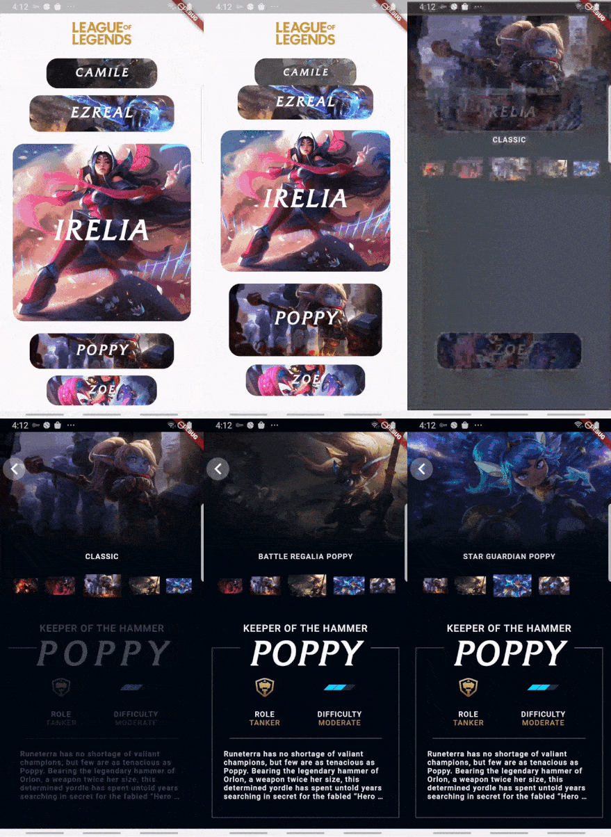
Use rolagens de visualização de cartões dinâmicos e bonitos (direção horizontal) para ajudá-lo a criar ótimos aplicativos.
173Curtidas 47Downloads em 30 dias140Pontos Pub
AndroidiOSWebmacOSWindowsLinux
Use rolagens de visualização de cartões dinâmicos e bonitos (direção horizontal) para ajudá-lo a criar ótimos aplicativos.

{"sdk":"flutter"}{"sdk":"flutter"}Texto original em inglês. Visite o GitHub para a versão atual.
Use dynamic and beautiful card view pagers (horizontal direction) to help you create great apps.
Add dependency to pubspec.yaml
Get the latest version in the 'Installing' tab on pub.dartlang.org
dependencies:
    horizontal_card_pager: ^1.1.1
import 'package:horizontal_card_pager/horizontal_card_pager.dart';
import 'package:horizontal_card_pager/card_item.dart';
HorizontalCardPagerWith optional parameters
HorizontalCardPager(
    initialPage : 2 // default value is 2
    onPageChanged: (page) => print("page : $page"),
    onSelectedItem: (page) => print("selected : $page"),
    items: { ... },  // set ImageCardItem or IconTitleCardItem class
))
CardItem object in items parameter in HorizontalCardPagerIf the contents of the card contain only images, use the ImageCardItem class. and If the contents of the card include an icon and a title, use the IconTitleCardItem class.
| Image | Icon & Text |
|---|---|
| imagetype | icontitletype |
ImageCardItem
class ImageCarditem extends CardItem {
  final Widget image;

  ImageCarditem({this.image});
}
IconTitleCardItemclass IconTitleCardItem extends CardItem {
final IconData iconData;
final String text;
final Color selectedBgColor;
final Color noSelectedBgColor;
final Color selectedIconTextColor;
final Color noSelectedIconTextColor;
IconTitleCardItem(
{this.iconData,
this.text,
this.selectedIconTextColor = Colors.white,
this.noSelectedIconTextColor = Colors.grey,
this.selectedBgColor = Colors.blue,
this.noSelectedBgColor = Colors.white});
}
Check out the example app in the example directory or the 'Example' tab on pub.dartlang.org for a more complete example.
This package's animation is inspired from from this Dribbble art.