
 v0.1.0
dropdown_overlay
Um componente Dropdown habilitado com personalização total da interface e controle programático: abrir/fechar/selecionar/pesquisar/carregar
7Curtidas 725Downloads em 30 dias160Pontos Pub
AndroidiOSWebmacOSWindowsLinux
Um componente de interface do usuário do Flutter para criar um menu suspenso e controlá-lo programaticamente.

{"sdk":"flutter"}{"sdk":"flutter"}^2.0.0Texto original em inglês. Visite o GitHub para a versão atual.
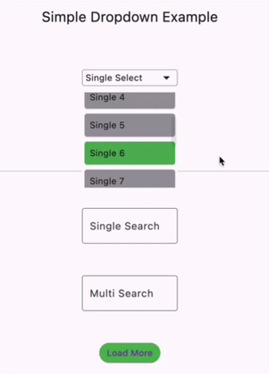
A Flutter package that provides a simple way to create a customized Dropdown widget.
Support Dropdown customization
DropdownMenuPositionSimpleDropdown.customControl the Dropdown programmatically via DropdownController
Searchable Dropdown. See example
Loading items synchronously/asynchronously via DropdownController.
import 'package:dropdown_overlay/dropdown_overlay.dart';
SimpleDropdown /// The widget that will be used to trigger the dropdown.
/// It can be a button, a text field, or any other widget.
///
/// if [enabled] is true, the widget will be interactive automatically to open and dismiss the dropdown menu
/// when tapping inside/outside of the dropdown button/trigger;
///
/// otherwise, you need to call [DropdownController.open] and [DropdownController.dismiss] manually.
final WidgetBuilder builder;
/// The controller that will be used to manage the dropdown menu and items.
///
/// See also:
/// * [DropdownController.single]
/// * [DropdownController.multi]
final DropdownController<T> controller;
/// Delegate that will be used to build the dropdown menu.
///
/// See also:
/// * [ListViewMenuBuilderDelegate]
/// * [CustomMenuBuilderDelegate]
final DropdownMenuBuilderDelegate<T> delegate;
/// The decoration that will be used to decorate the dropdown menu.
/// It only takes effect when the menu is displaying.
///
/// See also:
/// * [OverlayedDropdownMenu], the dropdown menu widget used to display the items.
final BoxDecoration? menuDecoration;
/// The constraints that will be used to constrain the dropdown menu.
/// It only takes effect when the menu is displaying.
/// It will work with [crossAxisConstrained] to constrain the dropdown menu if applicable.
final BoxConstraints? menuConstraints;
/// The position that will be used to position the dropdown menu.
///
/// See also
/// * [DropdownMenuPosition]
final DropdownMenuPosition menuPosition;
/// Whether the dropdown menu should be constrained by the cross axis of the dropdown trigger.
/// It will work with [menuConstraints] to constrain the dropdown menu if applicable.
/// It only takes effect when the menu is displaying.
///
/// Typically, it is specific if the dropdown menu should have the same width as the dropdown trigger.
final bool crossAxisConstrained;
/// Whether the dropdown menu should be dismissed when the user taps outside of both it and the dropdown button.
final bool dismissible;
/// if true, the dropdown will be interactive automatically;
/// otherwise, you need to call [DropdownController.open] and [DropdownController.dismiss] manually.
final bool enabled;
/// Whether the dropdown button/trigger built from [builder] should listen to the controller.
/// As a result, the button [builder] will be rebuilt when [DropdownController] changes, like selected items
final bool enableListen;
SimpleDropdown.list SimpleDropdown.list({
super.key,
required this.builder,
required this.controller,
this.menuConstraints,
this.menuDecoration,
this.enableListen = true,
this.menuPosition = const DropdownMenuPosition(),
this.crossAxisConstrained = true,
this.dismissible = true,
this.enabled = true,
/// The builder that will be used to build the items in the dropdown menu.
required MenuItemBuilder<T> itemBuilder,
/// The builder that will be used to build the separator in the dropdown menu.
/// it would use [LiveView.separated] internally to build the dropdown menu if provided.
IndexedWidgetBuilder? separatorBuilder,
/// The builder that will be used to build the loading indicator in the dropdown menu.
/// Default to a [CircularProgressIndicator] if not provided.
WidgetBuilder? loadingBuilder,
/// The builder that will be used to build the empty list indicator in the dropdown menu.
/// Default to Text("No items") if not provided.
WidgetBuilder? emptyListBuilder,
}) : delegate = ListViewMenuBuilderDelegate<T>(
itemBuilder: itemBuilder,
position: menuPosition,
separatorBuilder: separatorBuilder,
loadingBuilder: loadingBuilder,
emptyListBuilder: emptyListBuilder,
);
SimpleDropdown.custom SimpleDropdown.custom({
super.key,
required this.builder,
required this.controller,
/// The builder that will be used to build the dropdown menu.
required DropdownMenuBuilder<T> menuBuilder,
this.menuConstraints,
this.menuDecoration,
this.enableListen = true,
this.menuPosition = const DropdownMenuPosition(),
this.crossAxisConstrained = true,
this.dismissible = true,
this.enabled = true,
}) : delegate = CustomMenuBuilderDelegate<T>(menuBuilder);
DropdownController /// A single selection dropdown controller.
///
/// [unselectable] indicates whether the selected item can be unselected,
/// if true, either tapping the same selected item or [select] null item will unselect it;
/// otherwise, it will be ignored.
///
/// Only one item can be selected at a time.
factory DropdownController.single({
// Default is false.
bool? unselectable,
/// The initial items that will be shown in the dropdown menu,
/// but you can only set one of them as selected.
List<DropdownItem<T>>? items,
}) = SingleSelectionDropdownController;
  /// A multiple selection dropdown controller.
  ///
  /// [unselectable] indicates whether the selected item can be unselected,
  /// if true, tapping the same selected item will unselect it;
  /// otherwise, it will be ignored.
  factory DropdownController.multi({
    // Default is false.
    bool? unselectable,

    /// The initial items that will be shown in the dropdown menu,
    /// you can set multiple of them as selected.
    List<DropdownItem<T>>? items,
  }) = MultiSelectionDropdownController;
void open({VoidCallback? onOpened}): open the dropdown menu
void dismiss({VoidCallback? onDismissed}): dismiss the dropdown menu
void rebuildMenu() : refresh the dropdown menu if it is opened
void dispose(): dispose the controller
void select(T? value, {bool dismiss = true, bool refresh = true}): mark the item's as selected
dismiss: whether to dismiss the dropdown menu no matter if the value is selected or notrefresh: whether to refresh the dropdown menu after the value is selectedDropdownItem<T>? getLastSelected(): get the last selected item
List<DropdownItem<T>> getAllSelectedItems(): get all selected items
Future<void> load(DropdownItemLoader<T> loader, {bool replace = false, bool Function(Object)? onException}): load items from the loader
replace: whether to replace the current items with the loaded items. If not, the loaded items will be appended to the current items.onException: a callback to handle the exception thrown by the loadervoid search<K extends Object>(K query, {required DropdownItemMatcher<K, T> matcher}): search the items by the query
matcher: a function to match the query with each item.void setItems(List<DropdownItem<T>> items, {bool replace = false, bool rebuild = true}): set the items to the controller
replace: whether to replace the current items with the new items.
rebuild: whether to rebuild the dropdown menu after the items are set.void setAsHistoryItems(Object key, List<DropdownItem<T>> items,{bool rebuild = false}): set the items as an history entry and place it on the top of the history entries, like search history
key: the key to identify the history itemsrebuild: whether to rebuild the dropdown menu after the items are set.void restore({bool onlyOnce = false}): restore the initial and loaded items.
onlyOnce: if true, only pop the top history entry; otherwise, it will clear all history entries to show the initial and loaded items.