
 v0.0.2
rounded_tabbar_widget
Um pacote simples do Flutter para criar um layout TabBarView com TabBar personalizado.
18Curtidas 11Downloads em 30 dias140Pontos Pub
AndroidiOSWebmacOSWindowsLinux
Um pacote simples do Flutter para criar um layout TabBarView com TabBar personalizado.

{"sdk":"flutter"}{"sdk":"flutter"}Texto original em inglês. Visite o GitHub para a versão atual.
Language: English
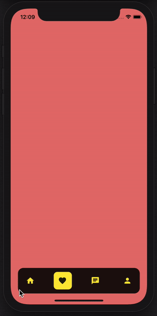
A simple flutter package for creating a TabBarView layout with custom Tabbar.
Technical Notes: The layout for pages is built using TabbarView and layout of Tab buttons is customised. This package supports pages to be scrolled too.
https://github.com/TeaTalkInternal/github_assets/blob/master/gifs/rounded_tabbar_2.gif
the usage is very simple, just use the following
 RoundedTabbarWidget(
      tabIcons: [
        Icons.home,
        Icons.favorite,
        Icons.chat,
        Icons.person,
      ],
      pages: [
        HomePageWidget(),
        FavoritePageWidget(),
        MessagesPageWidget(),
        ProfilePageWidget(),
      ],
      selectedIndex: 0,
      onTabItemIndexChanged: (int index) {
        print('Index: $index');
      },
    ),
| parameter | description | default |
|---|---|---|
| onTabItemIndexChanged | Completion Handler which returns index of current tab page | (int index) {} |
| tabIcons | List of Tab Icons | Pass List of IconData parameter |
| pages | List of Tab Pages | Pass List of Tab widgets parameter |
| selectedIndex | Index of tab page to be shown selected initially | This is a optional parameter |
| itemNormalColor | Color of Tabbar item for normal state | This is a optional parameter |
| itemSelectedColor | Color of Tabbar item for selected state | This is a optional parameter |
| tabBarBackgroundColor | Background color of Tabbar | This is a optional parameter |
Please note the number of pages and tabIcons should be equal.