
 v1.0.1
iconify_design
Um pacote Flutter que permite usar ícones da API do iconify.design com facilidade.
21Curtidas 361Downloads em 30 dias160Pontos Pub
AndroidiOSWebmacOSWindowsLinux
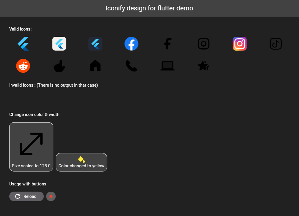
Um pacote Flutter que permite usar ícones da API Iconify.design com facilidade. Este pacote fornece um widget chamado IconifyIcon que recebe uma string de ícone e, opcionalmente, permite especificar o tamanho e a cor do ícone.

^2.2.3^0.10.1^2.0.10+1^5.5.0+1{"sdk":"flutter"}{"sdk":"flutter"}^2.0.0Texto original em inglês. Visite o GitHub para a versão atual.
A Flutter package that allows you to use icons from the Iconify.design API with ease. This package provides a widget called IconifyIcon that takes an icon string and optionally allows you to specify the size, color, placeholder, and error widget of the icon.
iconify-design
Add the following to your pubspec.yaml file:
dependencies:
  iconify_design: ^1.0.2
Then run:
flutter pub get
import 'package:iconify_design/iconify_design.dart';
import 'package:flutter/material.dart';
Here is an example of how to use the IconifyIcon widget:
import 'package:flutter/material.dart';
import 'package:iconify_design/iconify_design.dart';

void main() {
  runApp(MyApp());
}

class MyApp extends StatelessWidget {
  @override
  Widget build(BuildContext context) {
    return MaterialApp(
      home: Scaffold(
        appBar: AppBar(
          title: Text('Iconify Flutter Example'),
        ),
        body: Center(
          child: IconifyIcon(
            icon: 'mdi:home',
            size: 48.0,
            color: Colors.blue,
            placeholder: CircularProgressIndicator(),
            errorWidget: Icon(
              Icons.error_outline,
              color: Colors.red,
            ),
          ),
        ),
      ),
    );
  }
}
The IconifyIcon widget has the following parameters:
null also falls back to Black.You can customize the loading and error states:
IconifyIcon(
  icon: 'mdi:home',
  placeholder: const SizedBox(
    width: 24,
    height: 24,
    child: CircularProgressIndicator(strokeWidth: 2),
  ),
  errorWidget: const Icon(
    Icons.error_outline,
    color: Colors.red,
  ),
)
Feel free to open issues or submit pull requests to help improve this package.
This project is licensed under the MIT License - see the LICENSE file for details.
Don't forget to support (if you can).