
 v0.0.7
dialogs
Este pacote Flutter fornece diálogos cuidadosamente projetados com opções de personalização.
26Curtidas 87Downloads em 30 dias130Pontos Pub
AndroidiOSWebmacOSWindowsLinux
diálogos

{"sdk":"flutter"}{"sdk":"flutter"}Texto original em inglês. Visite o GitHub para a versão atual.
This flutter package provides aesthetically designed dialog box with customization options.
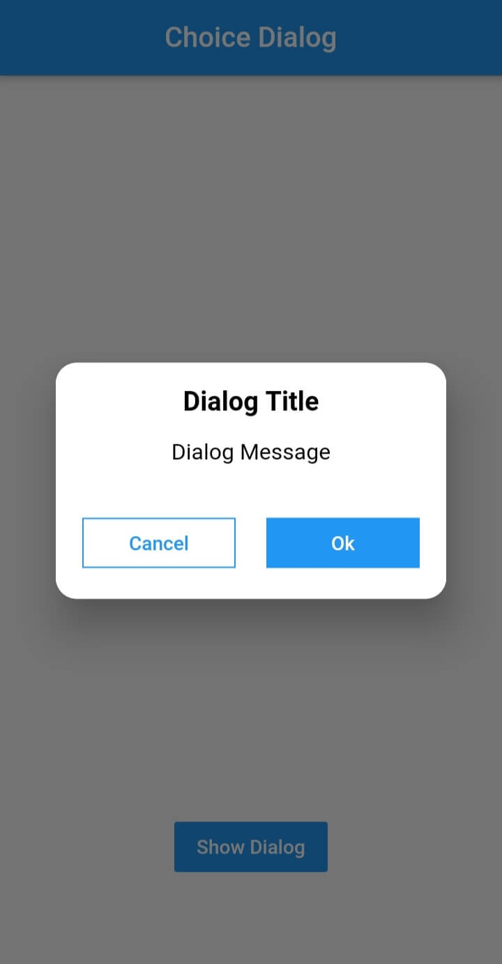
legacy_progress_dialogChoice Dialog Choice Dialog Rectangular Choice Dialog Rectangular Buttons
Message Dialog Gif Message Dialog Message Dialog
Pub Version GitHub Workflow Status Github Stars GitHub
To use this plugin, add dialogs as a
dependency in your pubspec.yaml file.
import 'package:dialogs/dialogs.dart';ChoiceDialog().show() function to display the dialog.
ChoiceDialog().show(context);
##OR
final choiceDialog = ChoiceDialog();
choiceDialog.show(context);
MessageDialog().show() function and call the Choice Dialog .
MessageDialog().show(context);
final messageDialog = MessageDialog();
choiceDialog.show(context);
//Create an instance of ProgressDialog
ProgressDialog progressDialog = ProgressDialog(
                  context: context,
                  backgroundColor: Colors.blue,
                  textColor: Colors.White,
                );
// show dialog
progressDialog.show();

//close dialog
progressDialog.dismiss();
In order to add the ChoiceDialog, MessageDialog to your app, there are several attributes that are important parameters that you might need frequently:
| Attribute | Type | Default | Required | Description |
|---|---|---|---|---|
buttonOkOnPressed |
Function() |
Navigator.pop(context) |
No |
This function will be registered as the callback of 'Ok' button. |
buttonCancelOnPressed |
Function() |
Navigator.pop(context) |
No |
This function will be registered as the callback of 'Cancel' button. |
dialogRadius |
double |
15.0 |
No |
Determines the borderRadius of dialog box. |
buttonRadius |
double |
18.0 |
No |
Determines the borderRadius of action buttons. |
iconButtonOk |
Icon |
null |
No |
Renders a FlatButton with the provided icon for positive action. |
iconButtonCancel |
Icon |
null |
No |
Renders a FlatButton with the provided icon for negative action. |
show() also provides some useful parameters of showDialog() function
| Attribute | Type | Default | Required | Description |
|---|---|---|---|---|
context |
BuildContext |
Null |
Yes |
The context argument is used to look up the Navigator and Theme for the dialog. |
barrierDismissible |
bool |
true |
No |
Indicates whether tapping on the barrier will dismiss the dialog. |
barrierColor |
Color |
Colors.black54 |
No |
Specifies the color of the modal barrier that darkens everything below the dialog. |
Made with contributors-img.