
 v0.0.6
flutter_tabbar_lite
FlutterTabBarLite é um widget de barra de guias personalizado com animações, recursos horizontais e verticais.
7Curtidas 68Downloads em 30 dias145Pontos Pub
AndroidiOSWebmacOSWindowsLinux
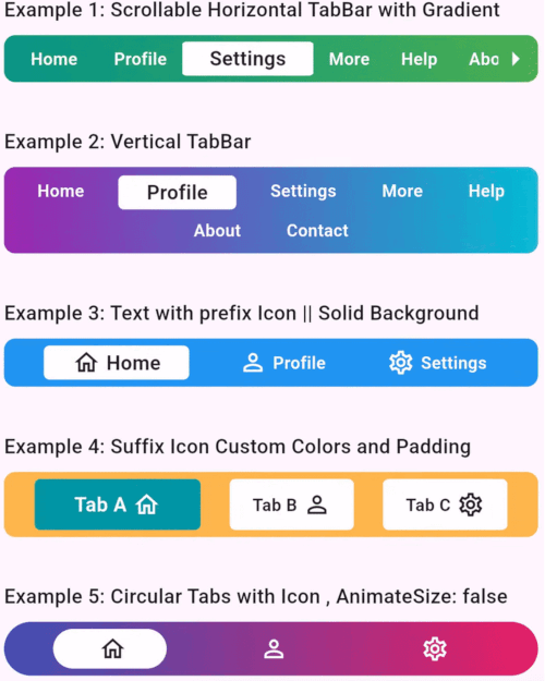
Um widget de barra de guias totalmente personalizável e animado para aplicativos Flutter. Projetado para tornar a navegação intuitiva e visualmente atraente, este pacote é perfeito para criar interfaces de guias modernas e dinâmicas.

{"sdk":"flutter"}{"sdk":"flutter"}Texto original em inglês. Visite o GitHub para a versão atual.
A fully customizable and animated tab bar widget for Flutter applications. Designed to make navigation intuitive and visually appealing, this package is perfect for creating modern and dynamic tab interfaces.
FlutterTabBarLite
Add the following to your pubspec.yaml file:
dependencies:
  flutter_tabbar_lite: ^0.0.6
Run the command to fetch the package:
flutter pub get
import 'package:flutter/material.dart';
import 'package:flutter_tab_bar/flutter_tabbar_lite.dart';

void main() => runApp(const MyApp());

class MyApp extends StatelessWidget {
  const MyApp({super.key});

  @override
  Widget build(BuildContext context) {
    return MaterialApp(
      home: Scaffold(
        appBar: AppBar(title: const Text("FlutterTabBarLite Horizontal Example")),
        body: Column(
          children: [
            FlutterTabBarLite.horizontal(
              scrollable: true,
              titles: const [
                "Home",
                "Profile",
                "Settings",
                "More",
                "Help",
                "About",
                "Contact"
              ],
              gradient: const LinearGradient(
                colors: [Colors.teal, Colors.green],
                begin: Alignment.centerLeft,
                end: Alignment.centerRight,
              ),
              onTabChange: (index) {
                print("Scrollable TabBar - Selected Tab: $index");
              },
            ),
          ],
        ),
      ),
    );
  }
}
import 'package:flutter/material.dart';
import 'package:flutter_tab_bar/flutter_tabbar_lite.dart';

void main() => runApp(const MyApp());

class MyApp extends StatelessWidget {
  const MyApp({super.key});

  @override
  Widget build(BuildContext context) {
    return MaterialApp(
      home: Scaffold(
        appBar: AppBar(title: const Text("FlutterTabBarLite Vertical Example")),
        body: Column(
          children: [
            FlutterTabBarLite.vertical(
              itemMargin: const EdgeInsets.symmetric(horizontal: 8, vertical: 2),
              titles: const [
                "Home",
                "Profile",
                "Settings",
                "More",
                "Help",
                "About",
                "Contact"
              ],
              gradient: const LinearGradient(
                colors: [Colors.purple, Colors.cyan],
                begin: Alignment.centerLeft,
                end: Alignment.centerRight,
              ),
              onTabChange: (index) {
                print("Selected Tab: $index");
              },
            ),
          ],
        ),
      ),
    );
  }
}
| Property | Type | Default Value | Description |
|---|---|---|---|
scrollable |
bool |
false |
Enables horizontal scrolling for tabs. |
titles |
List<String> |
["Tab 1", "Tab 2"] |
Titles for each tab. |
prefixIcons |
List<IconData>? |
null |
Icons before titles. |
suffixIcons |
List<IconData>? |
null |
Icons after titles. |
backgroundColor |
Color? |
Colors.blue |
Tab bar background color. |
selectedTextColor |
Color |
Colors.black87 |
Color for the selected tab's text. |
unselectedItemTextColor |
Color |
Colors.white |
Color for unselected tab's text. |
gradient |
LinearGradient? |
null |
Gradient applied to the tab bar. |
borderRadius |
double? |
8.0 |
Border radius for TabBar |
itemBorderRadius |
double? |
4.0 |
Border radius for TabBar Item |
itemMargin |
EdgeInsets? |
null |
Margin for TabBar Item |
onTabChange |
Function(int)? |
null |
Callback function invoked on tab change. |
horizontal |
constructor |
null |
Constructor to use horizontal tab bar |
vertical |
constructor |
null |
Constructor to use vertical TabBar |
Contributions are welcome! Please fork the repository, make changes, and submit a pull request. Refer to the CONTRIBUTING.md for more details.
This project is licensed under the MIT License. See the LICENSE file for details.
Developed with ❤️ by Khandakar Amir Hamza
GitHub Profile | Portfolio:amirhamza.com
Check the example directory for a fully functional implementation. Run it locally using:
cd example
flutter run
If you encounter any issues or have suggestions, please create an issue in the GitHub repository.