


 v0.1.0
stage_navigation_bar
Um pacote Flutter para barra de navegação bonita com animação ao selecionar um item.
9Curtidas 10Downloads em 30 dias150Pontos Pub
AndroidiOSWebmacOSWindowsLinux
mu7mmd/stage_navigation_bar open-source repository details.

Texto original em inglês. Visite o GitHub para a versão atual.


A beautiful navigation bar with animation when select item.
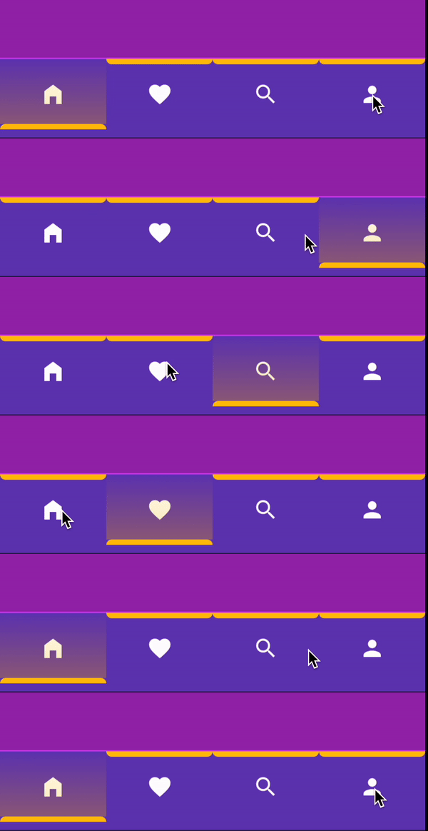
dependencies:
  stage_navigation_bar: ^0.1.0 #latest version
import 'package:stage_navigation_bar/stage_navigation_bar.dart';
Place your StageNavigationBar to the bottomNavigationBar slot of a Scaffold. Or in the bottom
of your main page view.
class StageNavigationBarExample extends StatefulWidget {
  const StageNavigationBarExample({super.key});

  @override
  State<StageNavigationBarExample> createState() =>
      _StageNavigationBarExampleState();
}

class _StageNavigationBarExampleState extends State<StageNavigationBarExample> {
  /// Your initial page
  int _selectedIndex = 0;

  @override
  Widget build(BuildContext context) {
    return Scaffold(
      bottomNavigationBar: StageNavigationBar(
        items: const [
          Icon(Icons.home_filled, color: Colors.white),
          Icon(Icons.favorite, color: Colors.white),
          Icon(Icons.search, color: Colors.white),
          Icon(Icons.person, color: Colors.white),
        ],
        selectedIndex: _selectedIndex,
        indicatorColor: Colors.amber,
        onTap: (int index) {
          setState(() {
            _selectedIndex = index;
          });
        },
      ),
    );
  }
}
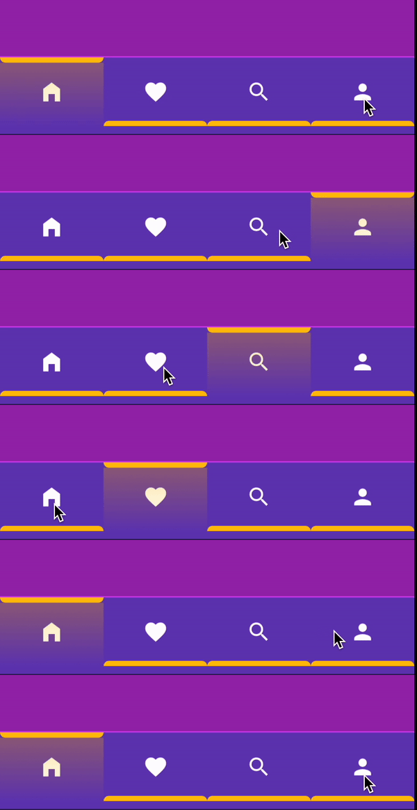
animationDirection: Define the animation move shape when tap.alignment: Alignment of the items.barHeight: StageNavigationBar height.barWidth: StageNavigationBar width.indicatorHeight: Indicator line height.itemPadding: Each item padding.duration: Indicator animation Transition duration.selectedIndex*: Current selected index.indicatorColor*: Color of the indicator and the gradient.onTap*: On item tap.barPadding?: StageNavigationBar internal padding.barMargin?: StageNavigationBar external padding.decoration?: StageNavigationBar box decoration.selectedIndicatorBorderRadius?: Selected item indicator border radius.unselectedIndicatorBorderRadius?: Unselected item indicator border radius.items!: StageNavigationBar items, List of widget.itemsCount!: Items count for itemBuilder callback.itemBuilder!: Callback will be called with indices greater than or equal to zero and less than itemsCount.animationDirection = IndicatorAnimationDirection.topToBottom,alignment = Alignment.center,barHeight = 60,barWidth = double.infinityindicatorHeight = 5,itemPadding = const EdgeInsets.all(0),duration = const Duration(milliseconds: 200),selectedIndicatorBorderRadius: default value depends on 'animationDirection' value,unselectedIndicatorBorderRadius: default value depends on 'animationDirection' value,IndicatorAnimationDirection.top
IndicatorAnimationDirection.topToBottom
IndicatorAnimationDirection.centerToTop
IndicatorAnimationDirection.centerToBottom
IndicatorAnimationDirection.bottom
IndicatorAnimationDirection.bottomToTop
onTap: (index){

}
IndicatorAnimationDirectionanimationDirection: IndicatorAnimationDirection.top
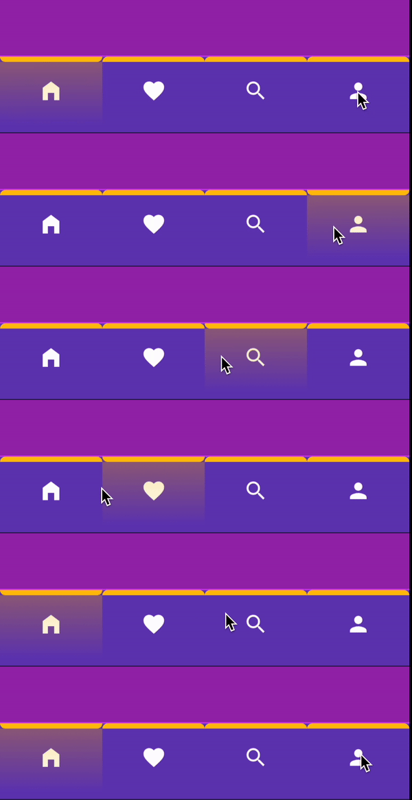
animationDirection: IndicatorAnimationDirection.topToBottom
animationDirection: IndicatorAnimationDirection.centerToTop
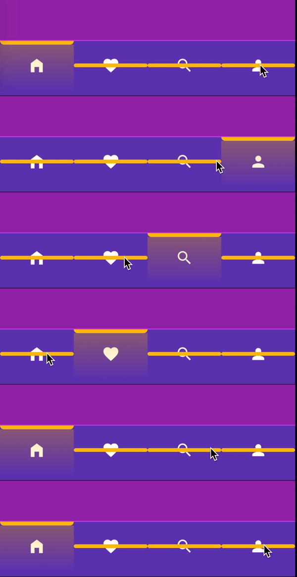
animationDirection: IndicatorAnimationDirection.centerToBottom
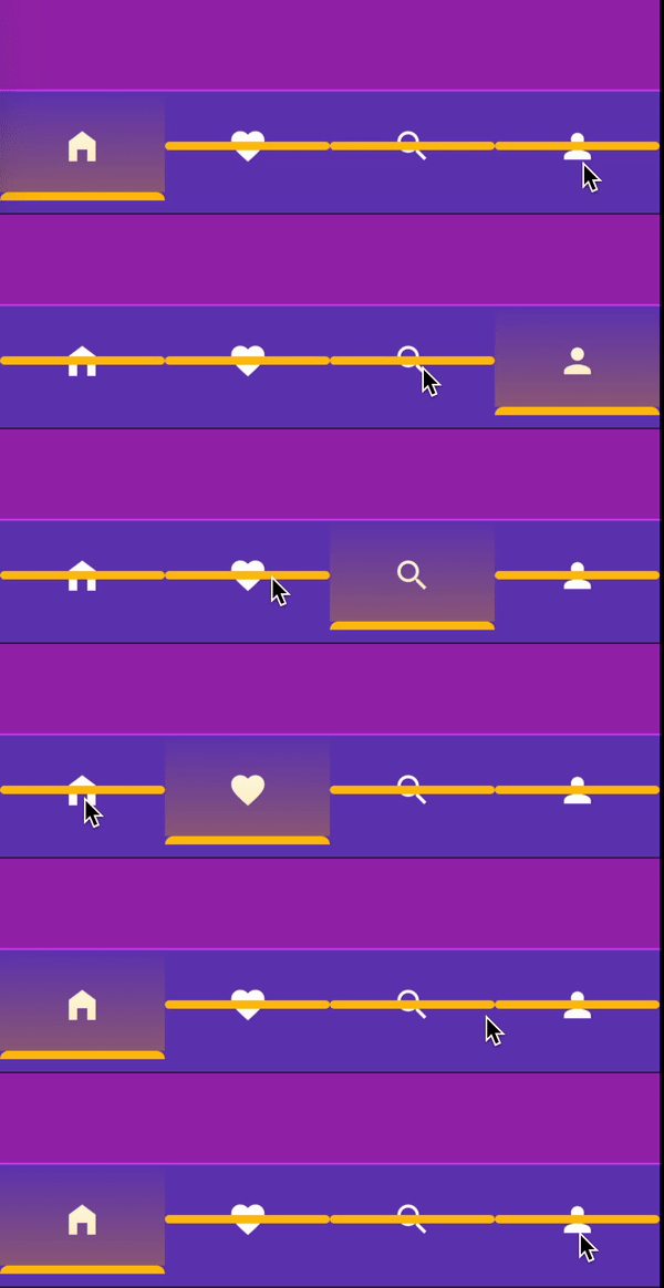
animationDirection: IndicatorAnimationDirection.bottom
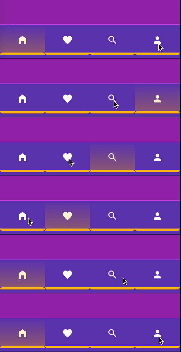
animationDirection: IndicatorAnimationDirection.bottomToTop
Mohammad Alamoudi @mu7mmd
Lista de dependências 3 itens
{"sdk":"flutter"}{"sdk":"flutter"}^3.0.0Filtre pelo caso de uso, compare a atividade e confira o projeto original antes de adotá-lo.
“A repository is the most basic element of GitHub.”
GitHub Docs — About repositories ↗