

 v3.0.0
vitality
使用 Vitality 輕鬆為您的 Flutter 應用程式添加引人入勝的即時動畫!
70喜歡 43近 30 天下載130Pub 分數
AndroidiOSWebmacOSWindowsLinux
一個 Flutter 套件專案,可在 10 行程式碼內讓你建立非常漂亮的背景動態動畫(例如隨機移動的圖示、圓形、矩形等)。

以下為英文專案原文快照,最新內容請造訪 GitHub。
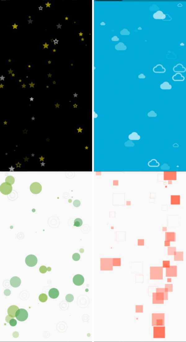
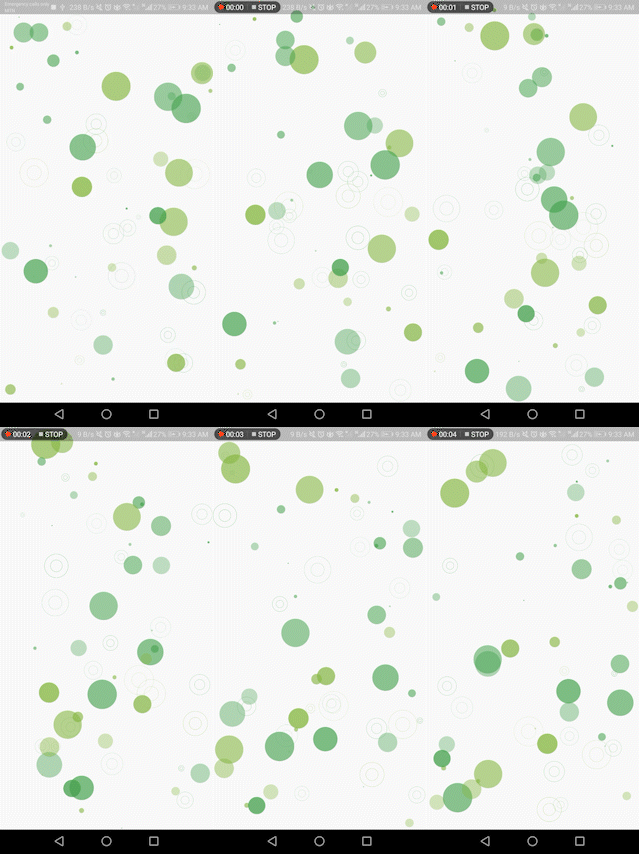
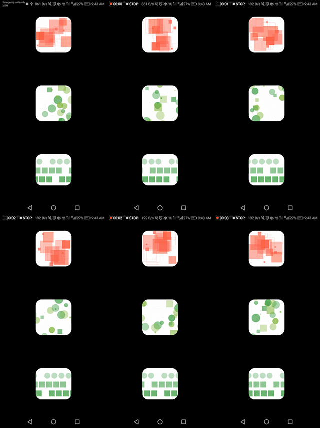
Check out these examples showcasing the versatility of the Vitality library:
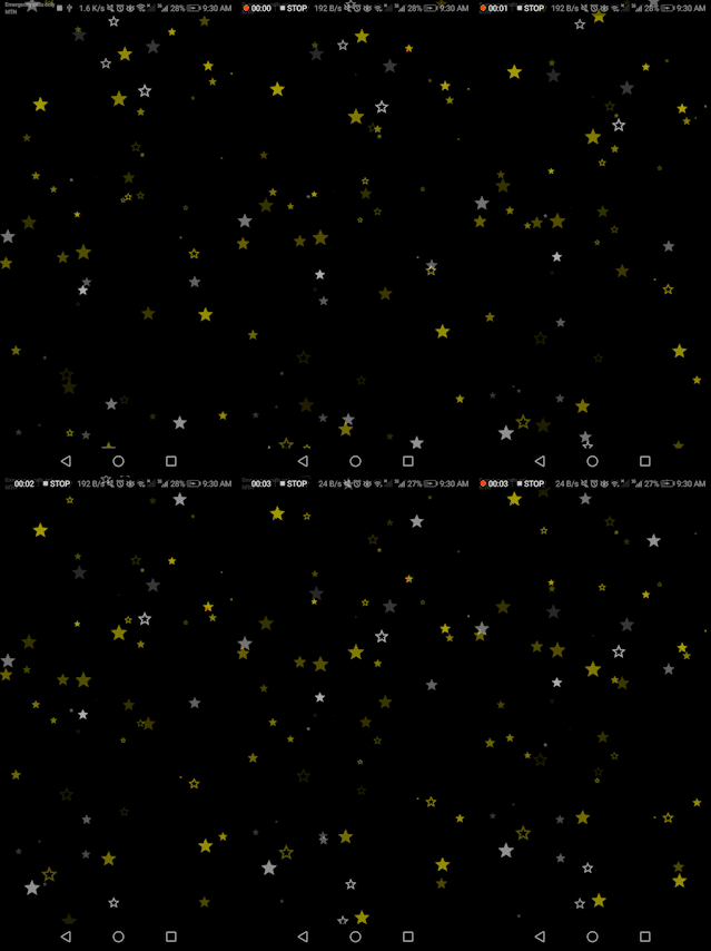



Vitality.randomly(
  background: Colors.black,
  maxOpacity: 0.8,
  minOpacity: 0.3,
  itemsCount: 80,
  enableXMovements: false,
  whenOutOfScreenMode: WhenOutOfScreenMode.Teleport,
  maxSpeed: 1.5,
  maxSize: 30,
  minSpeed: 0.5,
  randomItemsColors: [Colors.yellowAccent, Colors.white],
  randomItemsBehaviours: [
    ItemBehaviour(shape: ShapeType.Icon, icon: Icons.star),
    ItemBehaviour(shape: ShapeType.Icon, icon: Icons.star_border),
    ItemBehaviour(shape: ShapeType.StrokeCircle),
  ],
)
whenOutOfScreenMode Determines how a shape behaves at the screen edge, values are:
none: It does nothing and continues its movements out the screen.Reflect: It bounces and returns in the oppisite direction.Teleport: It continues its movements to the other side of the screen.randomItemsBehaviours Defines the shapes that the library can generate. Choose from the ShapeType enum (FilledCircle, StrokeCicle, FilledSquare, Icon, Image, etc.) :
For Icon type, pass an IconData object:
ItemBehaviour(shape: ShapeType.Icon, icon: Icons.star)
For Image type, pass a dart:ui Image object:
ItemBehaviour(shape: ShapeType.Image, image: /*ui.Image() here*/)
Sample code to load an image from assets:
dart:ui Image objectimport 'dart:ui' as ui;
import 'package:flutter/services.dart';
Future<ui.Image> loadImage(String assetPath) async {
ByteData data = await rootBundle.load(assetPath);
List<int> bytes = data.buffer.asUint8List();
ui.Codec codec = await ui.instantiateImageCodec(Uint8List.fromList(bytes));
ui.FrameInfo fi = await codec.getNextFrame();
return fi.image;
}
FutureBuilder<ui.Image>(
  future: loadImage('assets/images/your_image.png'),
  builder: (context, snapshot) {
    if (snapshot.connectionState == ConnectionState.done) {
      return Vitality.randomly(
        whenOutOfScreenMode: WhenOutOfScreenMode.Reflect,
        randomItemsColors: const [Colors.yellow],
        randomItemsBehaviours: [
          ItemBehaviour(
            shape: ShapeType.Image,
            image: snapshot.data!,
          )
        ],
      );
    }
    return const CircularProgressIndicator();
  },
),
shapes parameter. Additionally, you can control the background with the background parameter.Shape objects as the shapes parameter. Each Shape object includes the following properties:
pos: Initial position of the shape [Offset].dx: Speed on the X-axis [double].dy: Speed on the Y-axis [double].size: Size of the shape [double].color: Color of the shape [Color].whenOutOfScreenMode: Behavior of the shape at the screen edge [WhenOutOfScreenMode].behaviour: Structure of the shape [ItemBehaviour].Vitality.custom(shapes: [
Shape(
pos: const Offset(30, 30),
dx: 0.3,
dy: 0,
size: 160,
color: Colors.yellow,
whenOutOfScreenMode: WhenOutOfScreenMode.Reflect,
behaviour: ItemBehaviour(shape: ShapeType.Icon, icon: Icons.sunny),
),
]),
For more dynamic combinations, you can use the ShapesGenerator class. This class allows you to generate shapes with specific properties,
resulting in an easier way to seamlessly combine multiple shapes, allowing you to effortlessly craft a beautiful background. The parameters include:
minWidth, minHeight: Minimum width and height for random generation [double].maxWidth, maxHeigh: Maximum width and height for random generation [double].enableXMovements, enableYMovements: Whether or not the shapes will move on the X and Y axes [bool].minSize, maxSize: Minimum and maximum size values for shapes [double].minOpacity, maxOpacity: Minimum and maximum opacity values for shapes (values between 0 and 1) [double].minSpeed, maxSpeed: Minimum and maximum speed values for shapes [double].behaviours: List of ItemBehaviour for random selection.colors: List of Color for random selection.whenOutOfScreenMode: What will happen when shapes reach the screen edge [WhenOutOfScreenMode].List<Shape> getClouds(Size size) {
return ShapesGenerator.randomly(
maxWidth: size.width,
maxHeight: size.height / 3,
enableYMovements: false,
maxSize: 60,
minSize: 50,
maxOpacity: 0.9,
minOpacity: 0.5,
whenOutOfScreenMode: WhenOutOfScreenMode.Reflect,
behaviours: [ItemBehaviour(shape: ShapeType.Icon, icon: Icons.cloud)],
colors: const [Colors.white],
).getShapes(10);
}
Now, let's mix different shapes to make something truly magical.
List<Shape> getClouds(Size size) {
  return ShapesGenerator.randomly(
    maxWidth: size.width,
    maxHeight: size.height / 3,
    enableYMovements: false,
    maxSize: 60,
    minSize: 50,
    maxOpacity: 0.9,
    minOpacity: 0.5,
    whenOutOfScreenMode: WhenOutOfScreenMode.Reflect,
    behaviours: [ItemBehaviour(shape: ShapeType.Icon, icon: Icons.cloud)],
    colors: const [Colors.white],
  ).getShapes(10);
}
List<Shape> getGroundShapes(Size size) {
return ShapesGenerator.randomly(
minHeight: size.height - 130,
maxWidth: size.width,
maxHeight: size.height,
enableYMovements: false,
maxSize: 190,
minSize: 90,
maxOpacity: 1,
minOpacity: 0.5,
whenOutOfScreenMode: WhenOutOfScreenMode.none,
behaviours: [
ItemBehaviour(shape: ShapeType.Icon, icon: Icons.circle)
],
colors: const [Colors.green],
maxSpeed: 0,
minSpeed: 0
).getShapes(40);
}
@override
Widget build(BuildContext context) {
Size size = MediaQuery.of(context).size;
return Vitality.custom(background: Colors.blue, shapes: [
Shape(
pos: const Offset(30, 30),
dx: 0.3,
dy: 0,
size: 160,
color: Colors.yellow,
whenOutOfScreenMode: WhenOutOfScreenMode.Reflect,
behaviour: ItemBehaviour(shape: ShapeType.Icon, icon: Icons.sunny),
),
...getClouds(size),
...getGroundShapes(size),
]);
}
依賴清單 3 項
{"sdk":"flutter"}^2.0.3{"sdk":"flutter"}先依使用情境篩選,再比較專案活躍情況,最後到原始儲存庫確認使用要求。
“A repository is the most basic element of GitHub.”
GitHub Docs — About repositories ↗