
Flutter回應
Flutter UI 套件,可協助您在任何裝置上建立您想要的響應式 UI 設計,因為它會重新創造每個組件以適應應用程式運行的裝置顯示尺寸。

- 星標
- 3
- 分支
- 0
- 最近推送(UTC)
- 2021年4月5日
- 專案狀態
- 未封存
原始 README
以下為英文專案原文快照,最新內容請造訪 GitHub。
Response
Flutter UI package which will help you to build your responsive UI design as you wanted to be on any device as it recreates every widget to fit the device display size on which the app is working.
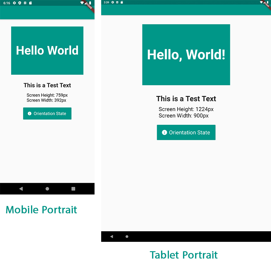
Features
- Easy to use, with so few but yet powerful methods.
- Fast, very reliable and readable.
- Saves you a lot of time trying to fit widget size to different displays.
- Works on any Android/ IOS device (including iPad).
- Works in Portrait mode or Landscape mode on the same device.
How to use
First wrap your MaterialApp widget with Response.
     Response(
      originalScreenHeight: 759,
      originalScreenWidth: 392,
      child: MaterialApp(
        home: HomePage(),
      ),
    )
Note: Responsive needs to be at the top of your Widget Tree to be able to work and rebulid the widgets to a new size as the device display changes.
Note: if you want to use any functions features related to
MediaQueryyou must change the order to make theResponsewidget a child to theMaterialAppwidget.
Second
declare an instance response of ResponseUI() class at the top of your file.
final response = ResponseUI.instance;
And that is all to be able to initialize the package, Very easy!
to use the package on your widget you have 4 easy to use methods:
| Name | Description |
|---|---|
response.setWidth(width) |
Sets the widget width in pixels value to be relatively constant across all different display sizes. |
response.setHeight(height) |
Sets the widget height in pixels value to be relatively constant across all different display sizes. |
response.setFontSize(fontSize) |
Sets the text size in pixels to be relativly constant on all diplays sizes. |
response.isDevicePortrait |
Helpful if you want to know whether the device orientation is in Portrait or in Landscape. |
response.inMobilePortrait |
Helps you if you want to know whether the device you are working on a Mobile Portrait (returns true) or a Tablet Portrait mode (returns false). |
response.screenWidth |
returns the current device screen width as of type double. |
response.screenPixelRatio |
returns the current device screen ratio. (using MediaQuery) |
response.textScaleFactor |
returns the font scalling factore as of type double. (using MediaQuery) |
response.bottomPadding |
returns the current device screen padding offset from the bottom. (using MediaQuery) |
response.topPadding |
returns the current device screen padding offset from the top. (using MediaQuery) |
Note:
isDevicePortraitandinMobilePortraitreturns abool(true or false) with which you can know the current orientation state of your device.
Height and Width
to set a width and height to for example a Container.
//We want the Container Widget to be 200px in width and 200px in height
    Container(
        width: response.setWidth(300), //setting the Container width to be 300px
        height: response.setHeight(200), //setting the Container height to be 300px
        color: Colors.teal,
       )
Note: the scaling process will work also in the same device in both in Portrait mode or in Landscape mode.
Text Size
to set the text size.
    Text(
        'This is a Test Text',
        style: TextStyle(
           fontSize: response.setFontSize(24), //defined a fixed font size in pixels
           fontWeight: FontWeight.bold,
    ),
)
Getting Screen Width & Height
    TextSpan(
      text: '\nScreen Height: ${response.screenHeight}px\n', //we are getting back our current device screen
      //height in pixels.
      style: TextStyle(
        color: Colors.black,
        fontSize: response.setFontSize(18),
      ),
    ),
    TextSpan(
      text: 'Screen Width: ${response.screenWidth}px', //we are getting back our current device screen
      //width in pixels.
      style: TextStyle(
        color: Colors.black,
        fontSize: response.setFontSize(18),
      ),
    ),
Contributions
If you feel like you can contribute to make the package much better and more useful for other
developers, don't hesitate to fork the repo and make pull request to your changes.
Source code on Github: here
Inspired
This package was inspired by Prateek Sharma's great custom responsive UI project.

Ahmed Abouelkheir ↗
使用的依賴
依賴清單 2 項
- flutter
{"sdk":"flutter"} - flutter_test開發依賴
{"sdk":"flutter"}
如何選擇適合專案的儲存庫?
先依使用情境篩選,再比較專案活躍情況,最後到原始儲存庫確認使用要求。
- 透過儲存庫名稱、作者或描述搜尋,再依技術分類縮小範圍。
- 綜合星標、分支與最近推送比較專案;星標反映社群關注,不保證品質。
- 使用前在 GitHub 確認 README、授權條款與 Issues。
來源與維護
“A repository is the most basic element of GitHub.”
GitHub Docs — About repositories ↗