
 v1.0.0
diagram_editor
一個用於建立互動式圖表編輯器的 Flutter 庫,支援類型安全的元件、連結、平移/縮放與序列化。
184喜歡 700近 30 天下載160Pub 分數
AndroidiOSWebmacOSWindowsLinux
Fllutter 圖表編輯器庫

{"sdk":"flutter"}^4.5.1{"sdk":"flutter"}^7.0.0以下為英文專案原文快照,最新內容請造訪 GitHub。
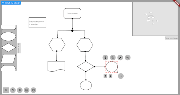
Flutter library for building interactive diagram editors. Create, connect, and manipulate nodes and links with pan, zoom, and full gesture support.
import 'package:diagram_editor/diagram_editor.dart';
import 'package:flutter/material.dart';

class MyDiagram extends StatelessWidget {
  MyDiagram({super.key});

  final controller = DiagramController<void, void>();

  @override
  Widget build(BuildContext context) {
    return DiagramEditor<void, void>(
      controller: controller,
      componentBuilder: (context, component) => Container(
        color: Colors.blue,
        child: Center(child: Text(component.id)),
      ),
      onCanvasTapUp: (details) {
        controller.addComponent(ComponentData(
          size: const Size(96, 72),
          position: controller.fromCanvasCoordinates(details.localPosition),
        ));
      },
      onComponentTap: (id) => controller.removeComponent(id),
    );
  }
}
Pan, zoom, link joints, and link control all work out of the box.
Use generic type parameters to attach typed data to components and links:
class MyNodeData {
  final Color color;
  final String label;
  MyNodeData({required this.color, required this.label});
}

final controller = DiagramController<MyNodeData, void>(
  componentDataCodec: JsonCodec(
    encode: (d) => {'color': d.color.toHex(), 'label': d.label},
    decode: (j) => MyNodeData(
      color: Color(int.parse(j['color'] as String, radix: 16)),
      label: j['label'] as String,
    ),
  ),
);

// No more casting — data is typed
controller.addComponent(ComponentData(
  data: MyNodeData(color: Colors.blue, label: 'Start'),
  size: const Size(96, 72),
));

// Access data without casting
final node = controller.getComponent('id');
final color = node.data?.color; // Color, not dynamic
final linkId = controller.connect(
  sourceComponentId: 'node-1',
  targetComponentId: 'node-2',
  linkStyle: LinkStyle(
    arrowType: ArrowType.arrow,
    lineWidth: 2,
    color: Colors.grey,
  ),
);
DiagramEditor<MyNodeData, void>(
  controller: controller,
  componentBuilder: (context, data) => MyNodeWidget(data),

  // Canvas config
  canvasConfig: const CanvasConfig(
    backgroundColor: Color(0xFFF5F5F5),
    minScale: 0.2,
    maxScale: 5.0,
  ),

  // Link endpoint alignment strategy
  linkEndpointAlignment: LinkAttachment.oval(),

  // Disable defaults if you want full control
  enableDefaultPanZoom: true,       // default
  enableDefaultLinkControl: true,   // default
  enableDefaultJointControl: true,  // default

  // Links rendered on top of components
  linksOnTop: true,                 // default

  // All gesture callbacks
  onCanvasTapUp: (details) { /* ... */ },
  onComponentTap: (id) { /* ... */ },
  onComponentScaleUpdate: (id, details) { /* ... */ },
  onLinkTap: (id) { /* ... */ },

  // Custom layers
  backgroundBuilder: (context) => [CustomPaint(painter: GridPainter())],
  foregroundBuilder: (context) => [/* selection UI, toolbars, etc. */],
  componentOverlayBuilder: (context, data) => /* resize handles, etc. */,
);
// Save
final json = controller.serialize();

// Load
controller.deserialize(json);
Custom data is serialized via the JsonCodec passed to the controller.
The central class managing all diagram state.
| Category | Methods |
|---|---|
| Components | addComponent, removeComponent, moveComponent, getComponent, componentExists, components, componentsSorted |
| Links | connect, removeLink, getLink, linkExists, links |
| Z-order | bringToFront, sendToBack, setComponentZOrder |
| Parent-child | setComponentParent, removeComponentParent |
| Canvas | setCanvasPosition, panCanvas, zoomCanvas, resetCanvasView, fromCanvasCoordinates, toCanvasCoordinates |
| Joints | insertLinkJoint, removeLinkJoint, showLinkJoints, hideLinkJoints |
| Serialization | serialize, deserialize |
| Strategy | Method |
|---|---|
| Rectangular | LinkAttachment.rectangular() (default) |
| Oval | LinkAttachment.oval() |
| Crystal/Diamond | LinkAttachment.crystal() |
| Center | LinkAttachment.center() |
none, arrow, pointedArrow, circle, centerCircle, semiCirclesolid, dashed, dottedGridPainter — canvas grid backgroundComponentHighlightPainter — selection highlightDeleteIconPainter — delete icon overlaySee the full Migration Prompt for a detailed mapping of every old API surface to its new equivalent, including complete before/after examples.
Key changes:
PolicySet with mixins -> DiagramEditor with callbackscanvasWriter.model.addComponent(...) -> controller.addComponent(...)componentData.data as MyType -> componentData.data (typed generics)provider dependency removed (uses built-in ListenableBuilder)