
flutter-反應效果
:lion: 包幫助顯示彈出反應,如 Facebook 和小部件包裝(顯示對此訊息作出反應的任何人)。
- 星標
- 20
- 分支
- 6
- 最近推送(UTC)
- 2023年9月21日
- 專案狀態
- 未封存
原始 README
以下為英文專案原文快照,最新內容請造訪 GitHub。
:four_leaf_clover: Package help show popup reaction like Facebook and wrapper for widget (Show anyone who reaction this message).
:four_leaf_clover::four_leaf_clover: Preview
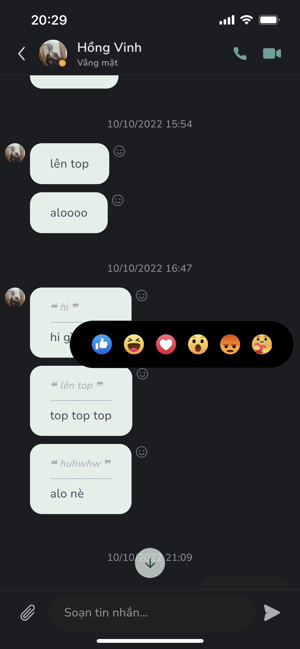
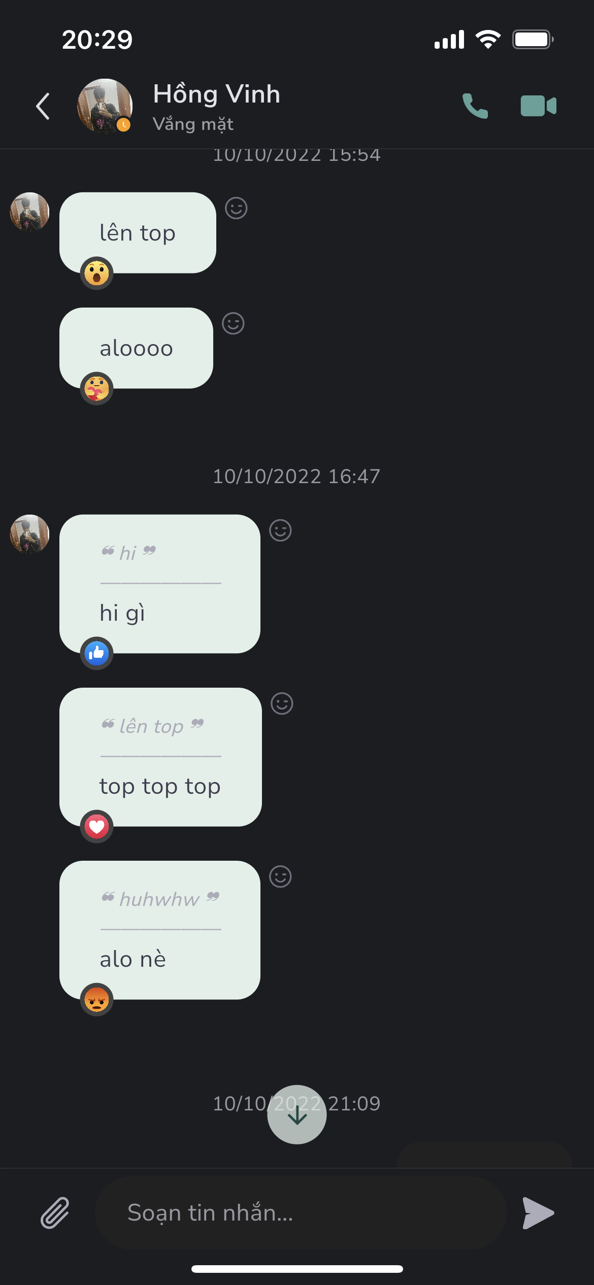


Features
- Support show popup emotions picker
- Support reaction wrapper for message card use case
Usage
- Show reaction popup
        GestureDetector(
          onTapDown: (details) {
            ReactionAskany.showReactionBox(
              context,
              offset: details.globalPosition,
              boxParamenters: boxParamenters,
              emotionPicked: _emotion,
              handlePressed: (Emotions emotion) {
                setState(() {
                  _emotion = emotion;
                });
              },
            );
          },
          child: widget.buttonReaction,
        ),
- Use reaction wrapper - useful for reaction message
            ReactionWrapper(
              boxParamenters: ReactionBoxParamenters(
                brightness: Brightness.light,
                iconSize: 26,
                iconSpacing: 10,
                paddingHorizontal: 30,
                radiusBox: 40,
                quantityPerPage: 6,
              ),
              buttonReaction: const Padding(
                padding: EdgeInsets.only(top: 2.0),
                child: Icon(
                  Icons.face_outlined,
                  size: 20.0,
                  color: Colors.grey,
                ),
              ),
              child: Container(
                padding: const EdgeInsets.symmetric(
                  vertical: 12.0,
                  horizontal: 20.0,
                ),
                decoration: BoxDecoration(
                  color: Colors.greenAccent.shade100,
                  borderRadius: BorderRadius.circular(30),
                ),
                child: const Text(
                  'Message from lambiengcode <3',
                ),
              ),
            ),
ReactionBoxParamenters
| parameter | description | default |
|---|---|---|
| iconSize | Size of emotion in reaction box | 20 |
| iconSpacing | Padding horizontal value for each emotion | 8 |
| paddingHorizontal | Padding horizontal value for reaction box | 16 |
| radiusBox | Radius circular of reaction box | 10 |
| quantityPerPage | Number of emotions per page view | 5 |
| brightness | Set brightness for show background color compatitive | Brightness.light |
Download Askany


License - lambiengcode
MIT License

Copyright (c) 2022 Askany

Permission is hereby granted, free of charge, to any person obtaining a copy
of this software and associated documentation files (the "Software"), to deal
in the Software without restriction, including without limitation the rights
to use, copy, modify, merge, publish, distribute, sublicense, and/or sell
copies of the Software, and to permit persons to whom the Software is
furnished to do so, subject to the following conditions:

The above copyright notice and this permission notice shall be included in all
copies or substantial portions of the Software.

THE SOFTWARE IS PROVIDED "AS IS", WITHOUT WARRANTY OF ANY KIND, EXPRESS OR
IMPLIED, INCLUDING BUT NOT LIMITED TO THE WARRANTIES OF MERCHANTABILITY,
FITNESS FOR A PARTICULAR PURPOSE AND NONINFRINGEMENT. IN NO EVENT SHALL THE
AUTHORS OR COPYRIGHT HOLDERS BE LIABLE FOR ANY CLAIM, DAMAGES OR OTHER
LIABILITY, WHETHER IN AN ACTION OF CONTRACT, TORT OR OTHERWISE, ARISING FROM,
OUT OF OR IN CONNECTION WITH THE SOFTWARE OR THE USE OR OTHER DEALINGS IN THE
SOFTWARE.

GitHub 作者
Askany ↗
語言DartC++CMakeHTMLCSwiftKotlinObjective-C
分類
使用的依賴
依賴清單 3 項
- flutter
{"sdk":"flutter"} - flutter_test開發依賴
{"sdk":"flutter"} - flutter_lints開發依賴
^2.0.0
如何選擇適合專案的儲存庫?
先依使用情境篩選,再比較專案活躍情況,最後到原始儲存庫確認使用要求。
- 透過儲存庫名稱、作者或描述搜尋,再依技術分類縮小範圍。
- 綜合星標、分支與最近推送比較專案;星標反映社群關注,不保證品質。
- 使用前在 GitHub 確認 README、授權條款與 Issues。
來源與維護
“A repository is the most basic element of GitHub.”
GitHub Docs — About repositories ↗