
熔岩導航欄_flutter
一個動畫底部導航欄

- 星標
- 8
- 分支
- 8
- 最近推送(UTC)
- 2024年2月26日
- 專案狀態
- 未封存
原始 README
以下為英文專案原文快照,最新內容請造訪 GitHub。
molten_navigationbar_flutter
An animated bottom navigation bar with a lot of attributes to teak and have fun with ✔🚀
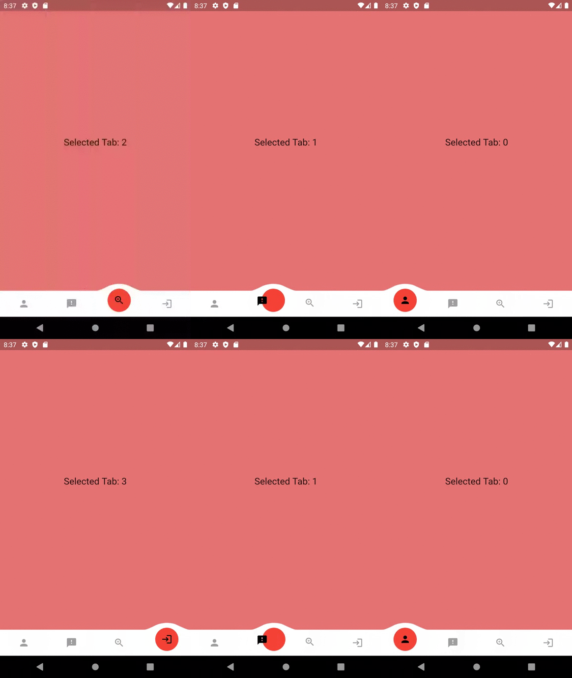 |
 |
 |
|---|
Getting Started
Add this to your package's pubspec.yaml file:
dependencies:
  molten_navigationbar_flutter: ^1.0.0
Import the package
import 'package:molten_navigationbar_flutter/molten_navigationbar_flutter.dart';
How to Use
You can use it in the scaffold's bottomnavigationbar, or anywhere you would like!
Just call the MoltenBottomNavigationBar widget and provide the tabs, onTabChange and selectedIndex attributes.
The rest of the attributes are optional
Scaffold(
   bottomNavigationBar: MoltenBottomNavigationBar(
      selectedIndex: _selectedIndex,
      onTabChange: (clickedIndex) {
        setState(() {
          _selectedIndex = clickedIndex;
        });
      },
      tabs: [
        MoltenTab(
          icon: Icon(Icons.search),
        ),
        MoltenTab(
          icon: Icon(Icons.home),
        ),
        MoltenTab(
          icon: Icon(Icons.person),
        ),
      ],
   ),
),
MoltenBottonNavigationBar's Attributes
| Attribute | Type | Description |
|---|---|---|
| barHeight | double | specify a Height for the bar, Default is kBottomNavigationBarHeight |
| domeHeight | double | specify a Height for the Dome above tabs, Default is 15.0 |
| domeWidth | double | If domeWidth is null, it will be set to 100 |
| domeCircleColor | Color | If a null value is passed, the domeCircleColor will be Theme.primaryColor |
| domeCircleSize | double | The size of the inner circle representing a seleted tab. Note that domeCircleSize must be less than or equal to (barHeight + domeHeight) |
| margin | EdgeInsets | Spacing around the bar |
| barColor | Color | specify a color to be used as a background color, Default is Theme.bottomAppBarColor |
| tabs | List | List of MoltenTab, each wil have an icon as the main widget, selcted color and unselected color |
| selectedIndex | int | The currently selected tab |
| onTabChange | Function(int index) | callback function that will be triggered whenever a [MoltenTab] is clicked, and will return it's index. |
| curve | Curve | Select a Curve value for the dome animation. Default is Curves.linear |
| duration | Duration | How long the animation should last, Default is Duration(milliseconds: 150) |
| borderSize | double | Applied to all 4 border sides, Default is 0 |
| borderColor | Color | Applied to all border sides |
| borderRaduis | BorderRadius | How much each angle is curved. Note that high raduis values may decrease the dome width. |
MoltenTab's Attributes
| Attribute | Type | Description |
|---|---|---|
| icon | double | can be any widget, preferably an icon |
| selectedColor | double | The icon color when the tab is selected, White if not set |
| unselectedColor | double | The icon color when the tab is not selected, Grey if not set |
Example
You can find an example here

GitHub 作者
Ayman ↗
語言DartSwiftKotlinObjective-C
使用的依賴
依賴清單 1 項
- flutter
{"sdk":"flutter"}
如何選擇適合專案的儲存庫?
先依使用情境篩選,再比較專案活躍情況,最後到原始儲存庫確認使用要求。
- 透過儲存庫名稱、作者或描述搜尋,再依技術分類縮小範圍。
- 綜合星標、分支與最近推送比較專案;星標反映社群關注,不保證品質。
- 使用前在 GitHub 確認 README、授權條款與 Issues。
來源與維護
“A repository is the most basic element of GitHub.”
GitHub Docs — About repositories ↗