

 v1.0.0
load
全域載入組件,純Flutter程式庫,不使用原生程式碼。其用法類似於OKToast。
22喜歡 1940近 30 天下載130Pub 分數
AndroidiOSWebmacOSWindowsLinux
CaiJingLong/flutter_load_widget open-source repository details.

以下為英文專案原文快照,最新內容請造訪 GitHub。


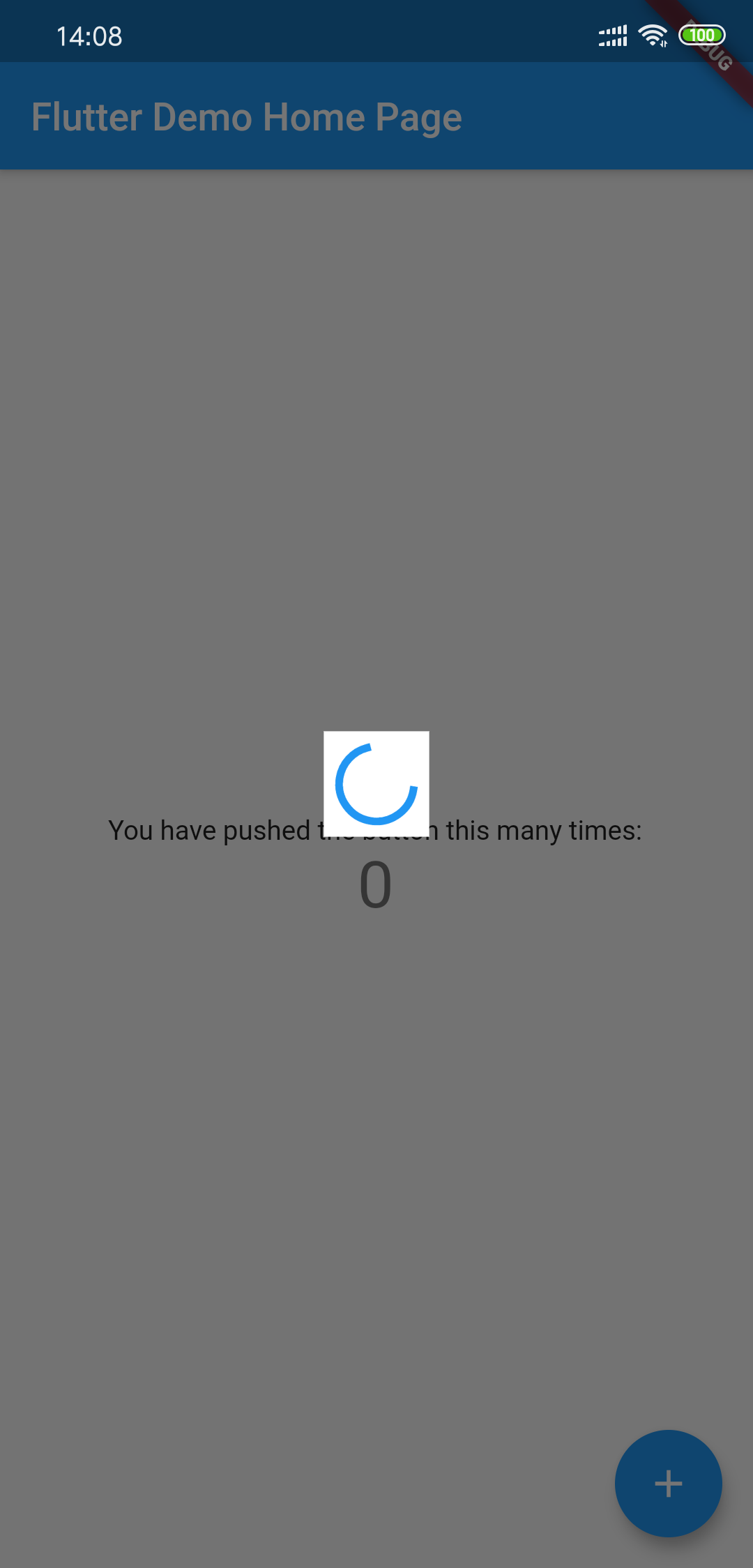
Global loading widget, which can be used through simple configuration.
Pure flutter library, not use native code.
It is similar to OKToast in use.
Add to yaml
version is
dependencies:
  load: $latest_version
import 'package:load/load.dart';
void main() {
  runApp(
    LoadingProvider(
      child: MyApp(),
    ),
  );
}

or

LoadingProvider(
  child: MaterialApp(),
);
Debug custom loading widget in Flutter inspector
You can try to use next method to include the widget:
MaterialApp(
  builder: (context, widget) {
    return LoadingProvider(
      child: widget,
    );
  },
);
see example/lib/main.dart
showLoadingDialog();
showCustomLoadingWidget(Container()); // custom dialog
hideLoadingDialog();
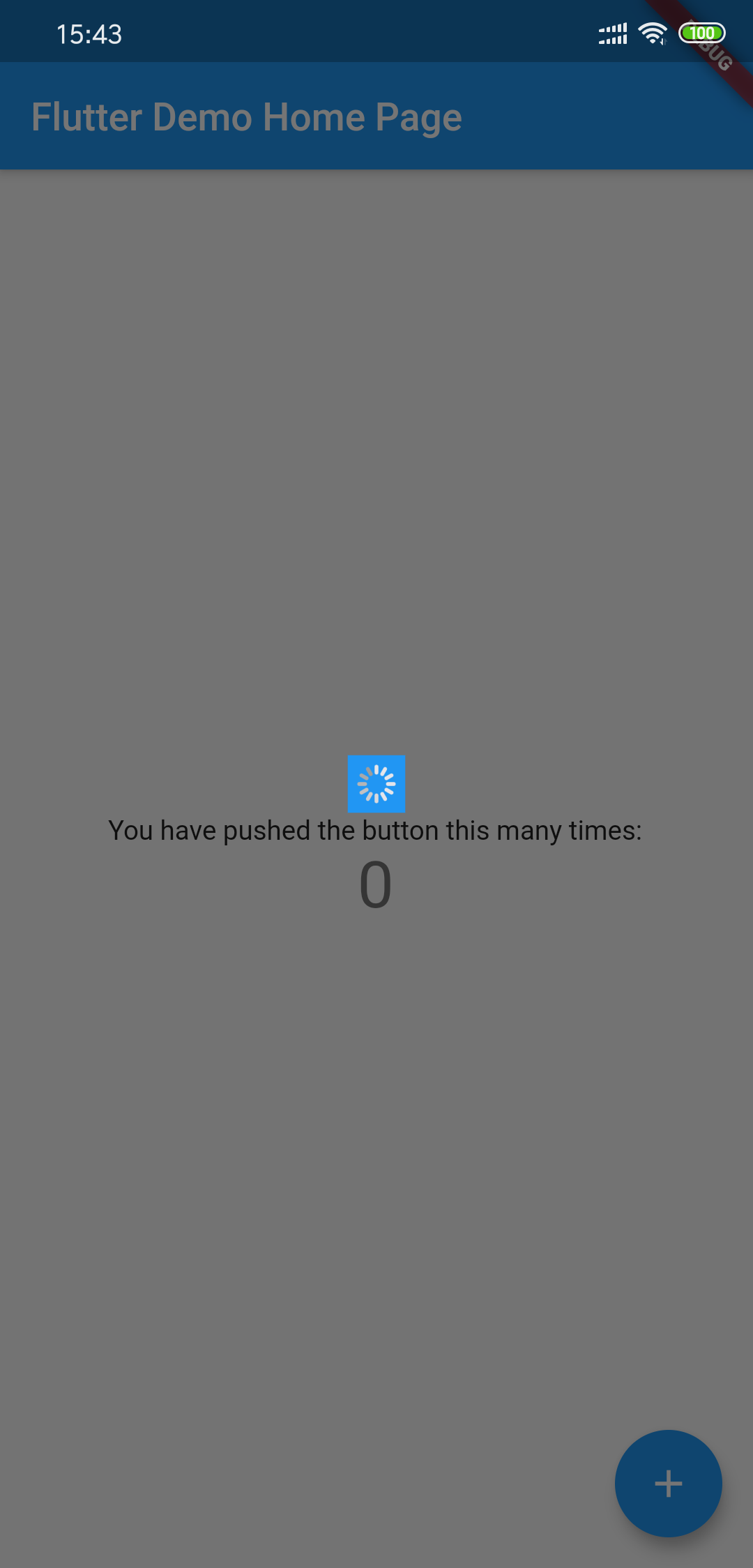
Using LoadingThemeData and loadingWidgetBuilder
LoadingProvider(
  themeData: LoadingThemeData(),
  loadingWidgetBuilder: (ctx, data) {
    return Center(
      child: SizedBox(
        width: 30,
        height: 30,
        child: Container(
          child: CupertinoActivityIndicator(),
          color: Colors.blue,
        ),
      ),
    );
  },
  child: MyApp(),
);
All params is optional
| Params | Type | Default Value | Desc |
|---|---|---|---|
| backgroundColor | Color | Colors.black54 | Background transparent mask |
| tapDismiss | bool | true | Will it close when touching the background? |
| loadingBackgroundColor | Color | Colors.white | Background color for the center Loading Widget |
| loadingPadding | EdgeInsets | EdgeInsets.all(8.0) | Padding for the center Loading Widget |
| loadingSize | Size | Size(55,55) | Size for the center Loading Widget |
| animDuration | Duration | Duration(milliseconds: 300) | Show/Hide Time Duration |
依賴清單 2 項
{"sdk":"flutter"}{"sdk":"flutter"}先依使用情境篩選,再比較專案活躍情況,最後到原始儲存庫確認使用要求。
“A repository is the most basic element of GitHub.”
GitHub Docs — About repositories ↗