
FloatingActionBubble
Darshan0/FloatingActionBubble open-source repository details.

- 星標
- 21
- 分支
- 34
- 最近推送(UTC)
- 2023年4月6日
- 專案狀態
- 未封存
原始 README
以下為英文專案原文快照,最新內容請造訪 GitHub。
Floating Action Bubble


A Flutter package to create a animated menu using a Floating Action Button.
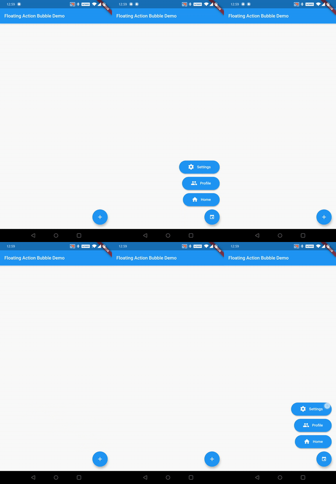
Installation
Just add floating_action_bubble to your pubspec.yml file
dependencies:
  floating_action_bubble: 1.1.2
Example
class MyApp extends StatelessWidget {
  @override
  Widget build(BuildContext context) {
    return MaterialApp(
      title: 'Floating Action Bubble Demo',
      theme: ThemeData(
        primarySwatch: Colors.blue,
      ),
      home: Directionality(textDirection: TextDirection.rtl, child: MyHomePage(title: 'Floating Action Bubble Demo')),
    );
  }
}

class MyHomePage extends StatefulWidget {
  MyHomePage({Key key, this.title}) : super(key: key);
  final String title;

  @override
  _MyHomePageState createState() => _MyHomePageState();
}

class _MyHomePageState extends State<MyHomePage> with SingleTickerProviderStateMixin{

  Animation<double> _animation;
  AnimationController _animationController;

  @override
  void initState(){

    _animationController = AnimationController(
      vsync: this,
      duration: Duration(milliseconds: 260),
    );

    final curvedAnimation = CurvedAnimation(curve: Curves.easeInOut, parent: _animationController);
    _animation = Tween<double>(begin: 0, end: 1).animate(curvedAnimation);


    super.initState();


  }

  @override
  Widget build(BuildContext context) {
    return  Scaffold(
      appBar: AppBar(
        title: Text(widget.title),
      ),

      floatingActionButtonLocation: FloatingActionButtonLocation.endDocked,

      //Init Floating Action Bubble
      floatingActionButton: FloatingActionBubble(
        // Menu items
        items: <Bubble>[

          // Floating action menu item
          Bubble(
            title:"Settings",
            iconColor :Colors.white,
            bubbleColor : Colors.blue,
            icon:Icons.settings,
            titleStyle:TextStyle(fontSize: 16 , color: Colors.white),
            onPress: () {
              _animationController.reverse();
            },
          ),
          // Floating action menu item
          Bubble(
            title:"Profile",
            iconColor :Colors.white,
            bubbleColor : Colors.blue,
            icon:Icons.people,
            titleStyle:TextStyle(fontSize: 16 , color: Colors.white),
            onPress: () {
              _animationController.reverse();
            },
          ),
          //Floating action menu item
          Bubble(
            title:"Home",
            iconColor :Colors.white,
            bubbleColor : Colors.blue,
            icon:Icons.home,
            titleStyle:TextStyle(fontSize: 16 , color: Colors.white),
            onPress: () {
              Navigator.push(context, new MaterialPageRoute(builder: (BuildContext context) => Homepage()));
              _animationController.reverse();
            },
          ),
        ],

        // animation controller
        animation: _animation,

        // On pressed change animation state
        onPress: () => _animationController.isCompleted
              ? _animationController.reverse()
              : _animationController.forward(),

        // Floating Action button Icon color
        iconColor: Colors.blue,

        // Flaoting Action button Icon
        iconData: Icons.ac_unit,
        backGroundColor: Colors.white,
      )
    );
  }

}
You can check for a more complete example in the example directory.
Customize
You can customize the widget appareance using the following properties:
| Property | Description |
|---|---|
| fabColor | Sets the FAB color |
| fabIcon | Sets the FAB icon |
| BubbleTitle | Sets the menu item title |
| BubbleTitleStyle | Sets the menu item title style |
| BubbleIcon | Sets the menu item icon |
| BubbleIconColor | Sets the menu item icon color |
| BubbleColor | Sets the menu item color |
| animation | Allows to animated the menu items |
Contributing
If you want to contribute to this project, please submit a PR to the development branch Thank you 😁

GitHub 作者
Darshan Murthy ↗
語言DartKotlinSwiftObjective-C
使用的依賴
依賴清單 3 項
- flutter
{"sdk":"flutter"} - flutter_test開發依賴
{"sdk":"flutter"} - flutter_lints開發依賴
^1.0.0
如何選擇適合專案的儲存庫?
先依使用情境篩選,再比較專案活躍情況,最後到原始儲存庫確認使用要求。
- 透過儲存庫名稱、作者或描述搜尋,再依技術分類縮小範圍。
- 綜合星標、分支與最近推送比較專案;星標反映社群關注,不保證品質。
- 使用前在 GitHub 確認 README、授權條款與 Issues。
來源與維護
“A repository is the most basic element of GitHub.”
GitHub Docs — About repositories ↗